Chapter 9 Heatmaps et al. - base R
9.1 Setup
In this chapter, we take a look at R for visualizing data matrices.
if(!require(RColorBrewer)){
  install.packages("RColorBrewer",repos = "http://cran.us.r-project.org")
  library(RColorBrewer)
}
if(!require(gplots)){
  install.packages("gplots",repos = "http://cran.us.r-project.org")
  library(gplots)
}
if(!require(gtools)){
  install.packages("gtools",repos = "http://cran.us.r-project.org")
  library(gtools)
}
## Loading required package: gtoolsHeatmaps are a commonly used visualization tool for large data matrices, where you’d have many features (e.g. gene’s expression values, microbial abundances, metabolite levels…) measured over a bunch of samples.
9.2 Loading data
In this example, we’ll work with a metabolomics dataset from a study on gastectomy, processed for a meta-analysis. There is also some metadata available.
metabo <- read.delim("../datasets/ERAWIJANTARI_metab.tsv",row.names=1) #data
colnames(metabo) <- sub("^X","",colnames(metabo))
metabo <- as.matrix(metabo)
metabo_log <- log10(metabo)
metaD <- read.delim("../datasets/ERAWIJANTARI_metaD.tsv") #metadata
all(colnames(metabo) == metaD$Sample) #check that samples match in data matrices
## [1] TRUEWith 96 samples and 211 metabolites, this is not a huge data set. But it’s awkward to analyse and visualize bit by bit. A heatmap can give a quick overview.
9.3 Basic heatmaps
9.3.1 A simple heatmap
Here’s how the default heatmap looks:
heatmap(metabo)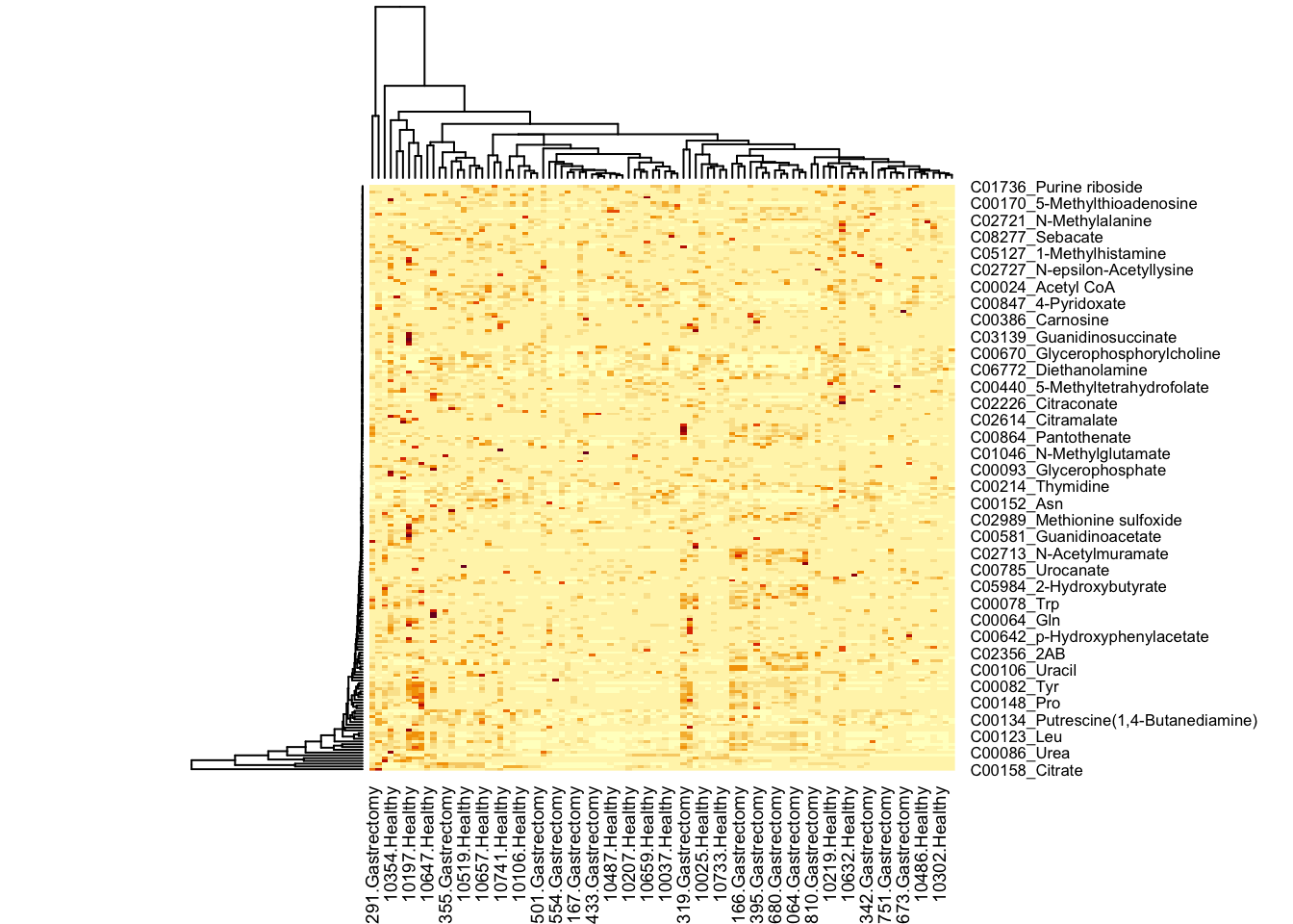
Every column represents one sample, every row represents a metabolite. Let’s for a moment ignore that there are too many datapoints to plot all the labels - indeed, let’s ignore the labels for now:
heatmap(metabo,
        labRow = "", # no rownames
        labCol = "", # no colnames
        margins = c(0.5,0.5)) # remove the white space around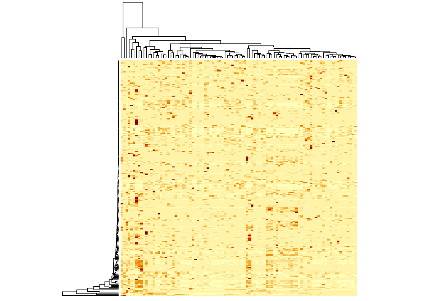
9.3.2 Scaling
What this simple visualization does not tell you is what the colours mean - we’ll come back to that later - but the darker colours are higher values. You see that there are some high values for all metabolites. When you think about it, this must mean that something was done to our data, because you would never find all metabolites at a similar level. This is true, the default setting for a heatmap is to scale by row. This means that the average value per row has the middle colour, and the further a value is away from the average, the lighter or darker it will be. How light or dark? scaling takes the distribution into account, so all values that are one standard deviation higher than its row’s average have the same colour. You can turn scaling off:
heatmap(metabo,
        scale = "none", # no scaling!
        labRow = "", # no rownames
        labCol = "", # no colnames
        margins = c(0.5,0.5)) # remove the white space around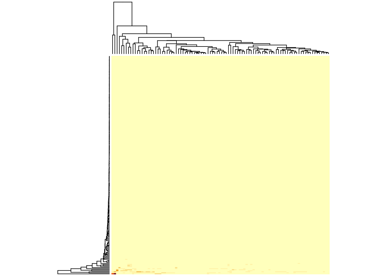
Now, you’ve lost most information, except that you can see that there are really very few metabolites with a high value. It’s not useful not to scale for this kind of data, but if all your rows have similar values, it can be better. You can see this, if you use the log-transformed version of the data set, where all values sit somewhere between -1 and 6:
You could also scale by column:
heatmap(metabo_log,
        scale = "none", # no scaling!
        labRow = "", # no rownames
        labCol = "", # no colnames
        margins = c(0.5,0.5)) # remove the white space around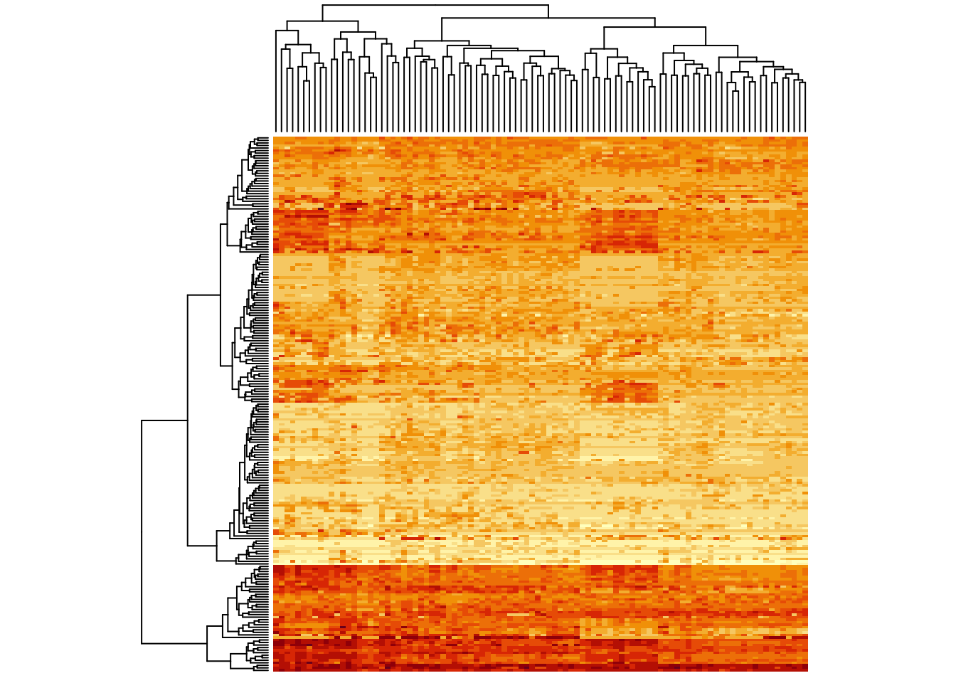
Instant patterns! As an exercise, plot the heatmap for this data set
with row scaling (scale = "row").
When comparing no scaling and row-scaling, you see that no scaling emphasizes the absolute values, while row-scaling emphasizes differences between samples. It depends on your question which visualization is appropriate.
heatmap(metabo_log,
        scale = "col", # column scaling!
        labRow = "", # no rownames
        labCol = "", # no colnames
        margins = c(0.5,0.5)) # remove the white space around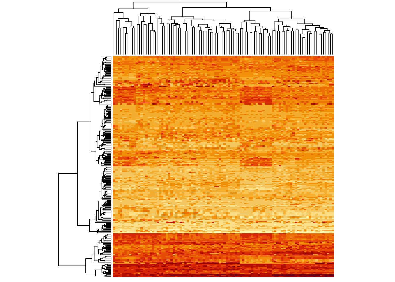
Now some of the columns which were lighter before cannot be distinguished anymore. So, you see, scaling is important for the visual impression.
Generally, we would recommend that you transform and normalize (and potentially scale/centre) your data set appropriately, before you visualize it. That way, your analyses are performed correctly and on the thing you see. What exactly is “appropriate” depends on your data set. Here, we’re just learning visualization, so we’ll stick with the un-normalized, un-scaled/centred (but log-transformed) data.
9.3.3 Colour schemes
A lot of the information in heatmaps comes from the colours. So it’s important to choose good colors. Generally speaking, if the data is not centred/scaled, use light colours for low values and darker colours for high values. If you are plotting a scaled/centred data set, it’s good practice to have a neutral color (black or whiteish) in the middle and stronger colours for the extremes:
heatmap(metabo_log,
        col = hcl.colors(12,"RdYlBu", rev = TRUE), #diverging palette
        scale = "row", # row scaling!
        labRow = "", # no rownames
        labCol = "", # no colnames
        margins = c(0.5,0.5)) # remove the white space around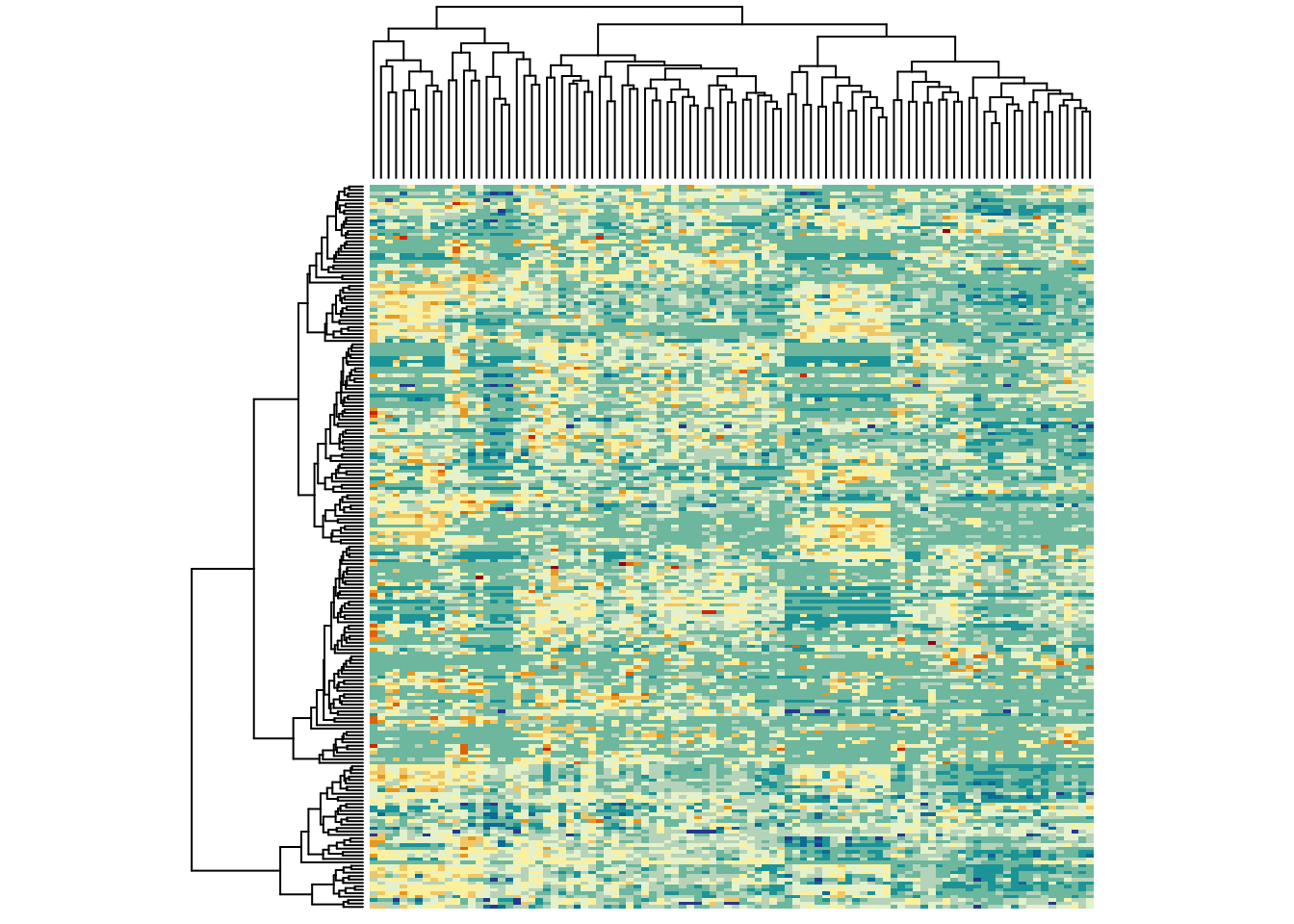
It would be nice to have a colour bar here. So, let’s use a bit more fancy function - which also centers the colours:
heatmap.2(metabo_log,
        col = hcl.colors(13,"RdYlBu", rev = TRUE), #diverging palette
        scale = "row", # row scaling!
        labRow = "", # no rownames
        labCol = "", # no colnames
        margins = c(0.5,0.5), # remove the white space around
        trace = "none", #don't plot a trace
        density.info = "none") #don't overlay a histogram in the colour bar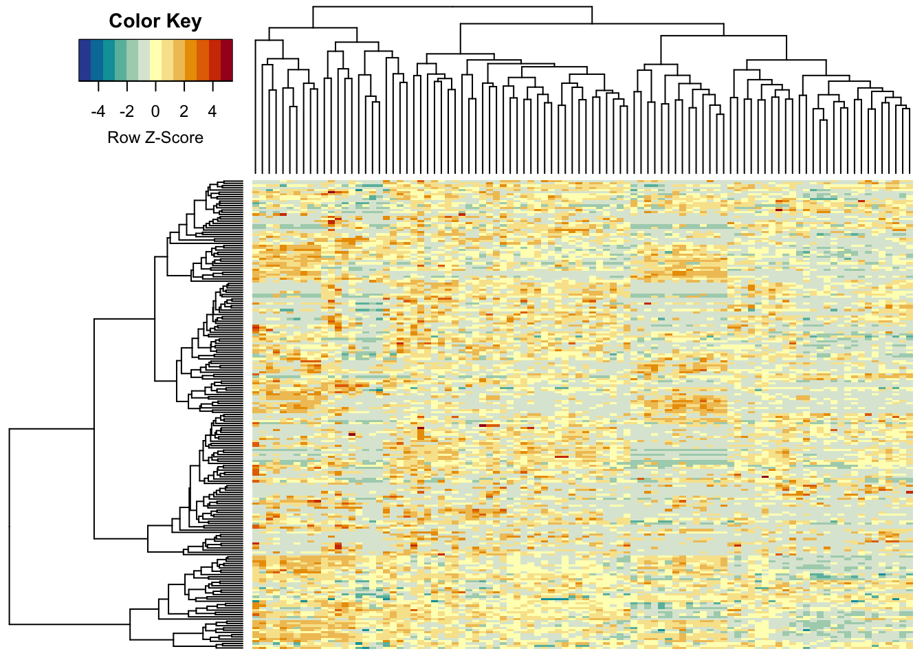
13 colour steps were not really enough (R’s base heatmap function uses
only 12…), so here we set it to 255, giving a smooth colour scale:
heatmap.2(metabo_log,
        col = hcl.colors(255,"RdYlBu", rev = TRUE), #diverging palette - 255 colours!
        scale = "row", # row scaling
        labRow = "", # no rownames
        labCol = "", # no colnames
        margins = c(0.5,0.5), # remove the white space around
        trace = "none", #don't plot a trace
        density.info = "none") #don't overlay a histogram in the colour bar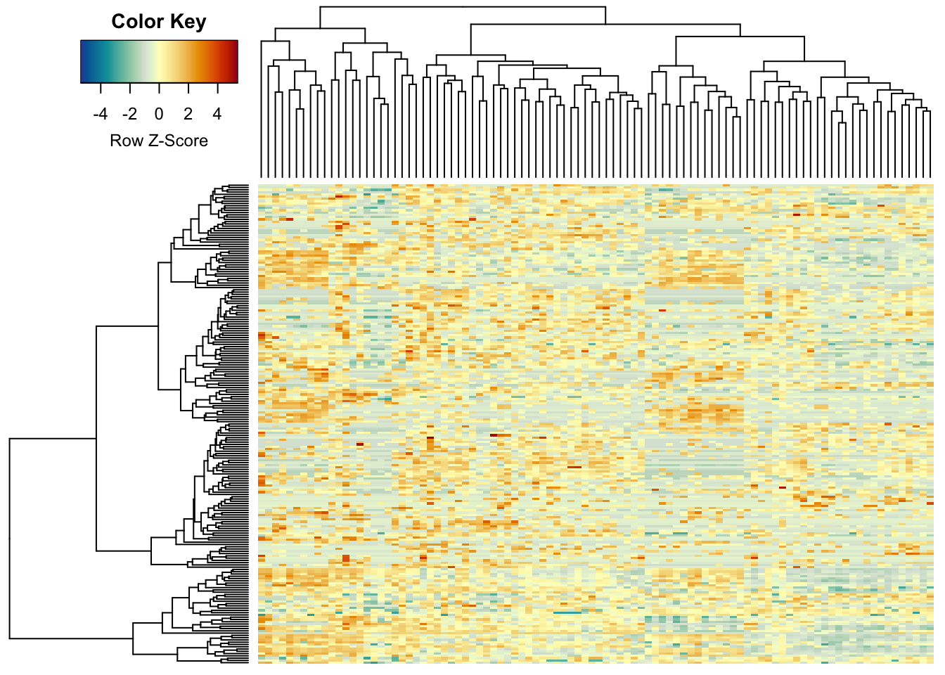
This would be the un-scaled image:
heatmap.2(metabo_log,
       col = hcl.colors(255,"YlGnBu", rev = TRUE), #single colour palette! - 255 colours
        symbreaks = F, #colours are not centred around 0
        scale = "none", # no scaling!
        labRow = "", # no rownames
        labCol = "", # no colnames
        margins = c(0.5,0.5), # remove the white space around
        trace = "none", #don't plot a trace
        density.info = "none") #don't overlay a histogram in the colour bar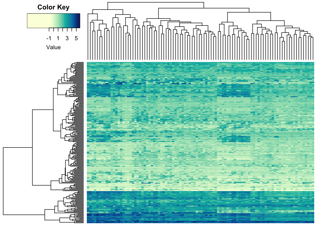
The colour key is a bit buggy, but Fortunately, it’s R, so we can change the function. Here’s the code (not displayed in the .html).
9.4 Decorating heatmaps
9.4.1 Dendrograms
The other thing that determines the impression of heatmaps is the order of the features and the samples. By default, R tries to make the picture as clear as possible. This is achieved by re-ordering the features and samples using dendrograms. Let’s take a look at our heatmap without the dendrogram and ordering:
heatmap.2a(metabo_log,
          dendrogram = "none", #no dendrogram plotted
          Rowv = F, #no sorting for rows
          Colv = F, #no sorting for columns
       col = hcl.colors(255,"YlGnBu", rev = TRUE), #single colour palette - 255 colours
        symbreaks = F, #colours are not centred around 0
        scale = "none", # no scaling!
        labRow = "", # no rownames
        labCol = "", # no colnames
        margins = c(0.5,0.5), # remove the white space around
        trace = "none", #don't plot a trace
        density.info = "none") #don't overlay a histogram in the colour bar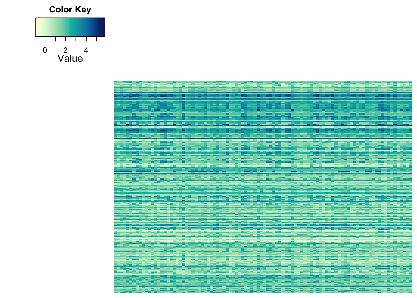
It’s hard to believe that these are the same values, right?
The default dendrogram is based on Euclidean distances, which are hierarchically clustered using complete linkage. You can supply your own dendrograms, based on your choice of distance:
heatmap.2a(metabo_log,
          dendrogram = "both", #both dendrograms plotted
          Rowv = as.dendrogram(hclust(dist(metabo_log,"minkowski"),
                        "ward.D2")), #custom
          Colv = as.dendrogram(hclust(dist(t(metabo_log)),
                        "ward.D2")), #custom dendrogram
       col = hcl.colors(255,"YlGnBu", rev = TRUE), #single colour palette - 255 colours
        symbreaks = F, #colours are not centred around 0
        scale = "none", # no scaling!
        labRow = "", # no rownames
        labCol = "", # no colnames
        margins = c(0.5,0.5), # remove the white space around
        trace = "none", #don't plot a trace
        density.info = "none") #don't overlay a histogram in the colour bar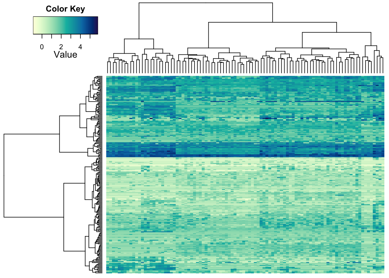
The choice of distance is up to you and depends on your data and what
you consider ‘different.’ Most fields of research have (more or less
justified) standards. *Try out some of the options you can find under
?dist and ?hclust to see effects.
9.4.2 Ordering features and samples
We’ve already seen the power of sorting. Next to ordering you data based on clustering (you might call this ‘unsupervised’), you can have pre-defined groups (especially for samples). You can also visualize those:
heatmap.2a(metabo_log[,order(metaD$Status,metaD$Gender,metaD$BMI)],# custom order using metadata: by study group, gender, and BMI
          dendrogram = "row", # row dendrogram plotted
         Colv = NULL,
       col = hcl.colors(255,"YlGnBu", rev = TRUE), #single colour palette - 255 colours
        symbreaks = F, #colours are not centred around 0
        scale = "none", # no scaling!
        labRow = "", # no rownames
        labCol = "", # no colnames
        margins = c(0.5,0.5), # remove the white space around
        trace = "none", #don't plot a trace
        density.info = "none") #don't overlay a histogram in the colour bar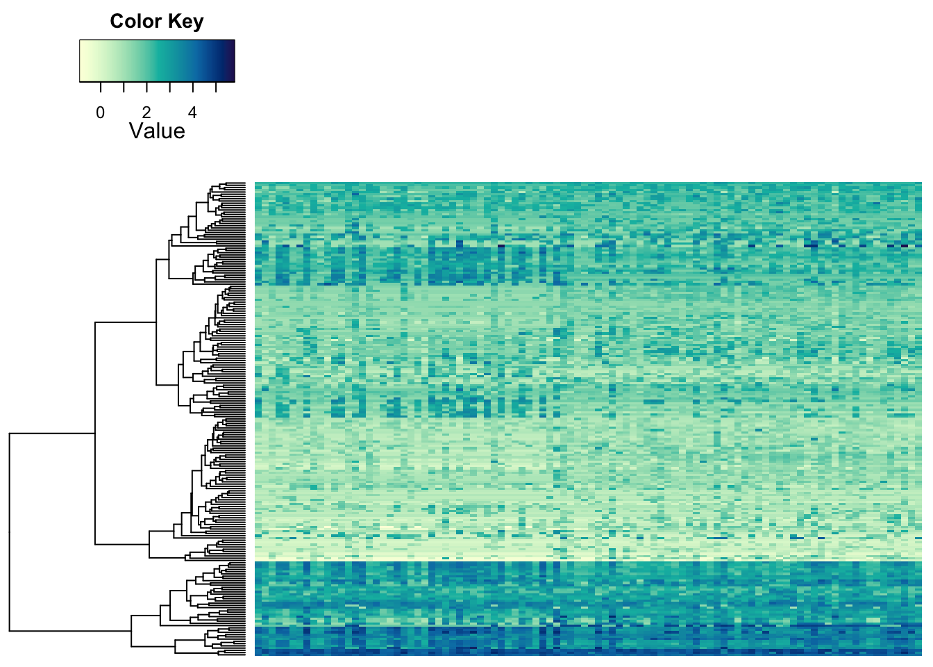
Some structure is still visible. So, this looks like some of the metabolites behave a bit differently in the samples on the left than on the right. But the most obvious differences between samples we seemed to see before may be due to something else. We can indicate the separation of groups with vertical lines:
heatmap.2a(metabo_log[,order(metaD$Status,metaD$Gender,metaD$BMI)],# custom order using metadata: by study group, gender, and BMI
          dendrogram = "row", # row dendrogram plotted
          Colv = NULL, # no sorting (except above)
          colsep = cumsum(c(t(table(metaD$Status,metaD$Gender)))), #counting the grouping from above!
          col = hcl.colors(255,"YlGnBu", rev = TRUE), #single colour palette - 255 colours
          symbreaks = F, #colours are not centred around 0
          scale = "none", # no scaling!
          labRow = "", # no rownames
          labCol = "", # no colnames
          margins = c(0.5,0.5), # remove the white space around
          trace = "none", #don't plot a trace
          density.info = "none") #don't overlay a histogram in the colour bar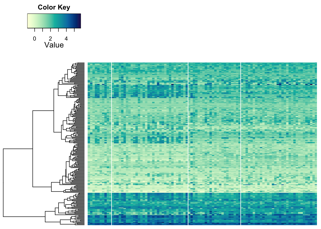
9.4.3 Adding attributes
We can add some sample information to the heatmap using colours for a similar effect:
heatmap.2a(metabo_log,
          ColSideColors = c("purple","green")[as.numeric(as.factor(metaD$Status))],
          dendrogram = "both", #both dendrograms plotted
       col = hcl.colors(255,"YlGnBu", rev = TRUE), #single colour palette - 255 colours
        symbreaks = F, #colours are not centred around 0
        scale = "none", # no scaling
        labRow = "", # no rownames
        labCol = "", # no colnames
        margins = c(0.5,0.5), # remove the white space around
        trace = "none", #don't plot a trace
        density.info = "none") #don't overlay a histogram in the colour bar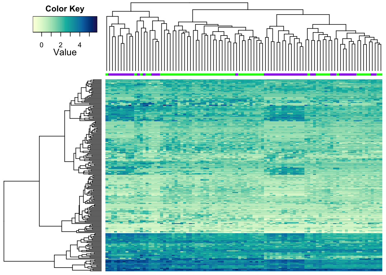
Our improved heatmap.2a also takes multiple attributes for colour
codes.
heatmap.2a(metabo_log,
          ColSideColors = rbind(c("pink","lightblue")[as.numeric(as.factor(metaD$Gender))],
                                brewer.pal(7,"Set3")[as.numeric(as.factor(metaD$Gastric.acid.medication))],
                                c("purple","green")[as.numeric(as.factor(metaD$Status))]),
          dendrogram = "both", #both dendrograms plotted
       col = hcl.colors(255,"YlGnBu", rev = TRUE), #single colour palette - 255 colours
        symbreaks = F, #colours are not centred around 0
        scale = "none", # no scaling
        labRow = "", # no rownames
        labCol = "", # no colnames
        margins = c(0.5,0.5), # remove the white space around
        trace = "none", #don't plot a trace
        density.info = "none") #don't overlay a histogram in the colour bar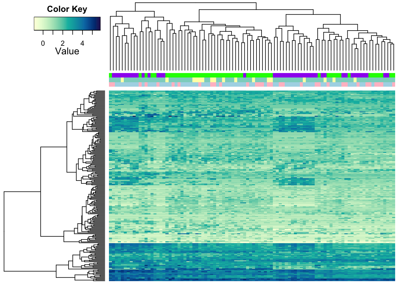
There are more options to tweak. Take a look at ?heatmap.2 to see
them.