Chapter 7 Summarizing distributions in base R
7.1 Setup
In this chapter, we take a look at R functions in the base packages that can summarize values. We will use some additional packages for specialized functions.
if(!require(vioplot)){
  install.packages("vioplot",repos = "http://cran.us.r-project.org")
  library(vioplot)
}
## Loading required package: vioplot## Loading required package: sm## Package 'sm', version 2.2-5.7: type help(sm) for summary information## Loading required package: zoo##
## Attaching package: 'zoo'## The following objects are masked from 'package:base':
##
## as.Date, as.Date.numericif(!require(beanplot)){
install.packages("beanplot",repos = "http://cran.us.r-project.org")
library(beanplot)
}## Loading required package: beanplotif(!require(RColorBrewer)){
install.packages("RColorBrewer",repos = "http://cran.us.r-project.org")
library(RColorBrewer)
}
if(!require(gplots)){
install.packages("gplots",repos = "http://cran.us.r-project.org")
library(gplots)
}## Loading required package: gplots##
## Attaching package: 'gplots'## The following object is masked from 'package:stats':
##
## lowess7.2 The data
For the visualizations we use the ChickWeight data set that comes with R.
data("ChickWeight") #import like this is possible for R's inbuilt datasets
head(ChickWeight)
## Grouped Data: weight ~ Time | Chick
## weight Time Chick Diet
## 1 42 0 1 1
## 2 51 2 1 1
## 3 59 4 1 1
## 4 64 6 1 1
## 5 76 8 1 1
## 6 93 10 1 1summary(ChickWeight) #dataset is present in the workspace with the dataset name## weight Time Chick Diet
## Min. : 35.0 Min. : 0.00 13 : 12 1:220
## 1st Qu.: 63.0 1st Qu.: 4.00 9 : 12 2:120
## Median :103.0 Median :10.00 20 : 12 3:120
## Mean :121.8 Mean :10.72 10 : 12 4:118
## 3rd Qu.:163.8 3rd Qu.:16.00 17 : 12
## Max. :373.0 Max. :21.00 19 : 12
## (Other):506You see that you have 4 columns, most importantly weight. There are 3 sets of ‘metadata’: when was a chick weighed, which chick, and what was the chick eating.
Let’s plot all of the chick data.
plot(ChickWeight$Time,
     ChickWeight$weight,
        xlab = "time point",
        ylab = "weight")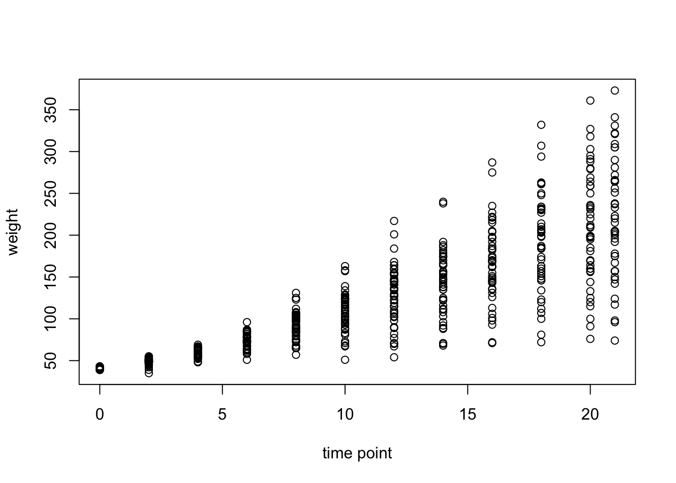
This is not very pretty and we’re missing some information. Let’s clean it up a bit:
par(mar=c(3,3,0.5,0.5), #different margins
    tcl=-0.3, #shorter tick marks
    mgp=c(1.9,0.5,0)) #move axis labels
plot(ChickWeight$Time,
     ChickWeight$weight,
     xlab = "time point",
     ylab = "weight",
     cex.axis=0.8, #smaller axis annotation
     pch=16, #filled symbols
     col=brewer.pal(4,"Dark2")[as.numeric(as.factor(ChickWeight$Diet))], #color by diet
     las=1, #all axis marks horizontal
     bty="l") #just the x and y axis, no box
legend("topleft", #legend, position
       legend = levels(as.factor(ChickWeight$Diet)), #names of diet
       pch=16, #filled points like plot
       col=brewer.pal(4,"Dark2"), #colours like plot
       title = "diet", #legend title
       bty="n") #no box around legend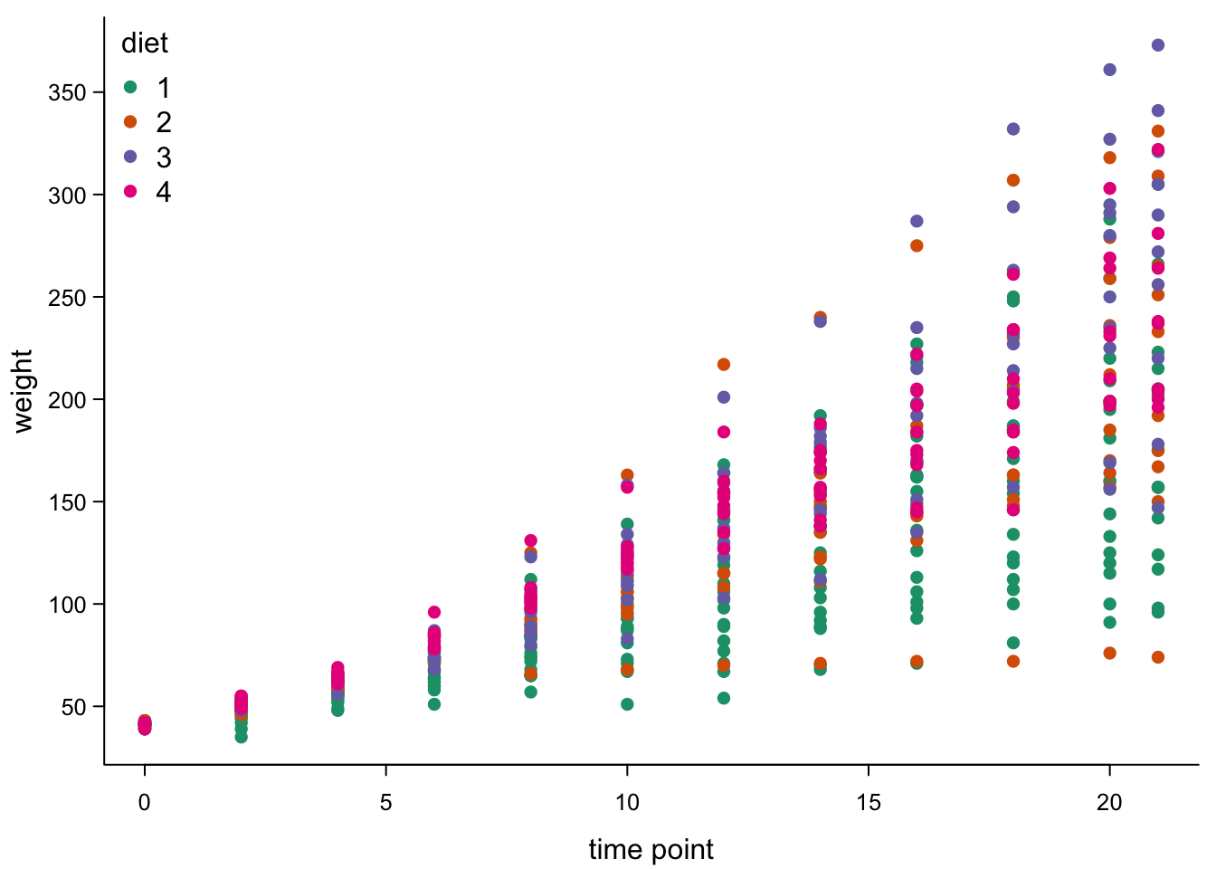
This looks nice, but the points are still overlapping, so we don’t see really well how they are distributed.
7.3 Just the mean: Barplots
One of the simplest summary values you may want to plot is the mean. You can visualize the mean of different groups using bar plots. For now, we are ignoring the different diets. Let’s look at all chicks’ weights at time 0:
summary(ChickWeight$weight[ChickWeight$Time==0]) ## Min. 1st Qu. Median Mean 3rd Qu. Max.
## 39.00 41.00 41.00 41.06 42.00 43.00and at time 10:
summary(ChickWeight$weight[ChickWeight$Time==10]) ## Min. 1st Qu. Median Mean 3rd Qu. Max.
## 51.0 93.0 109.0 107.8 124.0 163.0We can calculate the mean chick weight per time point using the
aggregate function, which will aggregate any set of values (here
ChickWeight$weight i.e. the column with weights) according to a factor
(here list(ChickWeight$Time) i.e. the time points) using a function of
our choice (here mean).
chickWeightTime <- aggregate(ChickWeight$weight,list(ChickWeight$Time),mean)
colnames(chickWeightTime) <- c("Time","weight") #clean up names
head(chickWeightTime)
## Time weight
## 1 0 41.06000
## 2 2 49.22000
## 3 4 59.95918
## 4 6 74.30612
## 5 8 91.24490
## 6 10 107.83673We could plot as a scatter plot, since the time points are not categories but real values:
par(mar=c(3,3,0.5,0.5), #different margins
    tcl=-0.3, #shorter tick marks
    mgp=c(1.9,0.5,0)) #move axis labels
plot(chickWeightTime$Time,
     chickWeightTime$weight,
     xlab = "time point",
     ylab = "weight",
     cex.axis=0.8, #smaller axis annotation
     pch=16, #filled symbols
     las=1, #all axis marks horizontal
     bty="l") #just the x and y axis, no box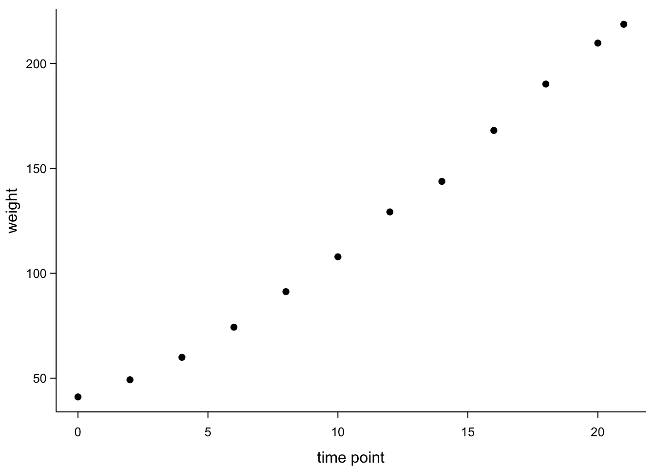
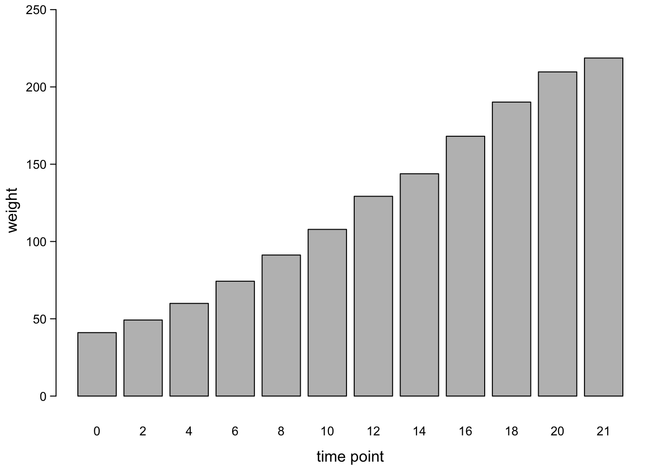
7.3.1 Simple barplots
Now we plot the barplot:
barplot(chickWeightTime$weight,
        names.arg = chickWeightTime$Time,
        xlab = "time point",
        ylab = "weight")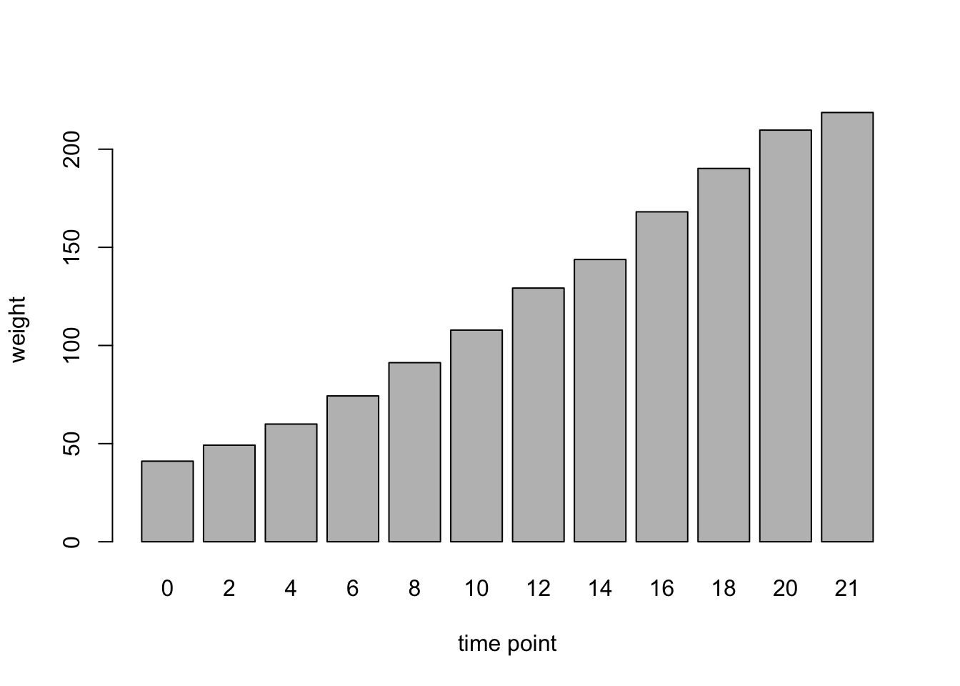
An important difference in the scatter plot and the bar plot is the y-axis default: scatter plot’s axes are scaled to the values, while the bar plot starts at 0 (if there are only positive data).
While sort of informative, base R barplots tend to be rather ugly. Compared to scatterplots, they need a lot of tweaking to look kind of nice. Here are some options:
par(mar=c(3,3,0.5,0.5), #different margins
    tcl=-0.3, #shorter tick marks
    mgp=c(1.9,0.5,0)) #move axis labels
barplot(chickWeightTime$weight,
        names.arg = chickWeightTime$Time,
        xlab = "time point",
        ylab = "weight",
        las = 1, # all letters horizontal
        ylim = c(0,1.1*max(chickWeightTime$weight)), #y-axis that is longer than the longest bar
        yaxs = "r",
        cex.axis = 0.8, #smaller y-axis annotation
        cex.names = 0.8 #smaller x-axis annotation
)
Sometimes, you want the bar plot to look more like all other plots:
par(mar=c(3,3,0.5,0.5), #different margins
    tcl=-0.3, #shorter tick marks
    mgp=c(1.9,0.5,0)) #move axis labels
bars <- barplot(chickWeightTime$weight,
        xlab = "time point",
        ylab = "weight",
        las = 1, # all letters horizontal
        ylim = c(0,1.1*max(chickWeightTime$weight)), #y-axis that is longer than the longest bar
        yaxs = "i", #x-axis to cut y axis at 0
        cex.axis = 0.8, #smaller y-axis annotation
        space = 0.4, #leaner bars
        col =  "grey30", #color of the bars
        border = NA #no borders on the bars
        )
axis(1, #add x-axis
     at = bars[,1], #get mid points from plot function above
     labels = chickWeightTime$Time,
      cex.axis = 0.8) #smaller x-axis annotation
box("plot",bty="l") #add box (x-axis)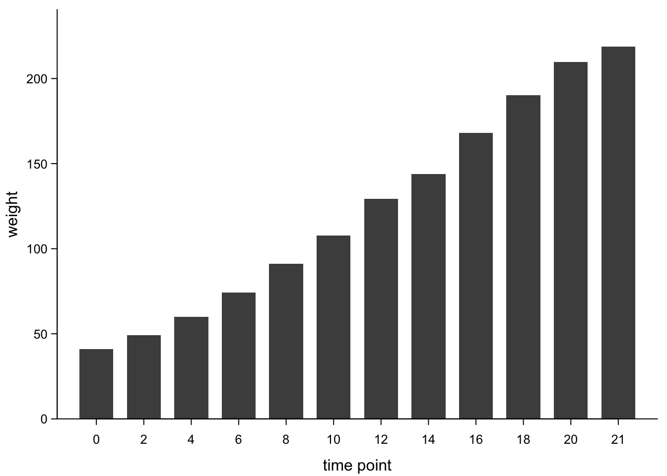
7.3.2 Barplots with error bars
Base R barplots are not designed to have automatic error bars.
barplot2 from the gplots package does the trick, though. First,
let’s calculate the standard deviation (sd) of each mean:
chickWeightTime$sd <- aggregate(ChickWeight$weight,list(ChickWeight$Time),sd)[,2]
# here, we calculate sd and just append it as another column (named sd) to the previous table
# we can do this, because the first two arguments of aggregate and the aggregated data.frame are the same as before, so the output will have the same order
Now, we plot as above, but with the barplot2 function. This takes the
arguments ci.l and ci.u which were originally conceived for
confidence intervals (hence we still need to calculate where we want
them to sit).
par(mar=c(3,3,0.5,0.5), #different margins
    tcl=-0.3, #shorter tick marks
    mgp=c(1.9,0.5,0)) #move axis labels
bars <- barplot2(chickWeightTime$weight,
        xlab = "time point",
        ylab = "weight",
        las = 1, # all letters horizontal
        ylim = c(0,1.1*max(chickWeightTime$weight + chickWeightTime$sd)), #y-axis that is longer than the longest bar, incl error
        yaxs = "i", #x-axis to cut y axis at 0
        cex.axis = 0.8, #smaller y-axis annotation
        space = 0.4, #leaner bars
        col =  "grey30", #color of the bars
        border = NA, #no borders on the bars
        plot.ci = T, #error bars need to be enabled explicitly
        ci.l = chickWeightTime$weight - chickWeightTime$sd, # lower error bar
        ci.u = chickWeightTime$weight + chickWeightTime$sd # upper error bar
        )
axis(1, #add x-axis
     at = bars[,1], #get mid points from plot function above
     labels = chickWeightTime$Time,
      cex.axis = 0.8) #smaller x-axis annotation
box("plot",bty="l") #add box (x-axis)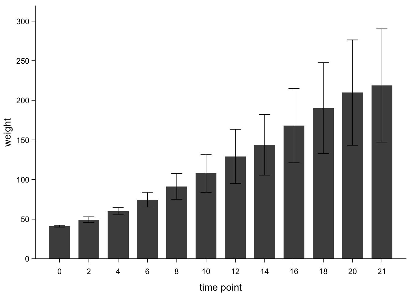
There’s no standard for which value should be reflected by error bars. In many fields, mean ± standard deviation are common, but sometimes you also see mean ± standard error of the mean (sd devided by n). In other fields you’ll more commonly have a mean and a confidence interval, e.g. 95%. Finally, you could plot medians and interquartile ranges. But then, you’ve got a poor man’s boxplot.
7.4 Medians, quartiles, and outliers: Boxplots
7.4.1 Basic boxplots
Boxplots have become the go-to visualization for many questions, because they give more information about data distribution than barplots. R calculates all the necessary summative values from the raw data, meaning we need to supply the whole data to the boxplot function (not the means as we did above). The values that are depicted by default are:
- the median (big bar in the middle = the 50th percentile)
- the 25th and 75 percentiles (ends of the box = quartiles)
- the whiskers extend to the last points within 1.5 * IQR from the quartiles (IQR is the interquartile range, i.e. the range between the box’s ends)
- all points that lie outside are plotted as points (outliers)
Here we go:
boxplot(ChickWeight$weight ~ ChickWeight$Time,
        xlab = "time point",
        ylab = "weight")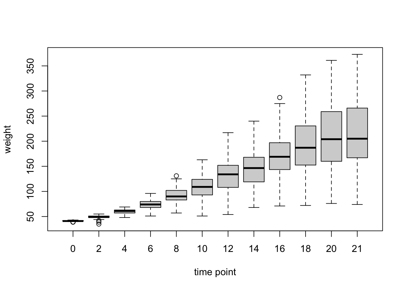
The default is already quite informative. We can make it a bit more pretty, if necessary, e.g.:
par(mar=c(3,3,0.5,0.5), #different margins
    tcl=-0.3, #shorter tick marks
    mgp=c(1.9,0.5,0)) #move axis labels
boxplot(ChickWeight$weight ~ ChickWeight$Time,
        xlab = "time point",
        ylab = "weight",
        cex.axis=0.8, #smaller axis annotation
        pch=16, #filled symbols
        las=1) #all axis marks horizontal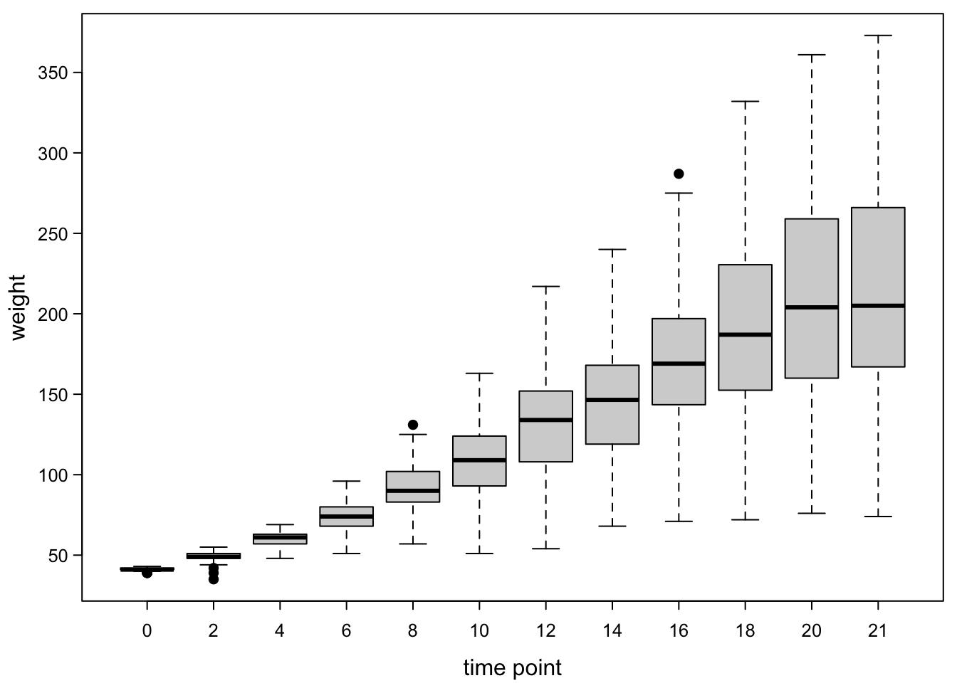
We can add the number of observations per box:
par(mar=c(3,3,1,0.5), #different margins !
    tcl=-0.3, #shorter tick marks
    mgp=c(1.9,0.5,0)) #move axis labels
boxplot(ChickWeight$weight ~ ChickWeight$Time,
        xlab = "time point",
        ylab = "weight",
        cex.axis=0.8, #smaller axis annotation
        pch=16, #filled symbols
        las=1) #all axis marks horizontal
#numbers of observations:
axis(3, #on a top axis
     at=1:length(levels(as.factor(ChickWeight$Time))), #at the coordinates of the boxes
     labels=table(ChickWeight$Time), #numbers of observations per timepoints
     cex.axis=0.8, #smaller letters
     tcl=0, #no ticks
     mgp=c(0,0,0)) #no distance to plot
mtext("N=",#N= as axis label
      3, #on top of the plot
      0, # no distance to plot
      cex = 0.8, #smaller letters
      adj = 0) #at the left end of the axis
7.4.2 Adding points on top
Now, we have a nice summary. However, it’s not visible whether the boxes are good approximations for the distribution of the data points. We can therefore add points to the boxes.
par(mar=c(3,3,0.5,0.5), #different margins
    tcl=-0.3, #shorter tick marks
    mgp=c(1.9,0.5,0)) #move axis labels
boxplot(ChickWeight$weight ~ ChickWeight$Time,
        xlab = "time point",
        ylab = "weight",
        cex.axis=0.8, #smaller axis annotation
        pch=16, #filled symbols
        las=1) #all axis marks horizontal
points(as.numeric(as.factor(ChickWeight$Time)),#this uses the time like the boxplot does !
  ChickWeight$weight, #the y-values
  cex=0.6, #make points a bit smaller
  pch=16) #fill points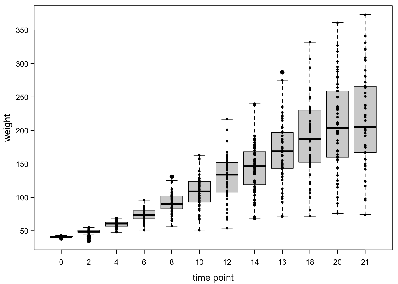
This is better, but the points are still overlapping. A simple way of dealing with that is to add a jitter. This is a random value which moves the points apart. We’re only applying it in x-direction (within a box), so the y-values are precise.
par(mar=c(3,3,0.5,0.5), #different margins
    tcl=-0.3, #shorter tick marks
    mgp=c(1.9,0.5,0)) #move axis labels
boxplot(ChickWeight$weight ~ ChickWeight$Time,
        xlab = "time point",
        ylab = "weight",
        cex.axis=0.8, #smaller axis annotation
        pch=16, #filled symbols
        las=1, #all axis marks horizontal
        outline=F) #don't plot outliers, because they are added later
points(jitter(as.numeric(as.factor(ChickWeight$Time)),amount = 0.25),#jitter added !
  ChickWeight$weight, #the y-values
  cex=0.6, #make points a bit smaller
  pch=16) #fill points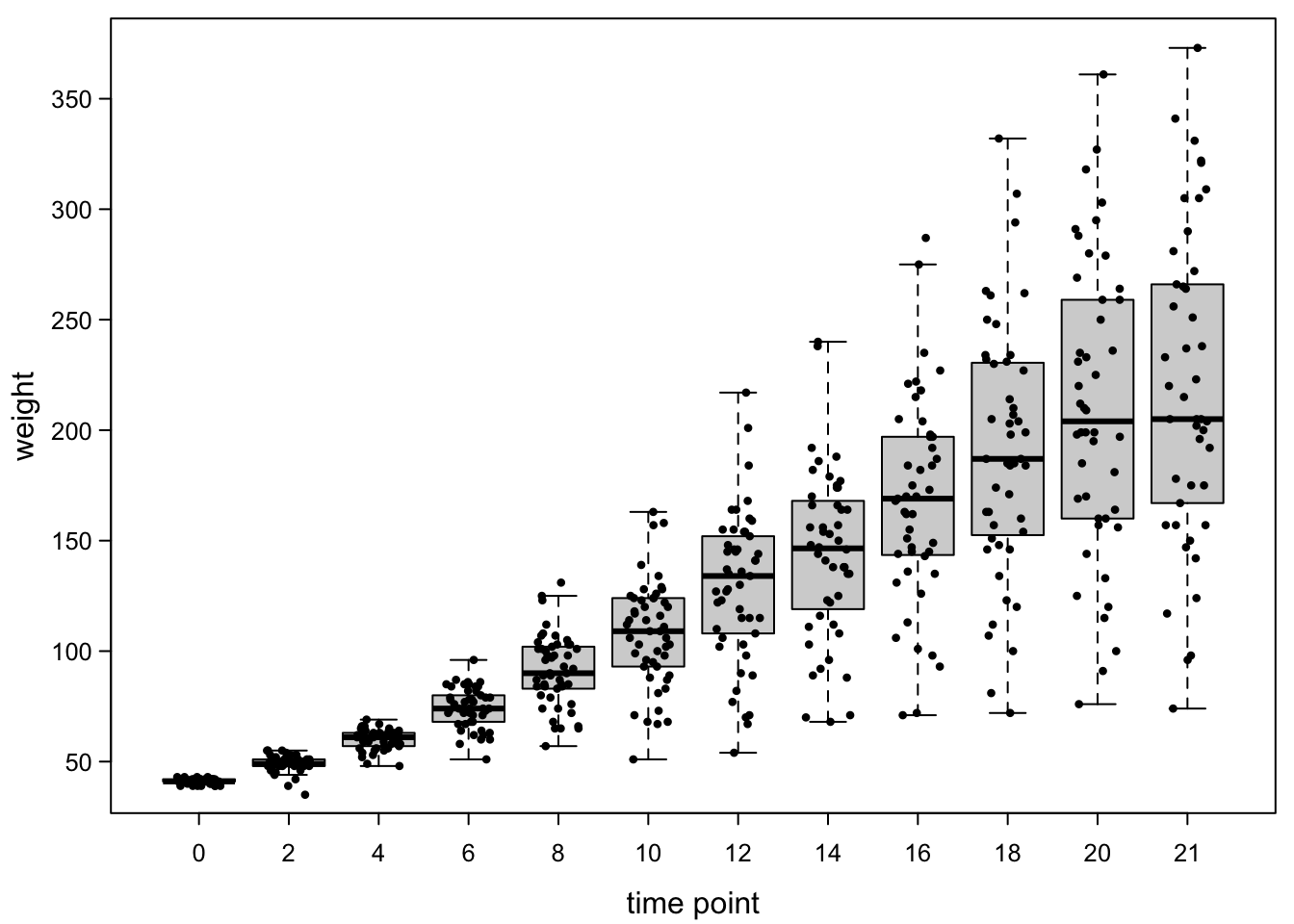
There are still some unfortunate collisions, but it’s much clearer.
We can also sort the points to be more nicely arranged, but this is a
bit more work. In the chunk below, we first define a function
smartJitter which can do this in most situations.
smartJitter <- function(x=NULL,y=NULL,modelFrame=NULL,cex.point=0.2,boxwex=0.8){
  pointheight <- abs(par("usr")[4]-par("usr")[3]) / ( par("pin")[2]*72/(par("ps")*cex.point) )
  pointwidth <- abs(par("usr")[2]-par("usr")[1]) / ( par("pin")[1]*72/(par("ps")*cex.point) )
  boxwidth <- par("pin")[1]*72*boxwex/(par("ps")*cex.point) / par("xaxp")[2]
  if(!is.null(x) & !is.null(y)){
    dat <- data.frame("x"=x,"y"=y,"pos"=1:length(x),stringsAsFactors = F)
  }else{
    if(!is.null(modelFrame)){
      dat <- data.frame("x"=as.numeric(as.factor(modelFrame[,2])),
                        "y"=modelFrame[,1],
                        "pos"=1:nrow(modelFrame),stringsAsFactors = F)
    }
  }
  datls <- aggregate(dat$y,list(dat$x),c,simplify = F)$x
  datps <- aggregate(dat$pos,list(dat$x),c,simplify = F)$x
  datl <- lapply(datls,sort)
  datr <- lapply(datls,function(x) rank(x,ties.method = "last"))
  dato <- lapply(datls,order)
  datops <- lapply(1:length(dato), function(x) datps[[x]][dato[[x]]])

  binl <- lapply(datl,
                 function(x) cut(x,
                                 breaks=max(2,round(abs(max(x)-min(x))/pointheight))))
  xoffl <- lapply(lapply(binl,
                         function(y){
                           table(y)[table(y)>0]
                         }),
                  function(x){
                    unlist(sapply(x,
                                  function(z) {
                                    as.numeric(rbind(seq(0,by=pointwidth,length.out=z/2),
                                                     -seq(pointwidth,by=pointwidth,
                                                          length.out=z/2)))[1:z]
                                  }))})
  xo <- dat$x + unlist(xoffl)[order(unlist(datops))]
  yo <- unlist(datl)[order(unlist(datops))]
  cbind(xo,yo)
}

par(mar=c(3,3,0.5,0.5), #different margins
    tcl=-0.3, #shorter tick marks
    mgp=c(1.9,0.5,0))#move axis labels
boxplot(ChickWeight$weight ~ ChickWeight$Time,
        xlab = "time point",
        ylab = "weight",
        cex.axis=0.8, #smaller axis annotation
        pch=16, #filled symbols
        las=1, #all axis marks horizontal
        outline=F) #don't plot outliers, because they are added later
points(smartJitter(modelFrame=model.frame(ChickWeight$weight ~ ChickWeight$Time)),# swarms added!
  cex=0.45, #make points a bit smaller
  pch=16) #fill points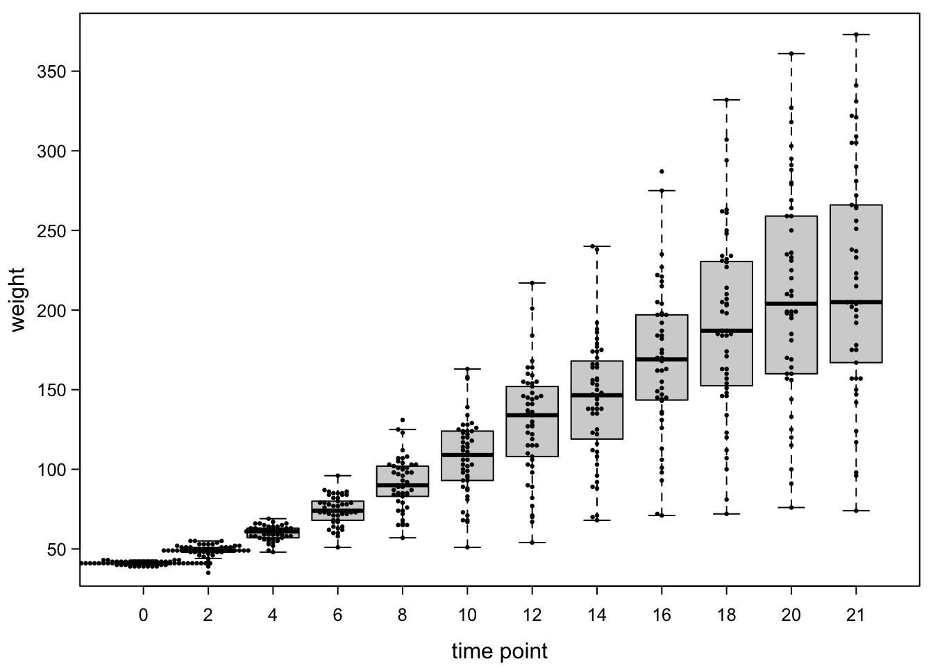
Because the points are very close together at the early time points, they overlap with each other, but overall this is quite clean.
Now, finally, we could add back the colours of the experimental groups.
par(mar=c(3,3,0.5,0.5), #different margins
    tcl=-0.3, #shorter tick marks
    mgp=c(1.9,0.5,0))#move axis labels
boxplot(ChickWeight$weight ~ ChickWeight$Time,
        xlab = "time point",
        ylab = "weight",
        cex.axis=0.8, #smaller axis annotation
        pch=16, #filled symbols
        las=1, #all axis marks horizontal
        outline=F) #don't plot outliers, because they are added later
points(smartJitter(modelFrame=model.frame(ChickWeight$weight ~ ChickWeight$Time)),#jitter added
  cex=0.45, #make points a bit smaller
  pch=16,#fill points
  col=brewer.pal(4,"Dark2")[as.numeric(as.factor(ChickWeight$Diet))]) #color by diet!
legend("topleft", #legend!, position
       legend = levels(as.factor(ChickWeight$Diet)), #names of diet
       pch=16, #filled points like plot
       pt.cex = 0.45,
       col=brewer.pal(4,"Dark2"), #colours like plot
       title = "diet", #legend title
       bty="n") #no box around legend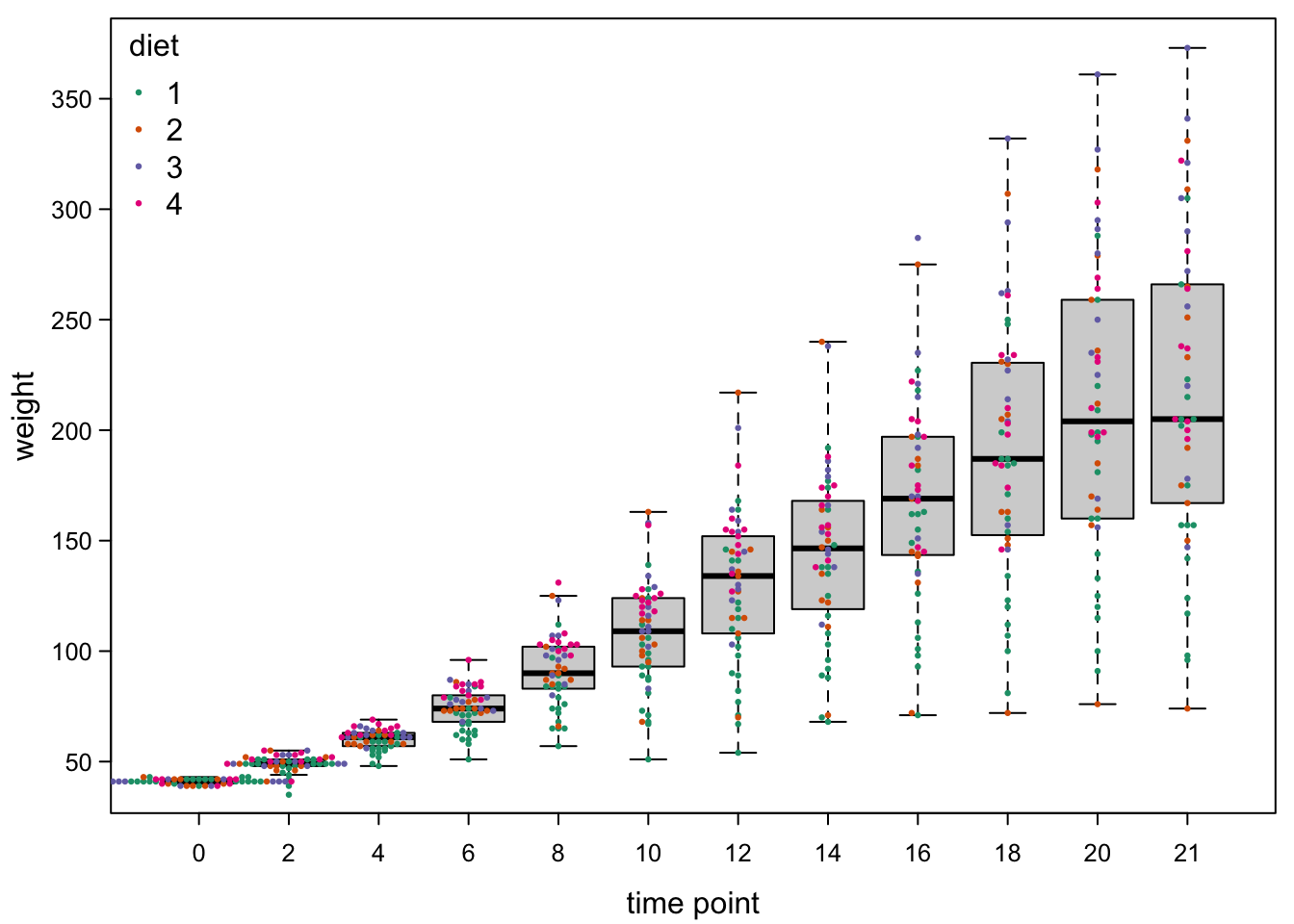
7.4.3 Adding lines between points
The colours above already help with seeing the different trends in the diet treatments. We could also aid our audience with some lines. For this, we need to draw one set of lines per chick through all time points.
par(mar=c(3,3,0.5,0.5), #different margins
    tcl=-0.3, #shorter tick marks
    mgp=c(1.9,0.5,0))#move axis labels
boxplot(ChickWeight$weight ~ ChickWeight$Time,
        xlab = "time point",
        ylab = "weight",
        cex.axis=0.8, #smaller axis annotation
        pch=16, #filled symbols
        las=1, #all axis marks horizontal
        outline=F) #don't plot outliers, because they are added later
#lines:!
quiet <- sapply(unique(ChickWeight$Chick), #the quiet is a dirty trick to suppress console output
       function(chick){ #per chcick, do
         chickdiet <- unique(as.numeric(as.factor(ChickWeight$Diet))[ChickWeight$Chick==chick]) #which diet did our chick have?
         lines(x = as.numeric(as.factor(ChickWeight$Time))[ChickWeight$Chick==chick], #time points for this chick
               y = ChickWeight$weight[ChickWeight$Chick==chick], #weights
               lty=1, lwd=0.3, #thin lines
               col=brewer.pal(4,"Dark2")[chickdiet]) #colour by diet
       })
points(smartJitter(modelFrame=model.frame(ChickWeight$weight ~ ChickWeight$Time)),#jitter added
  cex=0.45, #make points a bit smaller
  pch=16,#fill points
  col=brewer.pal(4,"Dark2")[as.numeric(as.factor(ChickWeight$Diet))]) #color by diet
legend("topleft", #legend, position
       legend = levels(as.factor(ChickWeight$Diet)), #names of diet
       pch=16, #filled points like plot
       pt.cex = 0.45,
       col=brewer.pal(4,"Dark2"), #colours like plot
       title = "diet", #legend title
       bty="n") #no box around legend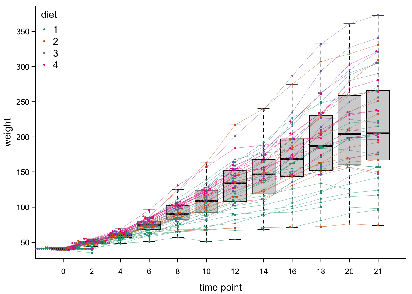
7.4.4 Half-boxes
In the previous examples, we split our data by one factor (time point) to make boxes. Sometimes, there is more than one factor of interest. For example, we could want to make one set of boxes for chicken with control diet (diet 1) and another set for the other diets.
#add a column saying whether we have the control or treatment
ChickWeight$Treat <- ifelse(test = ChickWeight$Diet == 1, #assign a new vector, depending on whether diet is 1
                            yes = "1", #if yes, use 1
                            no = "2-3-4") #else, use 2-3-4
We can then use both the treatment and the time factor for plotting:
par(mar=c(5,3,0.5,0.5), #different margins
    tcl=-0.3, #shorter tick marks
    mgp=c(1.9,0.5,0))#move axis labels
boxplot(ChickWeight$weight ~ ChickWeight$Treat + ChickWeight$Time, #both factors!
        xlab = "", #no x-axis label because the axis marks are too long
        ylab = "weight",
        cex.axis=0.8, #smaller axis annotation
        pch=16, #filled symbols
        las=2) #all axis marks orthogonal to the axis!
mtext("diet . timepoint", #add axis label manually!
      side = 1, #to x-axis
      line = 3.8)  # a bit away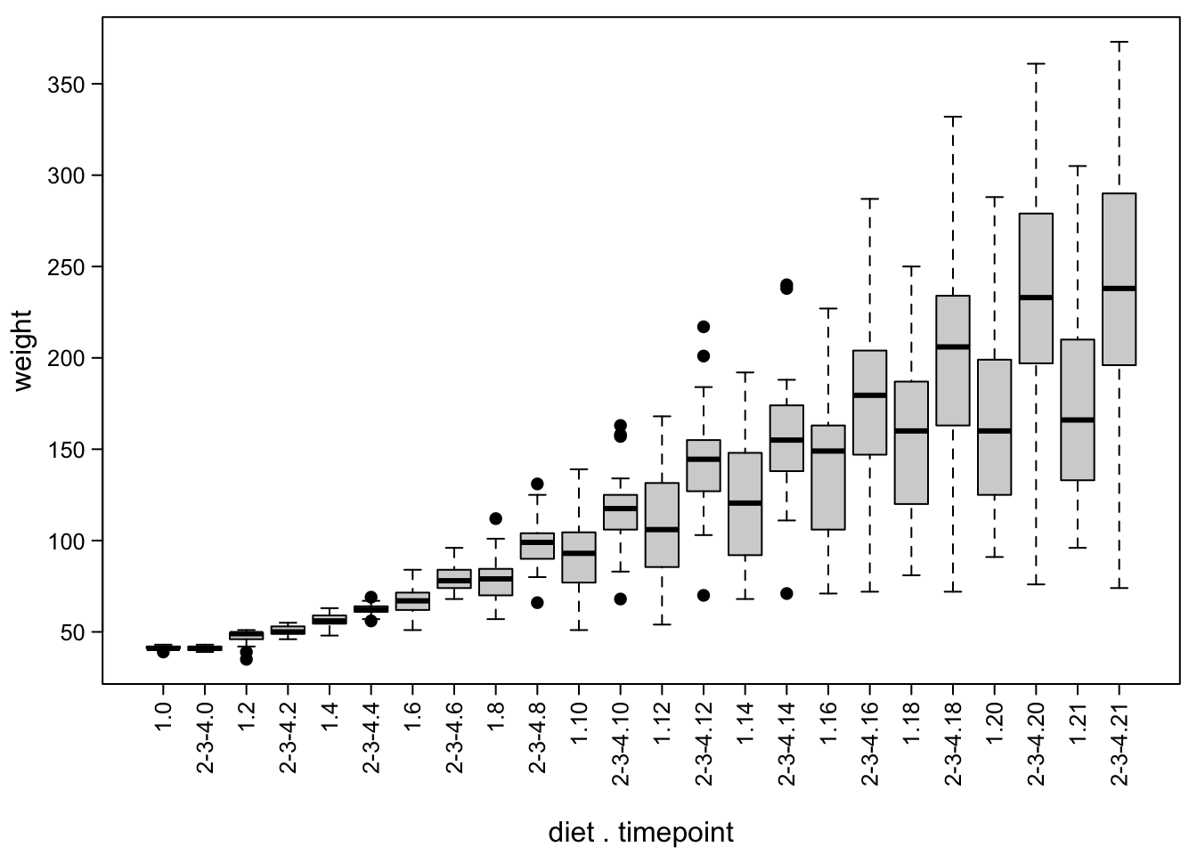
Here is a good moment to mention that you can also manipulate the width of the boxes, e.g. to indicate different group sizes:
par(mar=c(5,3,0.5,0.5), #different margins
    tcl=-0.3, #shorter tick marks
    mgp=c(1.9,0.5,0))#move axis labels
boxplot(ChickWeight$weight ~ ChickWeight$Treat + ChickWeight$Time,
        xlab = "",
        ylab = "weight",
        cex.axis=0.8, #smaller axis annotation
        pch=16, #filled symbols
        las=2,#all axis marks orthogonal to the axis
        varwidth=T) #box widths are proportional to square root of number of data points
mtext("diet . timepoint",side = 1,line = 3.8)
Another option is to split the boxes per time point. This is not a standard R function, but can be done by slightly changing the standard boxplot function. This happens in the next chunk - the code is long, so it will not be reproduced in the knitted document.
We plot both halves using information from the boxplot function:
par(mar=c(3,3,0.5,0.5), #different margins
    tcl=-0.3, #shorter tick marks
    mgp=c(1.9,0.5,0))#move axis labels

#left half of the boxes:
bxpL(boxplot(ChickWeight$weight[ChickWeight$Treat=="1"] ~ ChickWeight$Time[ChickWeight$Treat=="1"],
             plot=F), #plot only diet 1
     ylim=c(min(ChickWeight$weight),max(ChickWeight$weight)), #overall y-axis range
     whisklty="solid", #whiskers
     axes=F, #no axes (we add them later)
     xlab="time point", #x axis label
     ylab="weight",#y axis label
     bgcol="white",#white box
     border=brewer.pal(4,"Dark2")[1], #green box
     pch=16, #filled outliers
     cex=0.7)  #slightly smaller points

#right half of the boxes:
par(new=T) #to prevent starting a new plot
bxpR(boxplot(ChickWeight$weight[ChickWeight$Treat!="1"] ~ ChickWeight$Time[ChickWeight$Treat!="1"],
             plot=F), #plot the non-control diets
     ylim=c(min(ChickWeight$weight),max(ChickWeight$weight)),#overall y-axis range same as above
     whisklty="solid",#whiskers
     axes=F, #no axes
     bgcol="grey80", #grey box
     pch=16, #filled outliers
     cex=0.7)  #slightly smaller points

#everything around:
axis(1, #x-axis
     at=c(1:length(levels(as.factor(ChickWeight$Time)))), #in the middle of the boxes
     lab=levels(as.factor(ChickWeight$Time)), #with labels from timepoints
     las=1, #horizontal letters
     lwd=0, #no ticks
     cex.axis=0.8) #slightly smaller letters
axis(2, #y-axis
     las=1, #horizontal letters
     cex.axis=0.8) #slightly smaller letters
box(lwd=1) #frame around the plot
legend("topleft", #legend
       legend=c("1","2,3,4"), #words
       title = "diet", #title
       fill=c("white","grey80"),#colours from boxes
       border = c(brewer.pal(4,"Dark2")[1],"black"), #box colours
       bty="n")  #no box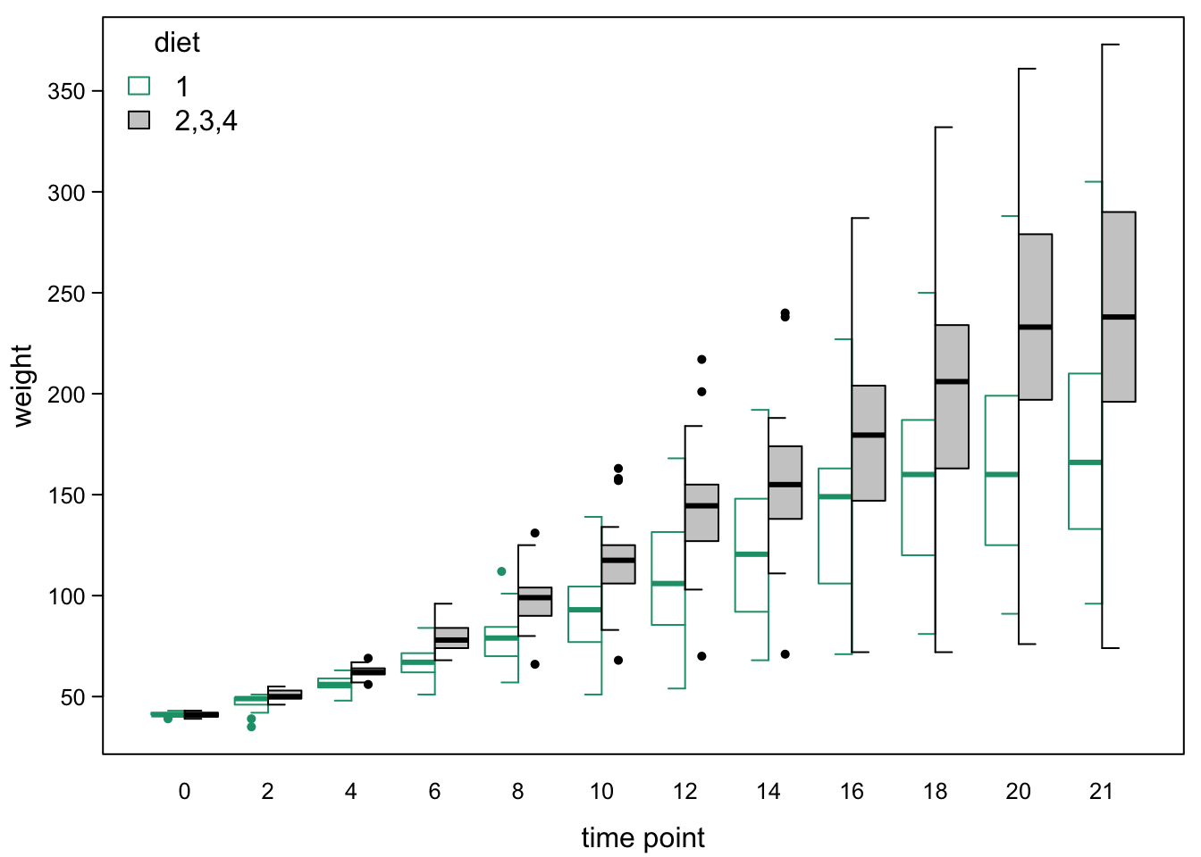
We can also add the points and lines as before:
par(mar=c(3,3,0.5,0.5), #different margins
    tcl=-0.3, #shorter tick marks
    mgp=c(1.9,0.5,0))#move axis labels

#left half of the boxes:
bxpL(boxplot(ChickWeight$weight[ChickWeight$Treat=="1"] ~ ChickWeight$Time[ChickWeight$Treat=="1"],
             plot=F), #plot only diet 1
     outline=F, #no outliers (we add them later)
     ylim=c(min(ChickWeight$weight),max(ChickWeight$weight)), #overall y-axis range
     whisklty="solid", #whiskers
     axes=F, #no axes (we add them later)
     xlab="time point", #x axis label
     ylab="weight",#y axis label
     bgcol="white") #white box

#right half of the boxes:
par(new=T) #to prevent starting a new plot
bxpR(boxplot(ChickWeight$weight[ChickWeight$Treat!="1"] ~ ChickWeight$Time[ChickWeight$Treat!="1"],
             plot=F), #plot the non-control diets
     outline=F, #no outliers (we add them later)
     ylim=c(min(ChickWeight$weight),max(ChickWeight$weight)),#overall y-axis range same as above
     whisklty="solid",#whiskers
     axes=F, #no axes
     bgcol="grey80") #grey box

#everything around:
axis(1, #x-axis
     at=c(1:length(levels(as.factor(ChickWeight$Time)))), #in the middle of the boxes
     lab=levels(as.factor(ChickWeight$Time)), #with labels from timepoints
     las=1, #horizontal letters
     lwd=0, #no ticks
     cex.axis=0.8) #slightly smaller letters
axis(2,
     las=1, #horizontal letters
     cex.axis=0.8) #slightly smaller letters
box(lwd=1) #frame around the plot
legend("topleft", #legend
       legend=c("1","2,3,4"), #words
       title = "diet", #title
       fill=c("white","grey80"),#colours from boxes
       bty="n")  #no box

#lines (as before):
quiet <- sapply(unique(ChickWeight$Chick), #the quiet is a dirty trick to suppress console output
       function(chick){ #per chcick, do
         chickdiet <- unique(as.numeric(as.factor(ChickWeight$Diet))[ChickWeight$Chick==chick]) #which diet did our chick have?
         lines(x = as.numeric(as.factor(ChickWeight$Time))[ChickWeight$Chick==chick]+ c(-0.25,0.25)[1+as.numeric(ChickWeight$Ctrl)[ChickWeight$Chick==chick]], #time points for this chick
               y = ChickWeight$weight[ChickWeight$Chick==chick], #weights
               lty=1, lwd=0.3, #thin lines
               col=brewer.pal(4,"Dark2")[chickdiet]) #colour by diet
       })
#points: - this time we give the coordinates to a variable first
jitteredPoints <- smartJitter(modelFrame=model.frame(ChickWeight$weight ~ ChickWeight$Time)) # jittered coordinates
points(jitteredPoints[,1] + c(0.25,-0.25)[1+as.numeric(ChickWeight$Treat==1)], #move left or right, depending on treatment
       jitteredPoints[,2], #keep y-position
  cex=0.45, #make points a bit smaller
  pch=16,#fill points
  col=brewer.pal(4,"Dark2")[as.numeric(as.factor(ChickWeight$Diet))]) #color by diet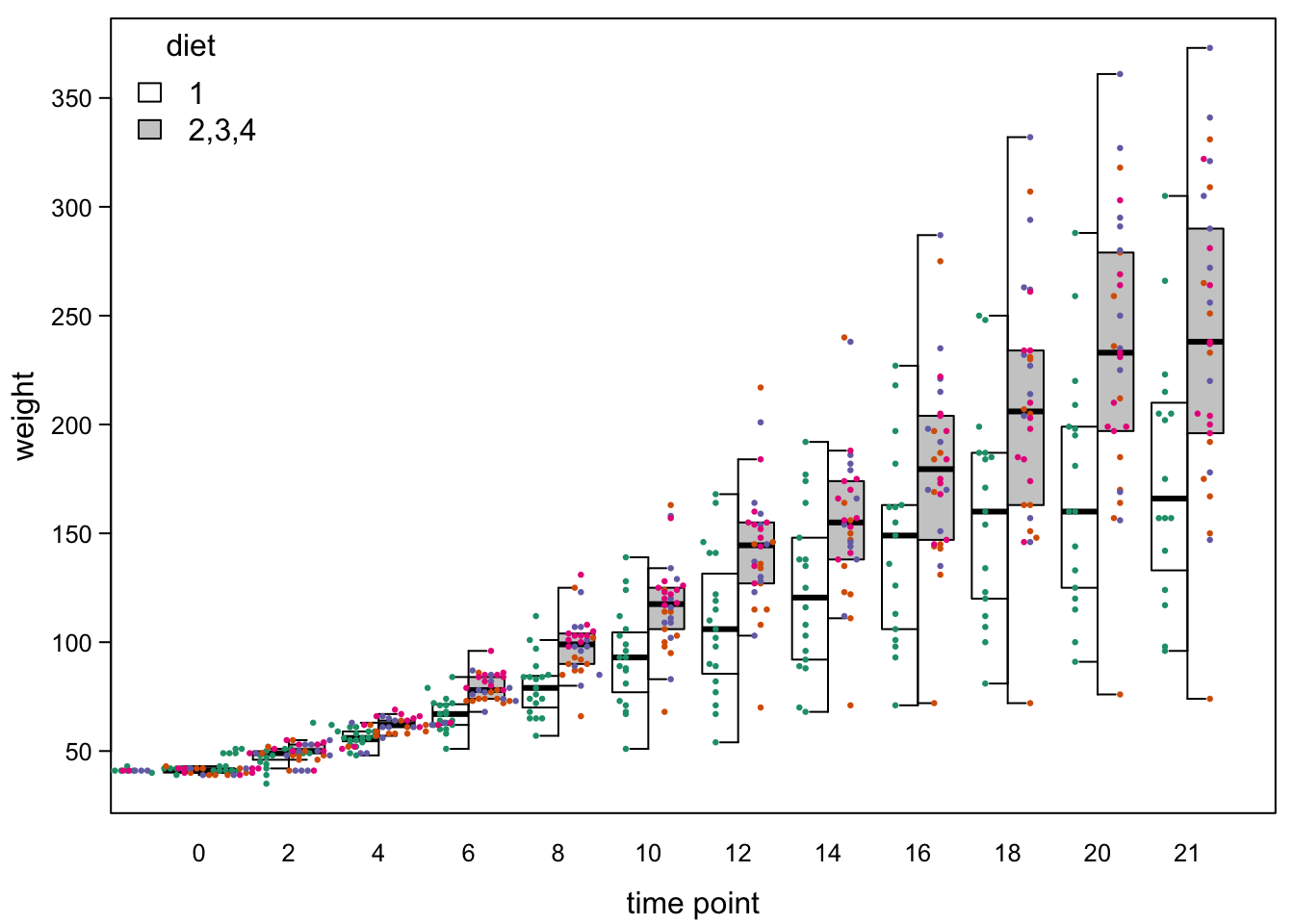
7.5 Histograms
From what you’ve read above about the values that the boxplot represents, you can already tell that it is more appropriate for unimodal distributions - that is, distributions that have most values in the middle. To see this, let’s focus on the chicken data from the first and third week and look at diet 3 only.
ChickWeight_3 <- ChickWeight[ ChickWeight$Time %in% c(0,2,4,6,16,18,20,21) &#subset of days
                                    ChickWeight$Diet==3 ,] #and diet 3
An easy way to visualize distributions as histograms:
hist(ChickWeight_3$weight)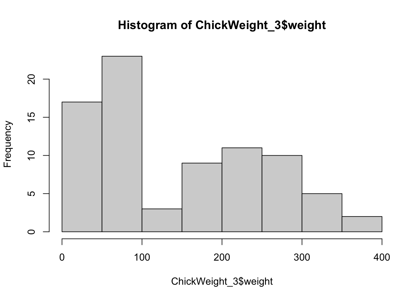
As usual, the default is ugly, but with a few additional arguments, this becomes a useful view:
par(mar=c(3,3,0.5,0.5), #different margins
    tcl=-0.3, #shorter tick marks
    mgp=c(1.9,0.5,0)) #move axis labels
hist(ChickWeight_3$weight,
     xlab = "weight",
        ylab = "counts",
     main="", #no title, this is in the axis labels
        cex.axis=0.8, #smaller axis annotation
        las=1, #all axis marks horizontal
        yaxs = "i", #x-axis to cut y axis at 0
)
box("plot",bty="l")
Okay, so what you see are two humps of values. This because one hump contains the values from the first week and the other contains the values of the second week. In real life, you’d not want to throw these two sets of values into the same plot, because you know they don’t belong together. But bear with us for a moment.
If you plot these values as a single boxplot box, this is what it looks like:
par(mar=c(3,3,0.5,0.5), #different margins
    tcl=-0.3, #shorter tick marks
    mgp=c(1.9,0.5,0)) #move axis labels
boxplot(ChickWeight_3$weight,
        xlab = "demo subset",
        ylab = "weight",
        cex.axis=0.8, #smaller axis annotation
        pch=16, #filled symbols
        las=1) #all axis marks horizontal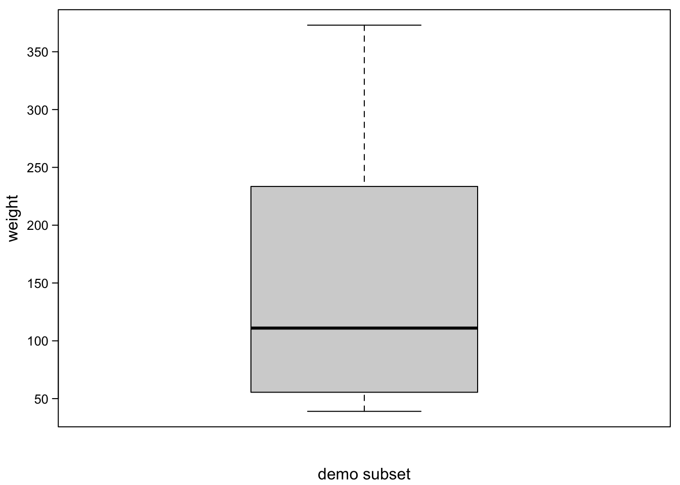
Without points plotted, you’d never guess what the distribution was.
To clarify this, in the following plot, we add the quartiles and where whiskers would lie in the histogram:
par(mar=c(3,3,0.5,0.5), #different margins
    tcl=-0.3, #shorter tick marks
    mgp=c(1.9,0.5,0)) #move axis labels
hist(ChickWeight_3$weight,
     xlab = "weight",
        ylab = "counts",
     main="", #no title, this is in the axis labels
        cex.axis=0.8, #smaller axis annotation
        las=1, #all axis marks horizontal
        yaxs = "i", #x-axis to cut y axis at 0
)
box("plot",bty="l")
abline(v=median(ChickWeight_3$weight),lwd=3) #median
abline(v=quantile(ChickWeight_3$weight,c(0.25,0.75)),lwd=1) #quartiles
abline(v=boxplot(ChickWeight_3$weight,plot = F)$stats[c(1,5),],lwd=1,lty=2) # whiskers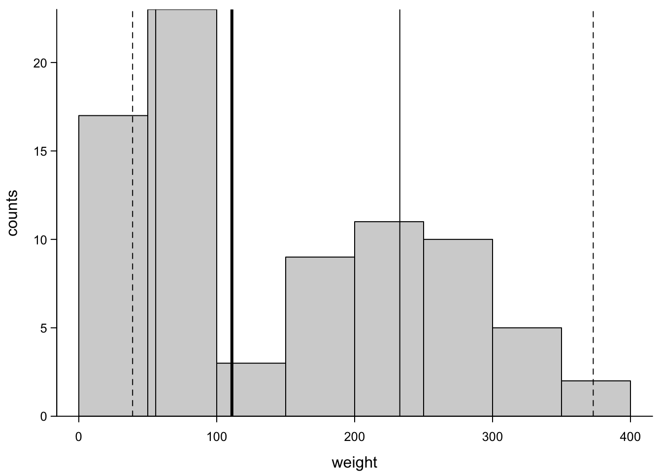
So, you see, the median lies at a place where there are no values at all. The histogram therefore gives a better visualization of this distribution. But it represents just one sample and overlaying several barplots or histograms would look clunky.
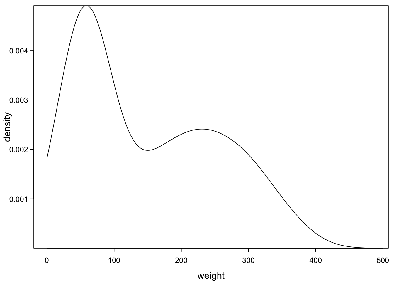
7.6 Density plots
One way of dealing with this is described in the next sections. R can smooth histograms and plot the smoothed line as density plot:
par(mar=c(3,3,0.5,0.5), #different margins
    tcl=-0.3, #shorter tick marks
    mgp=c(1.9,0.5,0)) #move axis labels
plot(density(ChickWeight_3$weight,from=0),
     xlab = "weight",
        ylab = "density",
     main="", #no title, this is in the axis labels
        cex.axis=0.8, #smaller axis annotation
        las=1, #all axis marks horizontal
        yaxs = "i" #x-axis to cut y axis at 0
)
One thing to keep in mind is the number of observations you need. To estimate such a smooth line, you want many points (a few hundred are better than 10). But R will do its best and plot a (maybe deceiving) line down to 2 points. You cant try this out below, by replacing the 80 (all available points) with smaller numbers (less points):
par(mar=c(3,3,0.5,0.5), #different margins
    tcl=-0.3, #shorter tick marks
    mgp=c(1.9,0.5,0)) #move axis labels
plot(density( #the density function
  ChickWeight_3$weight[sample(1:length(ChickWeight_3$weight), #we take a random sample of the weights
                                         80)], # sample size -> change this value
             from=0),
     xlab = "weight",
        ylab = "density",
     main="", #no title, this is in the axis labels
        cex.axis=0.8, #smaller axis annotation
        las=1, #all axis marks horizontal
        yaxs = "i" #x-axis to cut y axis at 0
)
7.7 Violinplots
Violinplots use a similar smoothing as the density plot above. But then, they flip the graph by 90 degrees and mirror it. This gives a violin shape for distributions that are bimodal as the one above.
par(mar=c(3,3,0.5,0.5), #different margins
    tcl=-0.3, #shorter tick marks
    mgp=c(1.9,0.5,0)) #move axis labels
vioplot(ChickWeight_3$weight,
        names = "demo subset",
        drawRect = F,
        col="white",
        xlab = "",
        ylab = "weight",
        cex.axis=0.8, #smaller axis annotation
        pch=16, #filled symbols
        las=1) #all axis marks horizontal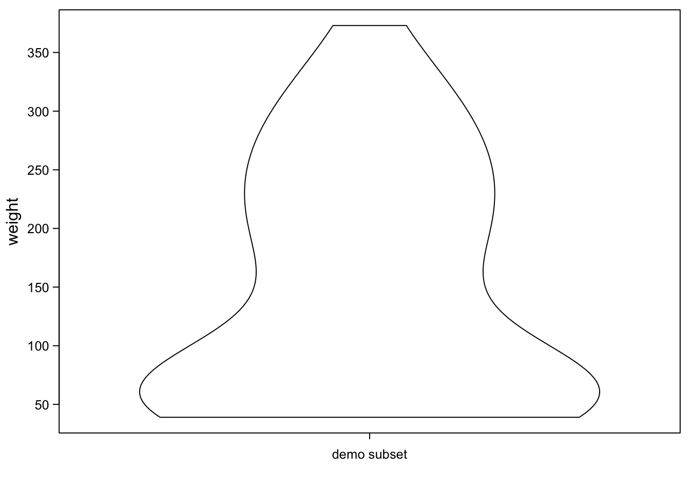
By default, violinplots are actually endowed with a tiny boxplot in the middle:
par(mar=c(3,3,0.5,0.5), #different margins
    tcl=-0.3, #shorter tick marks
    mgp=c(1.9,0.5,0)) #move axis labels
vioplot(ChickWeight_3$weight,
        names = "demo subset",
        xlab = "",
        ylab = "weight",
        cex.axis=0.8, #smaller axis annotation
        pch=16, #filled symbols
        las=1) #all axis marks horizontal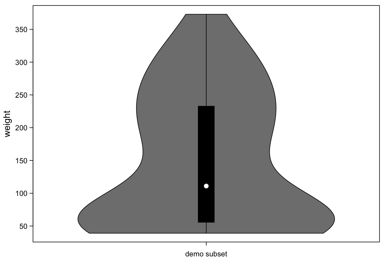
If you put several of these next to each other, you have a plot like a boxplot, but instead of only boxes you have violins, which are better at showing distributions:
ChickWeight_2 <- ChickWeight[ ChickWeight$Time %in% c(0,2,4,6,16,18,20,21) &#subset of days
                                    ChickWeight$Diet==2 ,] #and diet 2

par(mar=c(3,3,0.5,0.5), #different margins
    tcl=-0.3, #shorter tick marks
    mgp=c(1.9,0.5,0)) #move axis labels
vioplot(cbind(ChickWeight_2$weight,ChickWeight_3$weight),
        names = c("2","3"),
        xlab = "diet",
        ylab = "weight",
        cex.axis=0.8, #smaller axis annotation
        pch=16, #filled symbols
        las=1) #all axis marks horizontal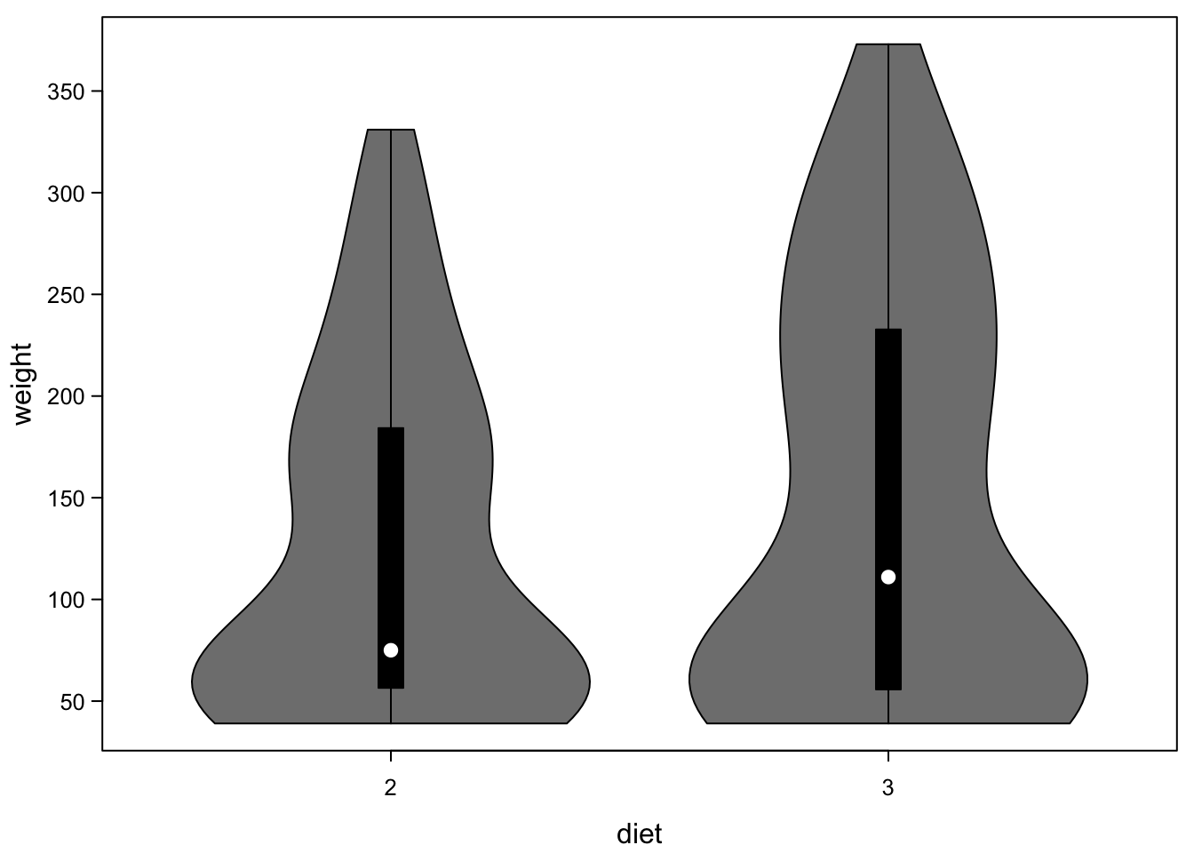
You can use violinplots pretty much like boxplots, when it comes to
coding. Here, you see our example from the boxplot section, as
violinplots. Only the function name boxplot needed to be changed to
vioplot.
par(mar=c(3,3,0.5,0.5), #different margins
    tcl=-0.3, #shorter tick marks
    mgp=c(1.9,0.5,0)) #move axis labels
vioplot(ChickWeight$weight ~ ChickWeight$Time, #only the function changed here!
        xlab = "time point",
        ylab = "weight",
        cex.axis=0.8, #smaller axis annotation
        pch=16, #filled symbols
        las=1) #all axis marks horizontal
quiet <- sapply(unique(ChickWeight$Chick), #the quiet is a dirty trick to suppress console output
       function(chick){ #per chick, do
         chickdiet <- unique(as.numeric(as.factor(ChickWeight$Diet))[ChickWeight$Chick==chick]) #which diet did our chick have?
         lines(x = as.numeric(as.factor(ChickWeight$Time))[ChickWeight$Chick==chick], #time points for this chick
               y = ChickWeight$weight[ChickWeight$Chick==chick], #weights
               lty=1, lwd=0.3, #thin lines
               col=brewer.pal(4,"Dark2")[chickdiet]) #colour by diet
       })
points(smartJitter(modelFrame=model.frame(ChickWeight$weight ~ ChickWeight$Time)),#jitter added
  cex=0.45, #make points a bit smaller
  pch=16,#fill points
  col=brewer.pal(4,"Dark2")[as.numeric(as.factor(ChickWeight$Diet))]) #color by diet
legend("topleft", #legend, position
       legend = levels(as.factor(ChickWeight$Diet)), #names of diet
       pch=16, #filled points like plot
       pt.cex = 0.45,
       col=brewer.pal(4,"Dark2"), #colours like plot
       title = "diet", #legend title
       bty="n") #no box around legend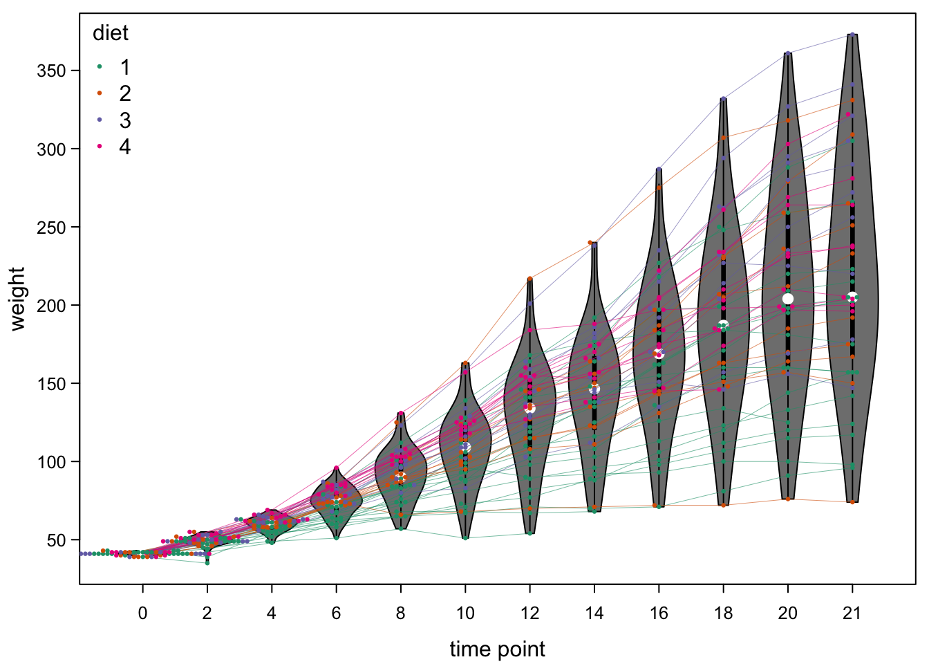
7.8 Beanplots
An alternative to violinplots are beanplots. These are kind of useful, if we have two groups of samples whose distribution should be compared over different levels. Here is an example, comparing diet 1 (the control diet) to the other diets:
par(mar=c(3,3,0.5,0.5), #different margins
    tcl=-0.3, #shorter tick marks
    mgp=c(1.9,0.5,0)) #move axis labels
beanplot(lapply(split(ChickWeight, ~ Treat + Time),function(x) x$weight), # !different format
         what=c(F,T,T,F), #undocumente option
         side = "both", #two sides
         col = list(brewer.pal(4,"Dark2")[1],"grey"),
        xlab = "time point",
        ylab = "weight",
        cex.axis=0.8, #smaller axis annotation
        pch=16, #filled symbols
        las=1) #all axis marks horizontal
legend("topleft", #legend, position
       legend = c("control","2,3,4"), #names of diet
       fill=c(brewer.pal(4,"Dark2")[1],"grey"), #colours like plot
       title = "diet", #legend title
       bty="n") #no box around legend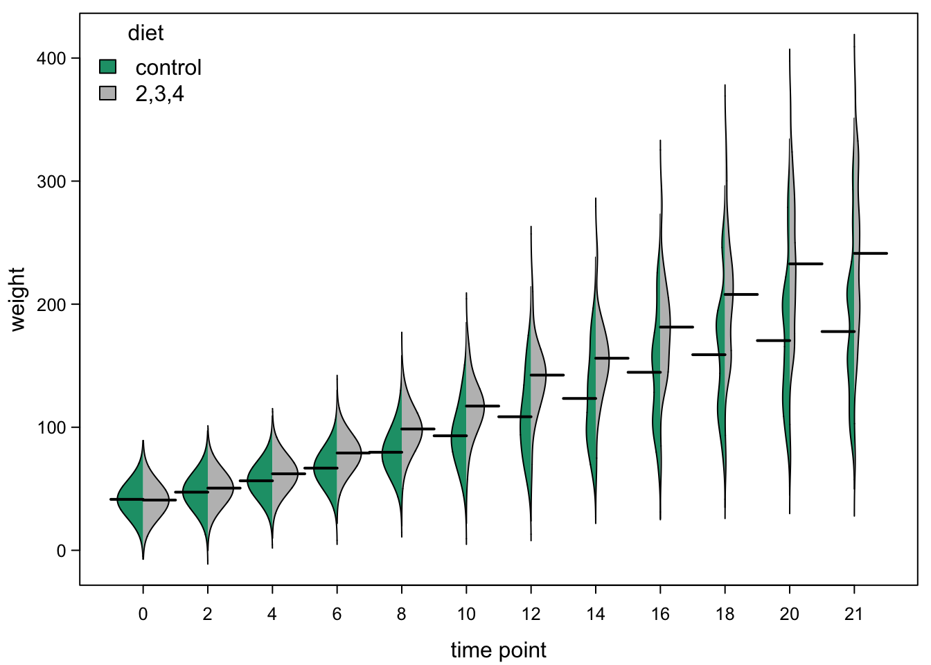
While this is an interesting idea, there are a few problems with this implementation:
- the density lines are not calculated in the most appropriate way (you can see the distributions reaching below 0, which can’t be true)
- the way the groups are defined is inflexible
- the function is brutally badly documented (you need to read the code to find the arguments and you get error messages if you try to open the help)