Chapter 5 Introduction to scatter plots in base R
5.1 Set up
In this chapter, we take a look at the plotting parameters in base R plotting. We’ll just grab some colours from a different package.
if(!require(RColorBrewer)){
  install.packages("RColorBrewer",repos = "http://cran.us.r-project.org")
  library(RColorBrewer)
}
We’ll use the iris data set that comes with R.
data("iris") #import like this is possible for R's inbuilt datasets
head(iris)
## Sepal.Length Sepal.Width Petal.Length Petal.Width Species
## 1 5.1 3.5 1.4 0.2 setosa
## 2 4.9 3.0 1.4 0.2 setosa
## 3 4.7 3.2 1.3 0.2 setosa
## 4 4.6 3.1 1.5 0.2 setosa
## 5 5.0 3.6 1.4 0.2 setosa
## 6 5.4 3.9 1.7 0.4 setosasummary(iris) #dataset is present in the workspace with the dataset name## Sepal.Length Sepal.Width Petal.Length Petal.Width
## Min. :4.300 Min. :2.000 Min. :1.000 Min. :0.100
## 1st Qu.:5.100 1st Qu.:2.800 1st Qu.:1.600 1st Qu.:0.300
## Median :5.800 Median :3.000 Median :4.350 Median :1.300
## Mean :5.843 Mean :3.057 Mean :3.758 Mean :1.199
## 3rd Qu.:6.400 3rd Qu.:3.300 3rd Qu.:5.100 3rd Qu.:1.800
## Max. :7.900 Max. :4.400 Max. :6.900 Max. :2.500
## Species
## setosa :50
## versicolor:50
## virginica :50
##
##
## You see that you have 5 columns, with measurements of iris flowers in three species.
5.2 Formatting plots
5.2.1 Defaults
We’ll use the length and widths of the petals. Let’s plot them:
plot(iris$Petal.Length, #x coordinates
     iris$Petal.Width, #y coordinates
        xlab = "petal length",
        ylab = "petal width")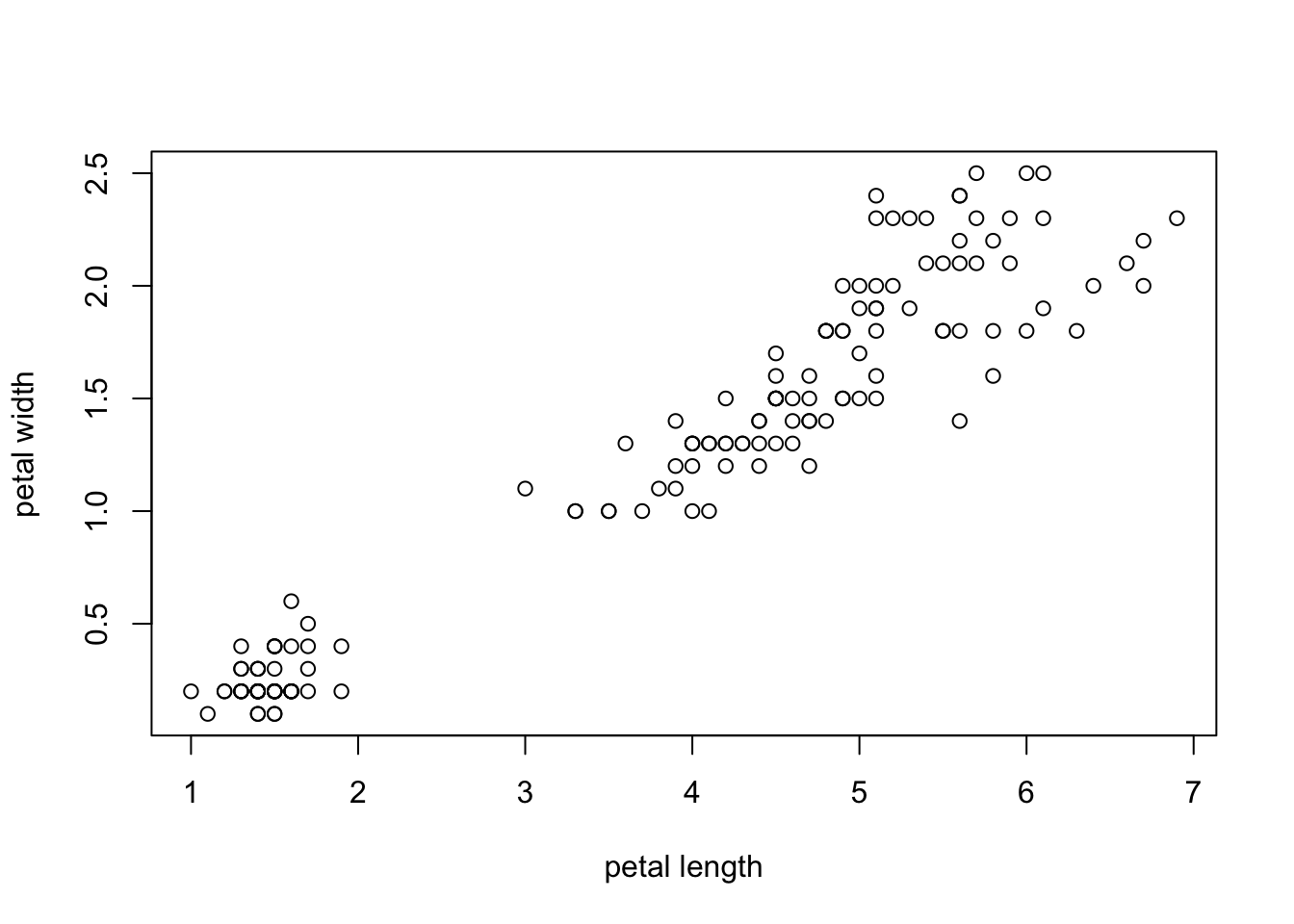
This is not very pretty, but it was super easy. Let’s look at R’s options to improve the optics:
5.2.2 Margins
Margins are defined for a whole plot using par (parameters). The
default often leaves a lot of white space, so you may want to decrease
it. Remember, you can change the code in the chunk below to try
different options, e.g. for the mar argument.
par(mar=c(4,4,0.5,0.5)) #mar for margin, 1 is bottom, 2 is left, 3 is top, 4 is right
plot(iris$Petal.Length,
     iris$Petal.Width,
        xlab = "petal length",
        ylab = "petal width")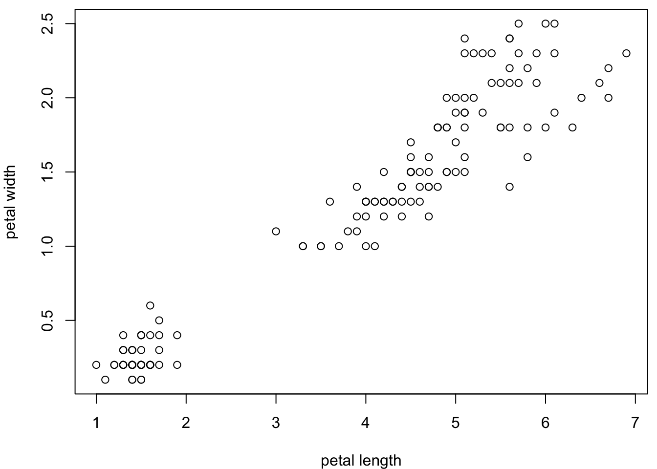
5.2.3 Plot borders
You can remove the borders around your plot.
par(mar=c(4,4,0.5,0.5))
plot(iris$Petal.Length,
     iris$Petal.Width,
        xlab = "petal length",
        ylab = "petal width",
     bty = "n") #no box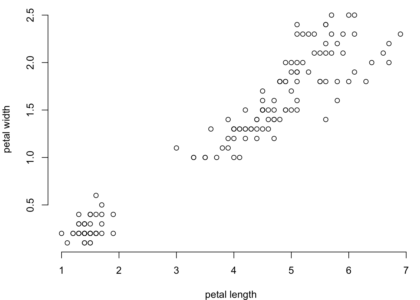
You can have a part of the box:
par(mar=c(4,4,0.5,0.5))
plot(iris$Petal.Length,
     iris$Petal.Width,
        xlab = "petal length",
        ylab = "petal width",
bty = "l") # L-shaped box (bottom and left) 
l is for bottom and left, o is for everywhere, c is for all sides
except the right… guess who u would be.
You can also add the box after the plot:
par(mar=c(4,4,0.5,0.5))
plot(iris$Petal.Length,
     iris$Petal.Width,
        xlab = "petal length",
        ylab = "petal width",
     bty = "n") # no box here
box("plot",bty="l") #box is plotted here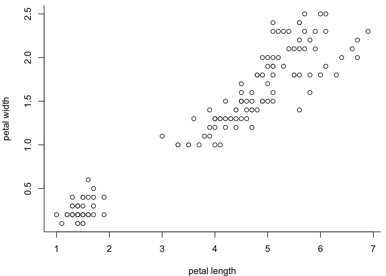
This way, you’re a bit more flexible with the look:
par(mar=c(4,4,0.5,0.5))
plot(iris$Petal.Length,
     iris$Petal.Width,
        xlab = "petal length",
        ylab = "petal width",
     bty = "n")
box("plot",bty="l",
    col="red", #red line
    lwd=3) #thick line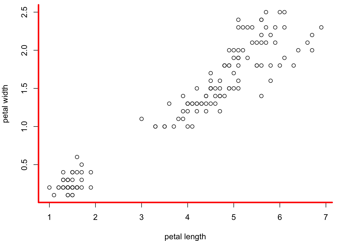
You can also add a box around the image:
par(mar=c(4,4,0.5,0.5))
plot(iris$Petal.Length,
     iris$Petal.Width,
        xlab = "petal length",
        ylab = "petal width",
     bty = "n")
box("plot",bty="l",
    col="red",
    lwd=3)
box("figure",bty="o", #box around the figure
    col="blue",
    lwd=5) #extra fat so we can see it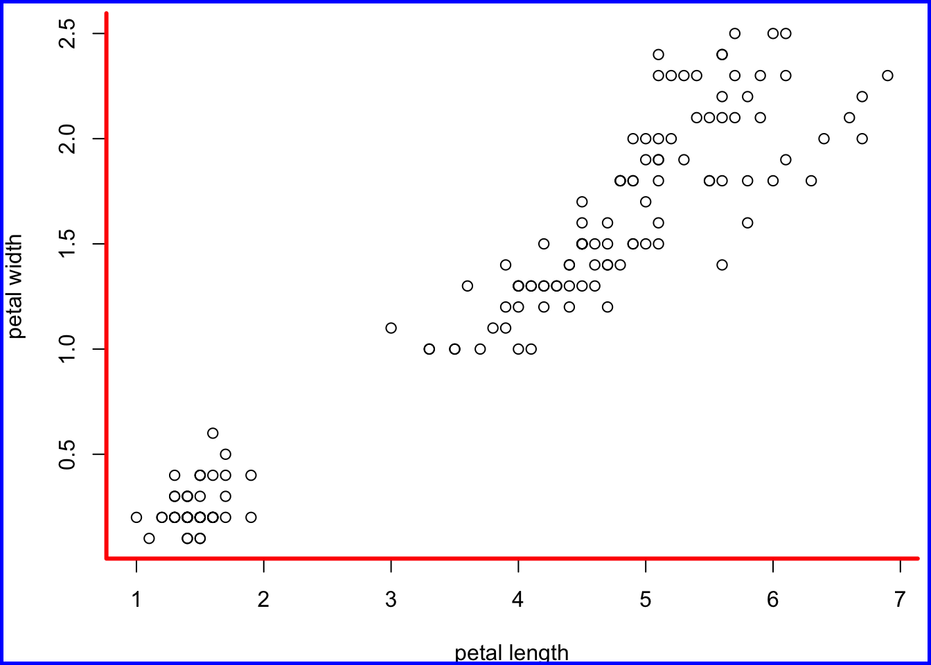
5.3 Axes
Axes are super important. R gives you all the control over them. For instance, you can plot them or not:
par(mar=c(4,4,0.5,0.5))
plot(iris$Petal.Length,
     iris$Petal.Width,
     xlab = "petal length",
     ylab = "petal width",
     bty = "n", # no box, so we see the axes
     axes=F) #no axes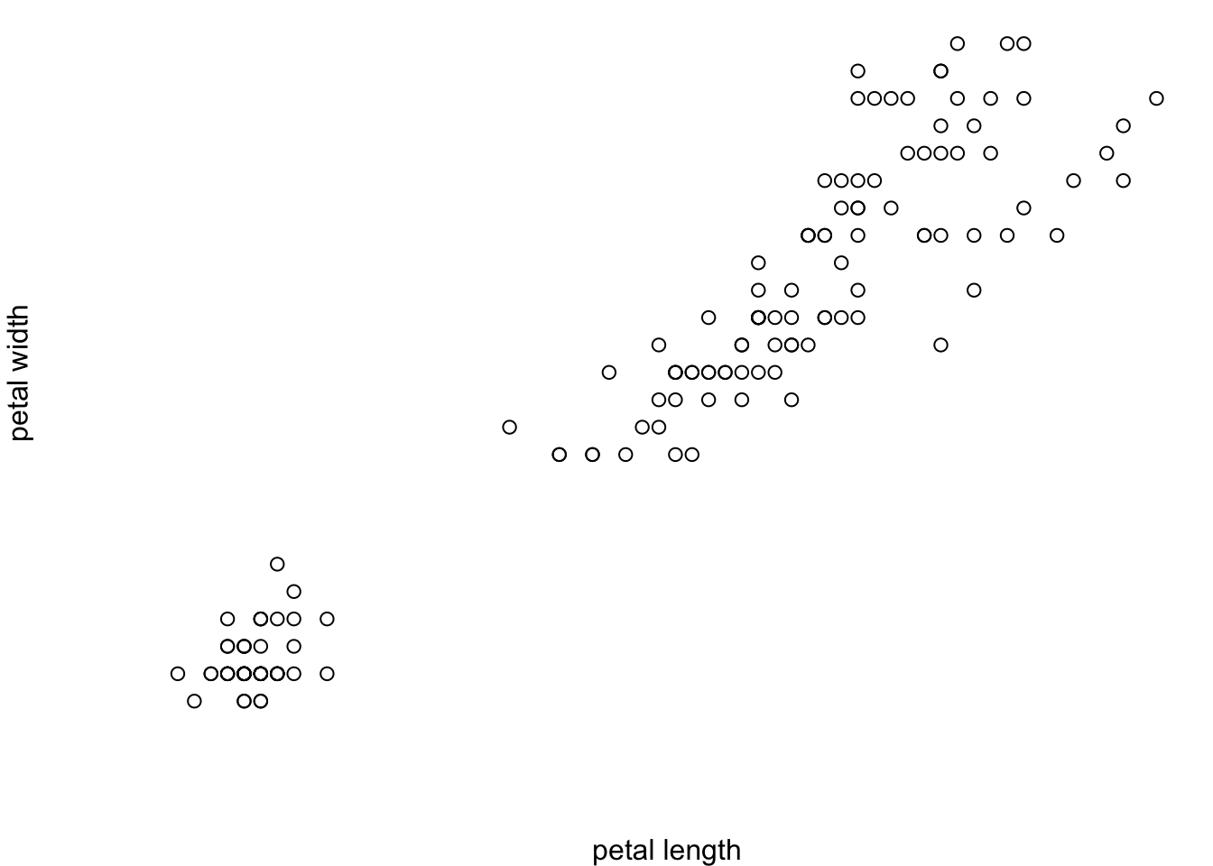
This is useful for plots where the axes are uninformative (e.g. NMDS, t-SNE, uMap plots). You can also plot just one axis:
par(mar=c(4,4,0.5,0.5))
plot(iris$Petal.Length,
     iris$Petal.Width,
     xlab = "petal length",
     ylab = "petal width",
     bty = "n", # no box, so we see the axes
     xaxt="n") #no x-axis (yaxt = "n" would suppress the y axis)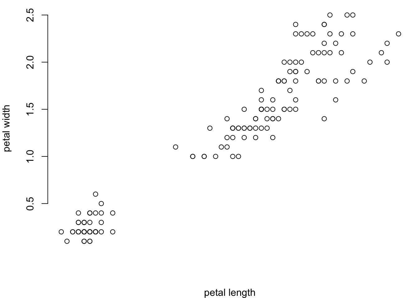
5.3.1 Axis marks
What is marked on an axis and how it is displayed is also in your hands. You can adjust the overall look:
par(mar=c(3.2,3.2,0.5,0.5),
    mgp=c(2,0.5,0), #distance of axis label, axis values, and axis position to plot
    tcl=-0.3) #tick length (- indicates that it goes into the margin)
plot(iris$Petal.Length,
     iris$Petal.Width,
     xlab = "petal length",
     ylab = "petal width",
bty = "l") 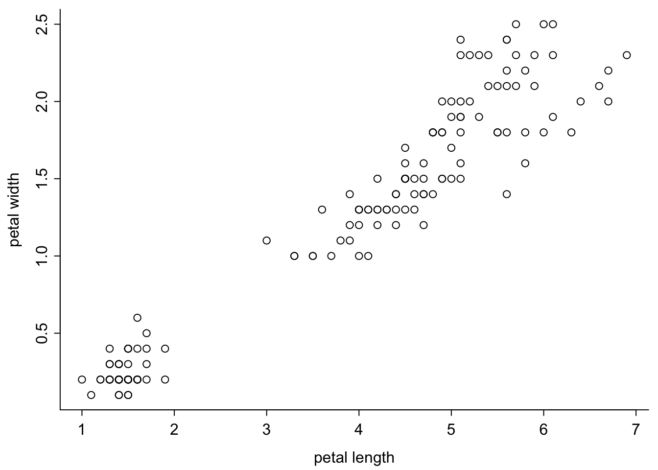
Play around with these parameters.
par(mar=c(2,2,0.5,0.5),
    mgp=c(1,0,0), #distance of axis label, axis values, and axis position to plot
    tcl=0.4) #tick length goes into the plot
plot(iris$Petal.Length,
     iris$Petal.Width,
     xlab = "petal length",
     ylab = "petal width",
bty = "o") 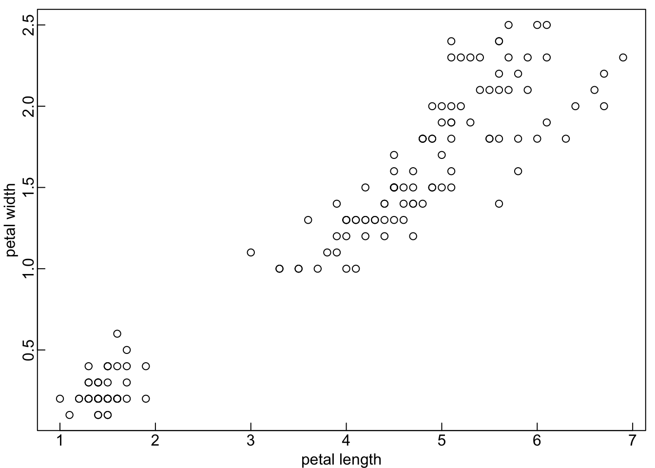
You can change the orientation of the markings:
par(mar=c(3.2,3.2,0.5,0.5),
    mgp=c(2,0.5,0),
    tcl=-0.3)
plot(iris$Petal.Length,
     iris$Petal.Width,
     xlab = "petal length",
     ylab = "petal width",
     bty = "l",
     las = 1) # all letters horizontal (2 would be orthogonal to the axes)
And their size:
par(mar=c(3,3,0.5,0.5),
    mgp=c(1.7,0.5,0),
    tcl=-0.3)
plot(iris$Petal.Length,
     iris$Petal.Width,
     xlab = "petal length",
     ylab = "petal width",
     bty = "l",
     las = 1,
     cex.axis = 0.8) #size (1 is normal)
And their font:
par(mar=c(3,3,0.5,0.5),
    mgp=c(1.7,0.5,0),
    tcl=-0.3)
plot(iris$Petal.Length,
     iris$Petal.Width,
     xlab = "petal length",
     ylab = "petal width",
     bty = "l",
     las = 1,
     cex.axis = 0.8,
     font = 3)  # 1 is normal, 2 is fat
If you want to have more control, create the axes after the plot.
par(mar=c(3,3,0.5,0.5),
    mgp=c(1.7,0.2,0),
    tcl=-0.3)
plot(iris$Petal.Length,
     iris$Petal.Width,
     xlab = "petal length",
     ylab = "petal width",
     axes = F) #no axis
axis(1, #x axis
     cex.axis = 0.8,
     font = 3,
     col.ticks ="blue",
     col.axis = "blue")
axis(2, #y axis
     cex.axis = 0.8,
     las = 1,
     font = 2,
     col.ticks ="red",
     col.axis = "red",
     mgp = c(1.7,0.5,0))
box("plot",bty="l")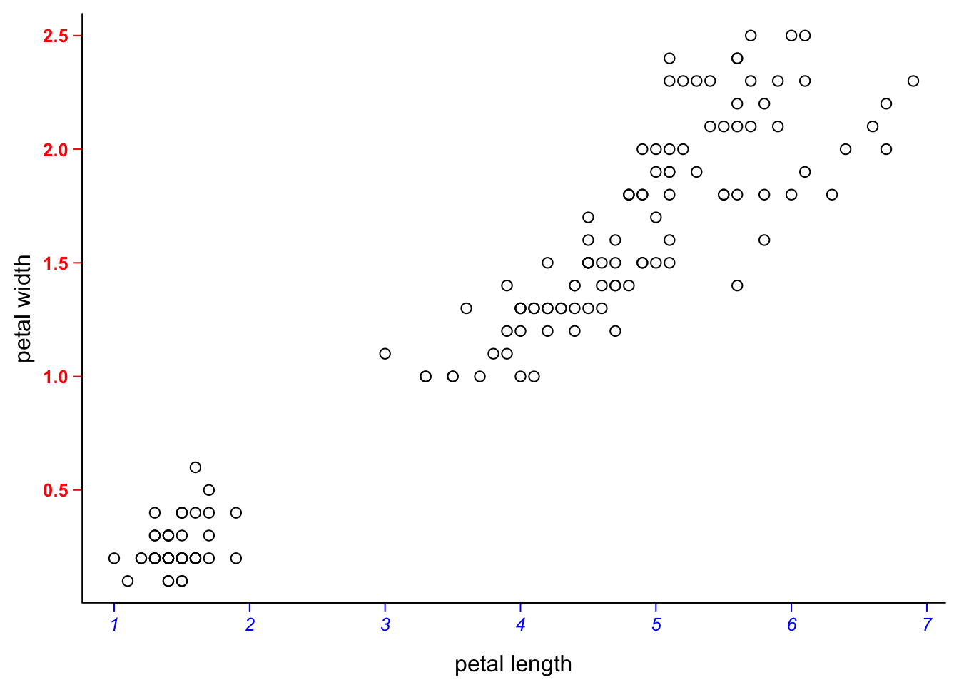
Creating the axes after the plot allows allows you to change what is displayed. Let’s say we measured the petals in cm but now we want to display their length in mm. You can do that while plotting, as shown here:
par(mar=c(3,3,0.5,0.5),
    mgp=c(1.7,0.4,0),
    tcl=-0.3,
    cex.axis = 0.8)
plot(iris$Petal.Length,
     iris$Petal.Width,
     xlab = "petal length [mm]",
     ylab = "petal width [cm]",
     xaxt = "n", #no x-axis
     bty="l",
     las=1)
axis(1, #x axis
     at = 1:7, #same values as before
     labels = 1:7 * 10) # values times 10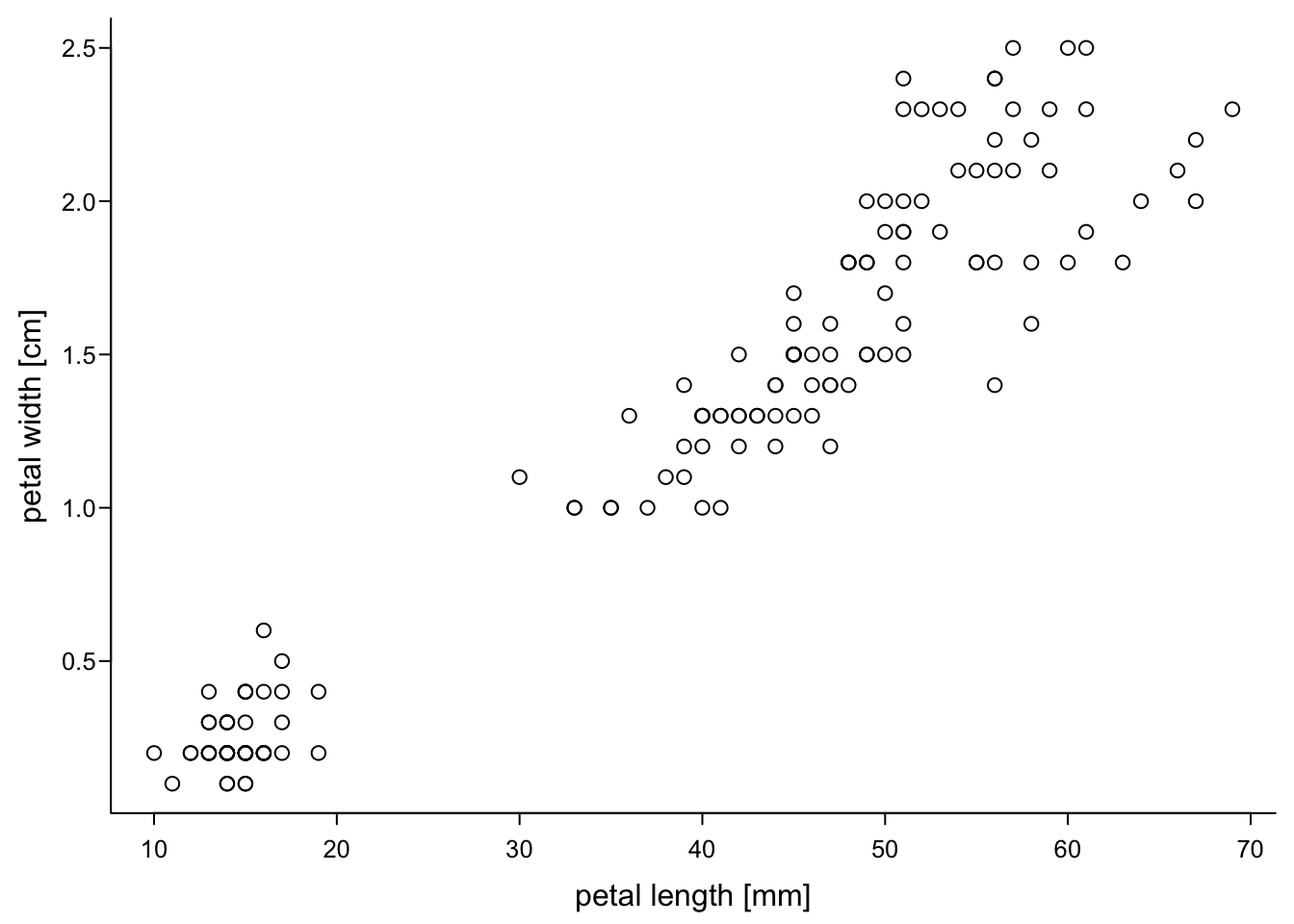
However, this is slightly dangerous, because you need to manually make sure that the values that are shown really belong to the axis. For example, this could happen:
par(mar=c(3,3,0.5,0.5),
    mgp=c(1.7,0.4,0),
    tcl=-0.3,
    cex.axis = 0.8)
plot(iris$Petal.Length,
     iris$Petal.Width,
     xlab = "petal length",
     ylab = "petal width",
     xaxt = "n", #no x-axis
     las=1,
     bty="l")
axis(1, #x axis
     at = 1:7, #same values as before
     labels = -7:-1) # bullshit values
We therefore recommend that you do any transformations on you data before you start plotting.
5.3.2 Axis labels
The axis names are controllable, too:
par(mar=c(3,3,0.5,0.5),
    mgp=c(1.7,0.4,0),
    tcl=-0.3,
    cex.axis = 0.8)
plot(iris$Petal.Length,
     iris$Petal.Width,
     xlab = "petal length",
     ylab = "petal width",
     las=1,
     font.lab = 2,
     bty="l")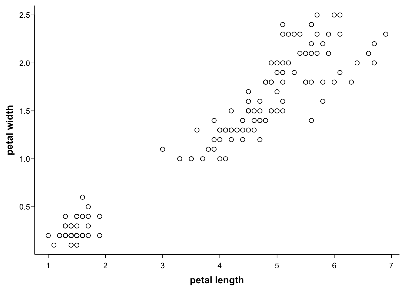
If you want to control them separately, use mtext:
par(mar=c(2.4,3,0.5,0.5),
    mgp=c(1.7,0.4,0),
    tcl=-0.3,
    cex.axis = 0.8)
plot(iris$Petal.Length,
     iris$Petal.Width,
     ann = F, #no axis labels/annotions
     las=1,
     bty="l")
mtext("petal length", #text
      1, #side (bottom)
      1.2, #distance from plot
      font = 2, #font
      col = "darkgreen", #colour
      adj = 1) #position along the axis (0-1)
mtext("petal width", #text
      2, #side (left)
      1.9, #distance from plot
      font = 1, #font
      col = "blue", #colour
      adj = 0.8) #position along the axis (0-1)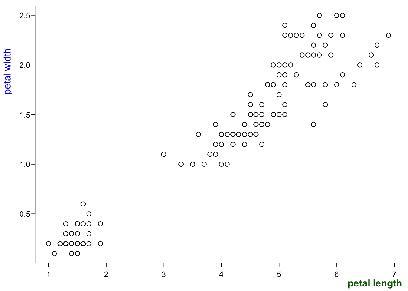
With mtext you can also add multiple axis labels:
par(mar=c(3.4,3.4,0.5,0.5),
    mgp=c(1.7,0.4,0),
    tcl=-0.3,
    cex.axis = 0.8)
plot(iris$Petal.Length,
     iris$Petal.Width,
     ann = F, #no axis labels/annotions
     las=1,
     bty="l")
mtext("petal length", #text
      1, #side (bottom)
      2.2, #distance from plot
      font = 2) #font
mtext("short", #text
      1, #side (bottom)
      1.2, #distance from plot
      adj = 0.1) #position
mtext("long", #text
      1, #side (bottom)
      1.2, #distance from plot
      adj = 0.9) #position
mtext("petal width", #text
      2, #side (left)
      2, #distance from plot
      font = 2) #font
You can have weird symbols in your axis labels:
par(mar=c(3,3,0.5,0.5),
    mgp=c(1.7,0.4,0),
    tcl=-0.3,
    cex.axis = 0.8)
plot(iris$Petal.Length,
     iris$Petal.Width,
     xlab = expression(paste("petal length [", 10^4, " ", mu ,"m]")),
     ylab = expression(paste("petal width [", 10^4, " ", mu ,"m]")),
     las=1,
     bty="l")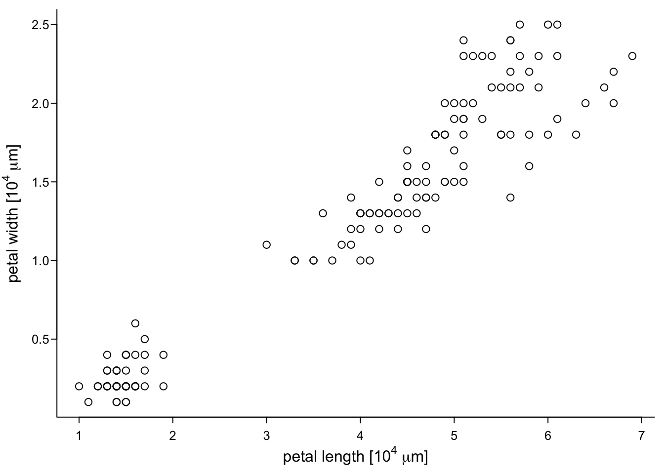
5.3.3 Scales and ranges
You can choose scales and ranges. E.g. logarithmic scales:
par(mar=c(3,3,0.5,0.5),
    mgp=c(1.7,0.4,0),
    tcl=-0.3,
    cex.axis = 0.8)
plot(iris$Petal.Length,
     iris$Petal.Width,
     xlab = "petal length",
     ylab = "petal width",
     log = "xy", #both axes logarithmic, you can chose x or y to have only one transformed
     las=1,
     bty="l")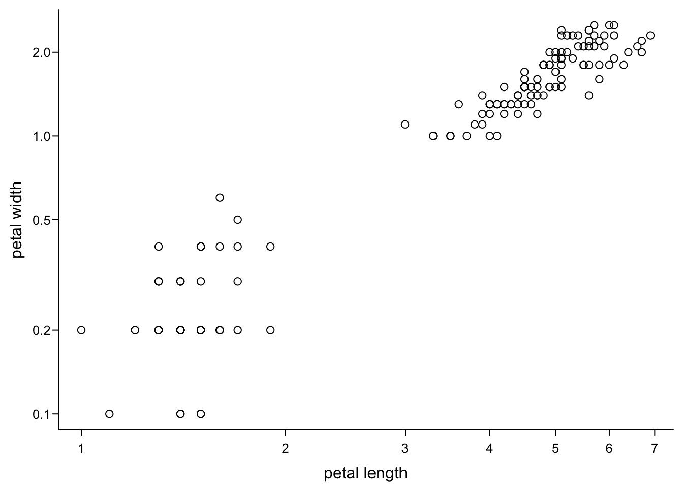
You can also change where the x and y-axis start and stop.
par(mar=c(3,3,0.5,0.5),
    mgp=c(1.7,0.4,0),
    tcl=-0.3,
    cex.axis = 0.8)
plot(iris$Petal.Length,
     iris$Petal.Width,
     xlab = "petal length",
     ylab = "petal width",
     log = "xy",
     xlim = c(0.1,10), #lower and upper end for x axis
     ylim = c(0.1,10), #lower and upper end for y axis
     las=1,
     bty="l")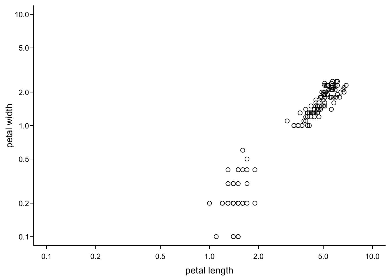
But you need to take care yourself that everything you wanted to plot is visible, because R does not complain:
par(mar=c(3,3,0.5,0.5),
    mgp=c(1.7,0.4,0),
    tcl=-0.3,
    cex.axis = 0.8)
plot(iris$Petal.Length,
     iris$Petal.Width,
     xlab = "petal length",
     ylab = "petal width",
     xlim = c(0.1,2), #lower and upper end for x axis, cutting off points
     ylim = c(0.1,2), #lower and upper end for y axis
     las=1,
     bty="l")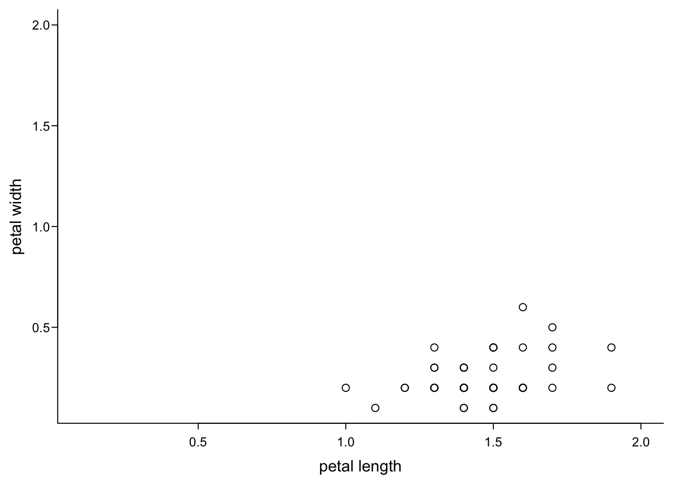
5.4 Points
How to display your data? The simplest option in a scatterplot is using points. You can manipulate them, too.
5.4.1 Shapes
Default points in base R are open circles. You can change this overall:
par(mar=c(3,3,0.5,0.5),
    mgp=c(1.7,0.5,0),
    tcl=-0.3)
plot(iris$Petal.Length,
     iris$Petal.Width,
     xlab = "petal length",
     ylab = "petal width",
     pch = 16, #see ?points for all shapes, e.g. 0 is an open square, 2,6,17 are triangles, 3,4 are crosses, 8 is a star
     bty = "l",
     las = 1,
cex.axis = 0.8) 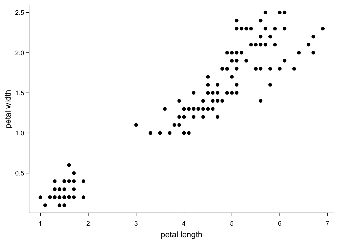
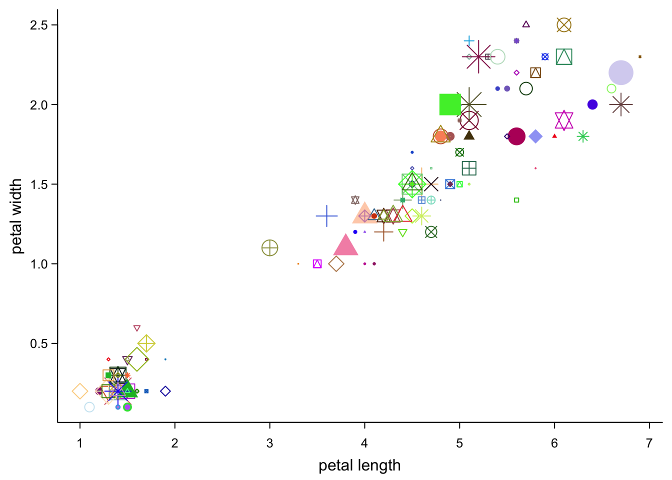
You can also control shapes point-by-point by giving a vector. Here, we just give all 25 possible shapes (they are recycled over all points):
par(mar=c(3,3,0.5,0.5),
    mgp=c(1.7,0.5,0),
    tcl=-0.3)
plot(iris$Petal.Length,
     iris$Petal.Width,
     xlab = "petal length",
     ylab = "petal width",
     pch = 1:25, #all shapes
     bty = "l",
     las = 1,
cex.axis = 0.8) 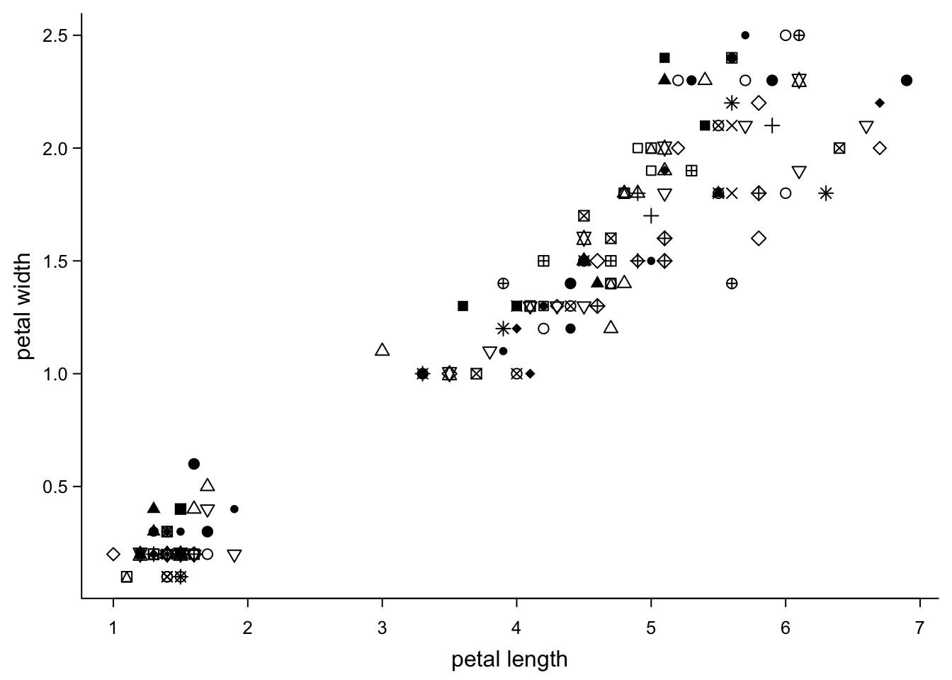
That’s not very informative. But you can use the information you have to choose shapes. E.g. we can use the species information to set the shape:
par(mar=c(3,3,0.5,0.5),
    mgp=c(1.7,0.5,0),
    tcl=-0.3)
plot(iris$Petal.Length,
     iris$Petal.Width,
     xlab = "petal length",
     ylab = "petal width",
     pch = c(15:17)[as.numeric(as.factor(iris$Species))], #three shapes, subsetted by species
     bty = "l",
     las = 1,
cex.axis = 0.8) 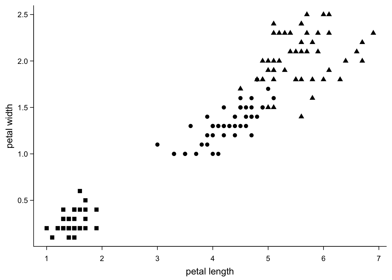
How does this work? The as.numeric(as.factor(iris$Species)) command
first changes the column with the species names into a factor:
setosa, setosa, setosa, setosa, setosa, setosa, setosa, setosa, setosa, setosa, setosa, setosa, setosa, setosa, setosa, setosa, setosa, setosa, setosa, setosa, setosa, setosa, setosa, setosa, setosa, setosa, setosa, setosa, setosa, setosa, setosa, setosa, setosa, setosa, setosa, setosa, setosa, setosa, setosa, setosa, setosa, setosa, setosa, setosa, setosa, setosa, setosa, setosa, setosa, setosa, versicolor, versicolor, versicolor, versicolor, versicolor, versicolor, versicolor, versicolor, versicolor, versicolor, versicolor, versicolor, versicolor, versicolor, versicolor, versicolor, versicolor, versicolor, versicolor, versicolor, versicolor, versicolor, versicolor, versicolor, versicolor, versicolor, versicolor, versicolor, versicolor, versicolor, versicolor, versicolor, versicolor, versicolor, versicolor, versicolor, versicolor, versicolor, versicolor, versicolor, versicolor, versicolor, versicolor, versicolor, versicolor, versicolor, versicolor, versicolor, versicolor, versicolor, virginica, virginica, virginica, virginica, virginica, virginica, virginica, virginica, virginica, virginica, virginica, virginica, virginica, virginica, virginica, virginica, virginica, virginica, virginica, virginica, virginica, virginica, virginica, virginica, virginica, virginica, virginica, virginica, virginica, virginica, virginica, virginica, virginica, virginica, virginica, virginica, virginica, virginica, virginica, virginica, virginica, virginica, virginica, virginica, virginica, virginica, virginica, virginica, virginica, virginica
with the levels setosa, versicolor, virginica
The as.numeric part of this command then replaces every level with its
number: 1, 1, 1, 1, 1, 1, 1, 1, 1, 1, 1, 1, 1, 1, 1, 1, 1, 1, 1, 1, 1, 1, 1, 1, 1, 1, 1, 1, 1, 1, 1, 1, 1, 1, 1, 1, 1, 1, 1, 1, 1, 1, 1, 1, 1, 1, 1, 1, 1, 1, 2, 2, 2, 2, 2, 2, 2, 2, 2, 2, 2, 2, 2, 2, 2, 2, 2, 2, 2, 2, 2, 2, 2, 2, 2, 2, 2, 2, 2, 2, 2, 2, 2, 2, 2, 2, 2, 2, 2, 2, 2, 2, 2, 2, 2, 2, 2, 2, 2, 2, 3, 3, 3, 3, 3, 3, 3, 3, 3, 3, 3, 3, 3, 3, 3, 3, 3, 3, 3, 3, 3, 3, 3, 3, 3, 3, 3, 3, 3, 3, 3, 3, 3, 3, 3, 3, 3, 3, 3, 3, 3, 3, 3, 3, 3, 3, 3, 3, 3, 3
The subsetting [] then says that the first element takes the first
shape (15), because it is a 1. “virginica” take the last shape
(17), because they are encoded by 3.
5.4.2 Colour
The same can be done with colours:
par(mar=c(3,3,0.5,0.5),
    mgp=c(1.7,0.5,0),
    tcl=-0.3)
plot(iris$Petal.Length,
     iris$Petal.Width,
     xlab = "petal length",
     ylab = "petal width",
     pch = 16,
     col = c("blue","pink","orange")[as.numeric(as.factor(iris$Species))], #three colours, subsetted by species
     bty = "l",
     las = 1,
cex.axis = 0.8) 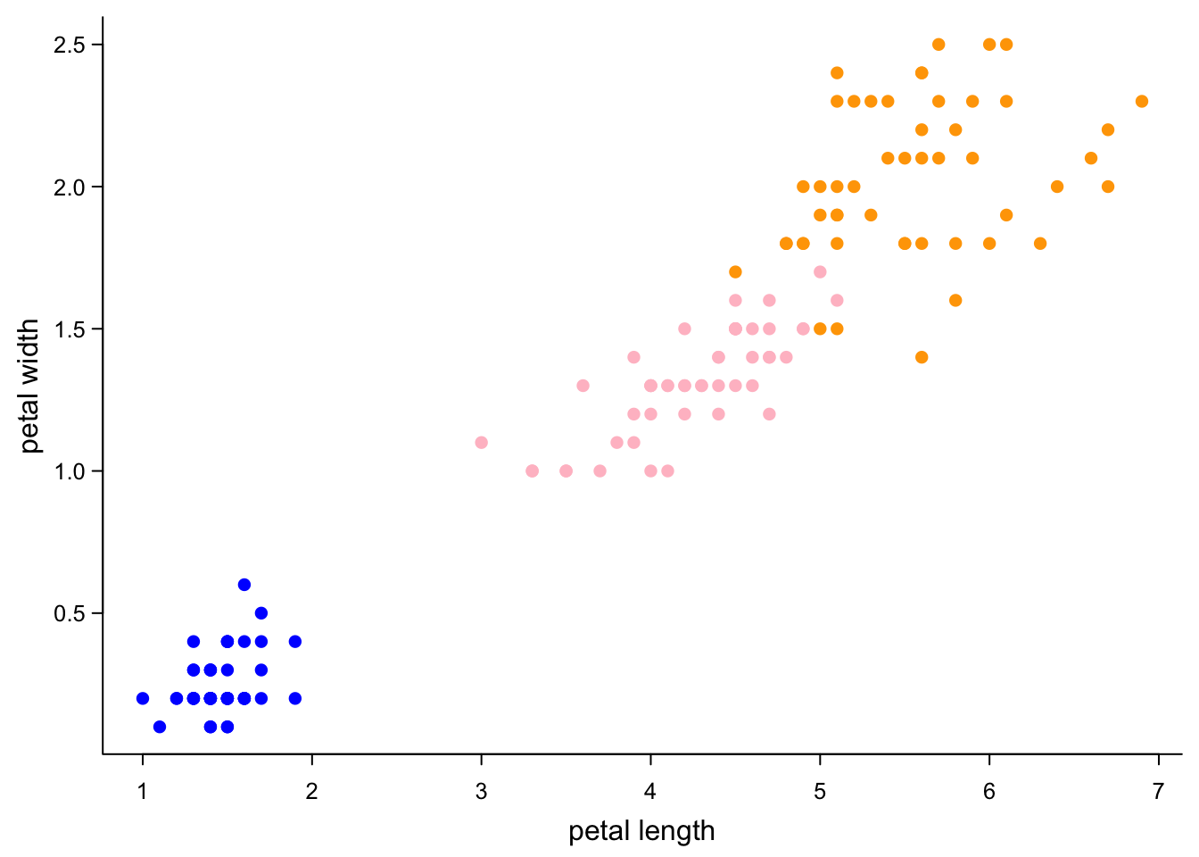
R’s default colours are not the prettiest. Nice palettes are offered by
several packages, one of which is RColorBrewer. Here’s an example:
par(mar=c(3,3,0.5,0.5),
    mgp=c(1.7,0.5,0),
    tcl=-0.3)
plot(iris$Petal.Length,
     iris$Petal.Width,
     xlab = "petal length",
     ylab = "petal width",
     pch = 16,
     col = brewer.pal(3,"Dark2")[as.numeric(as.factor(iris$Species))], #three colours from a palette
     bty = "l",
     las = 1,
cex.axis = 0.8) 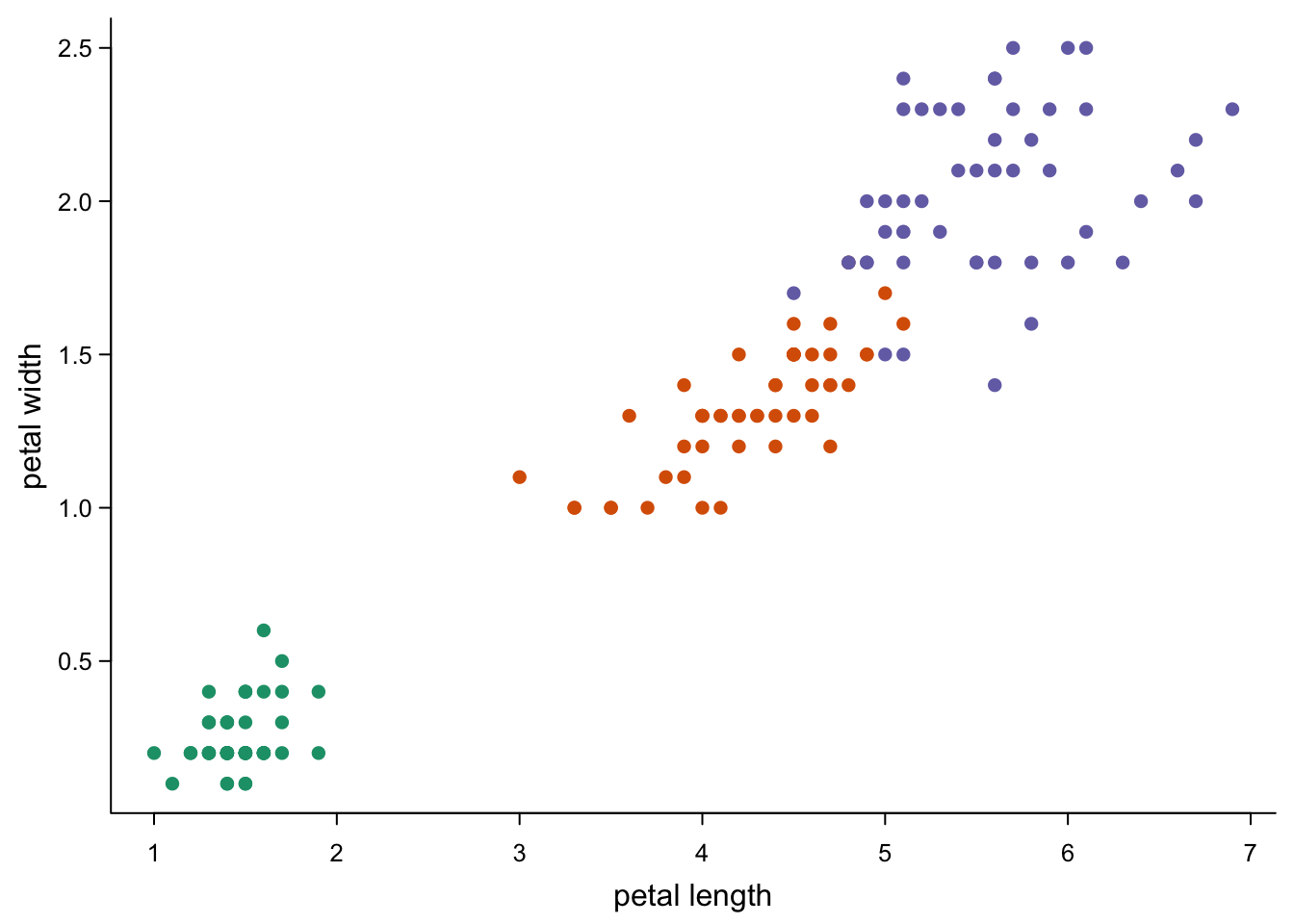
You can also colour points by values.
par(mar=c(3,3,0.5,0.5),
    mgp=c(1.7,0.5,0),
    tcl=-0.3)
plot(iris$Petal.Length,
     iris$Petal.Width,
     xlab = "petal length",
     ylab = "petal width",
     pch = 16,
     col = brewer.pal(9,"YlGnBu")[cut(iris$Petal.Width,9)], #nine colours by petal width
     bty = "l",
     las = 1,
cex.axis = 0.8) 
Of course, you can also colour by a vector that is not used in the rest
of the plot. Try it e.g. with iris$Sepal.Length.
You can also increase the resolution of the color scale:
par(mar=c(3,3,0.5,0.5),
    mgp=c(1.7,0.5,0),
    tcl=-0.3)
plot(iris$Petal.Length,
     iris$Petal.Width,
     xlab = "petal length",
     ylab = "petal width",
     pch = 16,
     col = colorRampPalette(brewer.pal(9,"YlGnBu"))(256)[cut(iris$Petal.Width,256)], #256 colours
     bty = "l",
     las = 1,
cex.axis = 0.8) 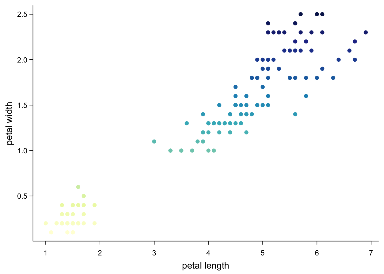
5.4.3 Size
You can change the size of points, either all at the same time:
par(mar=c(3,3,0.5,0.5),
    mgp=c(1.7,0.5,0),
    tcl=-0.3)
plot(iris$Petal.Length,
     iris$Petal.Width,
     xlab = "petal length",
     ylab = "petal width",
     pch = 16,
     col = "red",
     cex = 2, #bigger symbols
     bty = "l",
     las = 1,
cex.axis = 0.8) 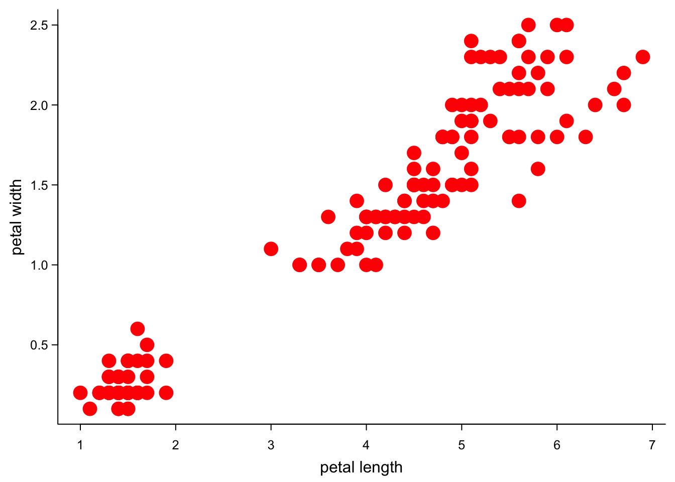
Or depending on the group:
par(mar=c(3,3,0.5,0.5),
    mgp=c(1.7,0.5,0),
    tcl=-0.3)
plot(iris$Petal.Length,
     iris$Petal.Width,
     xlab = "petal length",
     ylab = "petal width",
     pch = 16,
     col = "red",
     cex = as.numeric(as.factor(iris$Species))/2, #point size by species
     bty = "l",
     las = 1,
cex.axis = 0.8) 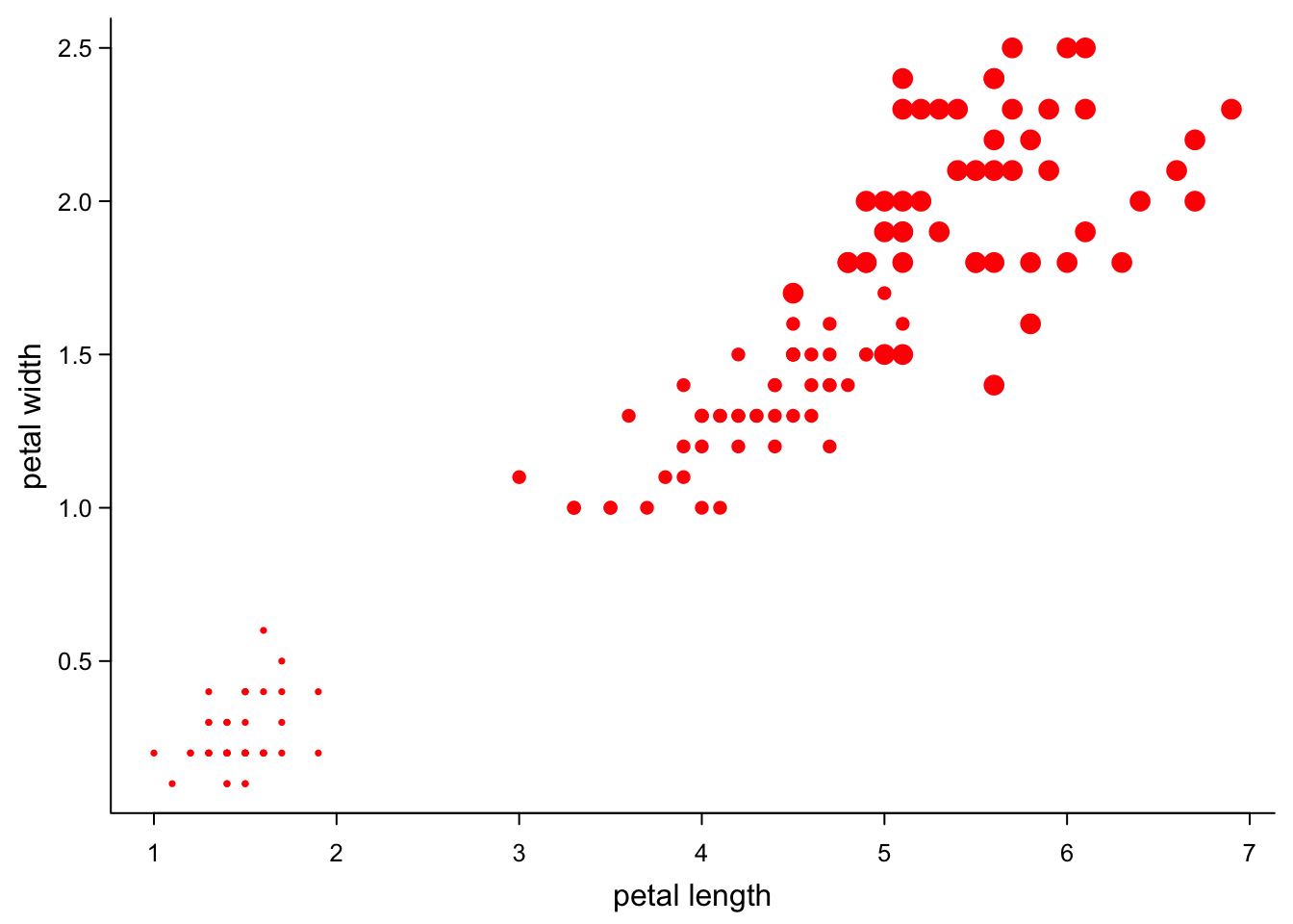
Or proportional to a value:
par(mar=c(3,3,0.5,0.5),
    mgp=c(1.7,0.5,0),
    tcl=-0.3)
plot(iris$Petal.Length,
     iris$Petal.Width,
     xlab = "petal length",
     ylab = "petal width",
     pch = 16,
     col = "red",
     cex = sqrt(iris$Petal.Length)/2, #point size by petal length
     bty = "l",
     las = 1,
cex.axis = 0.8) 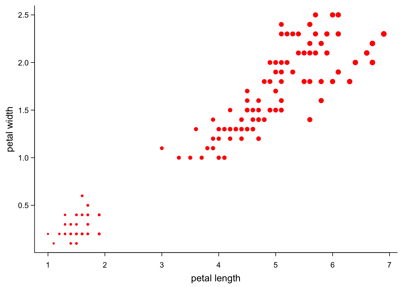
5.4.4 Multiple sets of points
You can use the points command to add more points to an existing plot.
Here, we just add the same points again, but with different symbols.
par(mar=c(3,3,0.5,0.5),
    mgp=c(1.7,0.5,0),
    tcl=-0.3)
plot(iris$Petal.Length,
     iris$Petal.Width,
     xlab = "petal length",
     ylab = "petal width",
     pch = 16,
     cex = sqrt(iris$Petal.Length)/4, #point size by petal length
     bty = "l",
     las = 1,
     cex.axis = 0.8)
points(iris$Petal.Length,
     iris$Petal.Width,
     pch = 1,
     col = "green",
     cex = iris$Petal.Length^2/8, #point size by petal length
     bty = "l",
     las = 1,
cex.axis = 0.8) 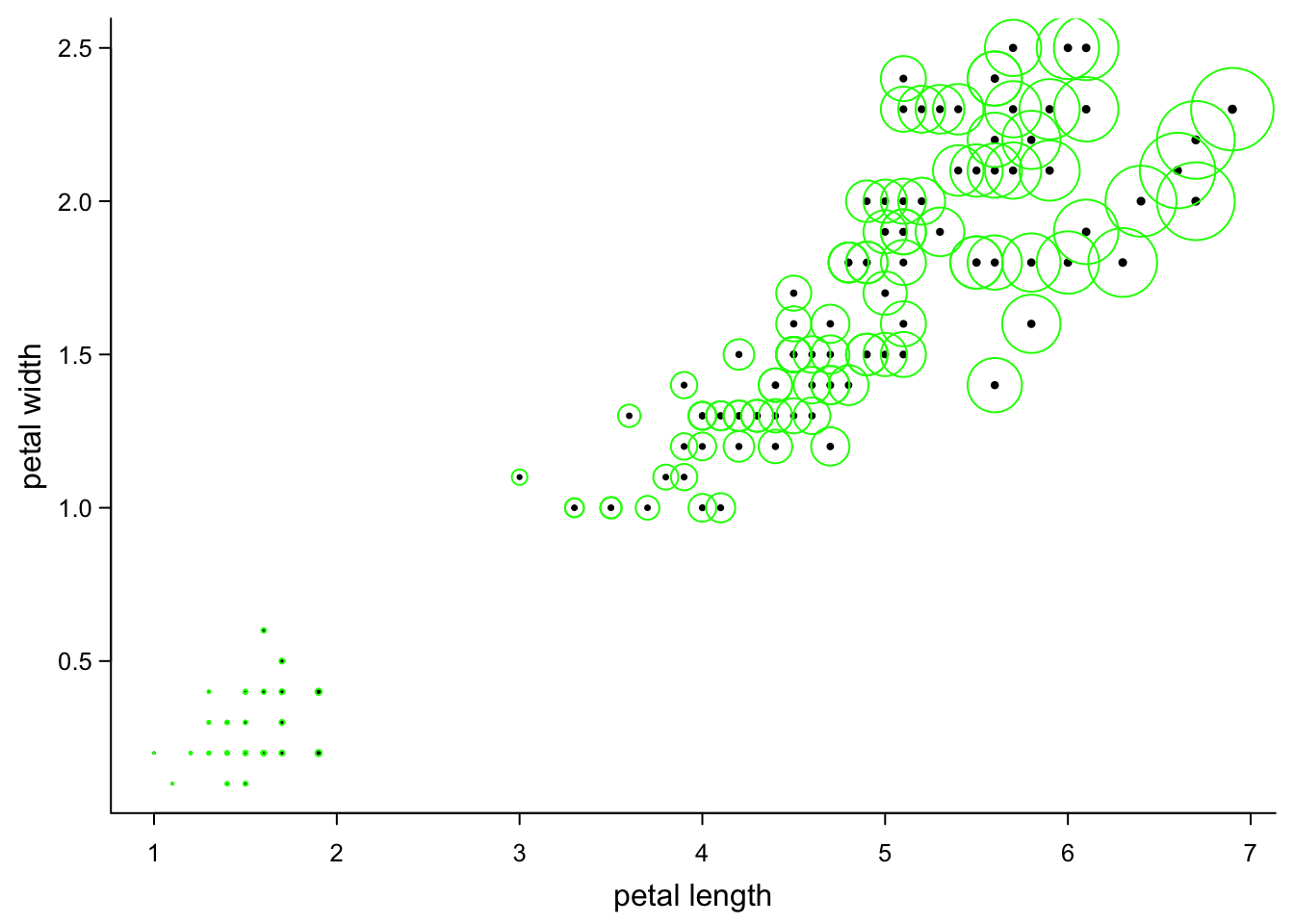
You can use this trick also too have tight control of all the points you plot, by not plotting them in the first plot at all:
par(mar=c(3,3,0.5,0.5),
    mgp=c(1.7,0.5,0),
    tcl=-0.3)
plot(iris$Petal.Length,
     iris$Petal.Width,
     xlab = "petal length",
     ylab = "petal width",
     type = "n", #nothing plotted
     bty = "l",
     las = 1,
cex.axis = 0.8) 
and then adding the points (here, every point is added individually - a bit of an overkill)
par(mar=c(3,3,0.5,0.5),
    mgp=c(1.7,0.5,0),
    tcl=-0.3)
plot(iris$Petal.Length,
     iris$Petal.Width,
     xlab = "petal length",
     ylab = "petal width",
     type = "n", #nothing plotted
     bty = "l",
     las = 1,
     cex.axis = 0.8)
for(p in 1:nrow(iris)){
  points(iris$Petal.Length[p],
     iris$Petal.Width[p],
     pch = sample(1:25,1), #random symbol
     cex = rnorm(1,1,1), #random size
     col = rgb(runif(1),runif(1),runif(1))) #random RGB colour
}
5.5 Legends
If you did not randomly attribute colours, shapes and sizes, you’ll want a legend.
par(mar=c(3,3,0.5,0.5),
    mgp=c(1.7,0.5,0),
    tcl=-0.3)
plot(iris$Petal.Length,
     iris$Petal.Width,
     xlab = "petal length",
     ylab = "petal width",
     pch = 16,
     col = brewer.pal(3,"Dark2")[as.numeric(as.factor(iris$Species))], #three colours from a palette
     bty = "l",
     las = 1,
     cex.axis = 0.8)
legend("topleft", #position - there's also e.g. "bottom" or "right"
       legend = levels(as.factor(iris$Species)), #if you use the factors as in the plot, the names are correct
       col = brewer.pal(3,"Dark2"), #colours
       pch = 16, #symbol
       title = "species", #you can have a title
       cex = 0.8, # smaller text and symbols
       bty = "n") #I like to not have a box around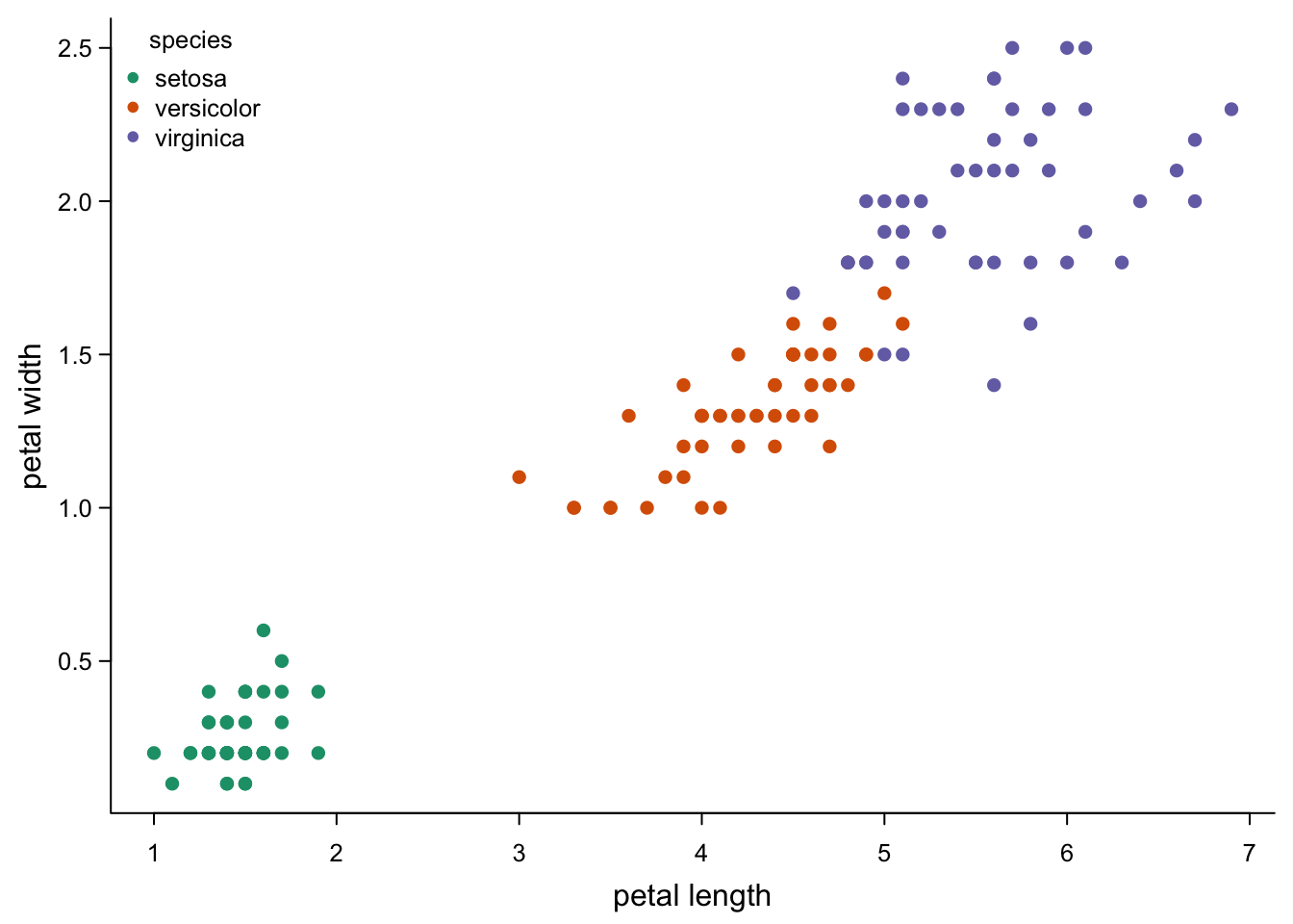
base R legends are super-flexible: you can choose the title, the words, the symbols, their order, their size; you can put multiple legends where you want. However, you need to take care that they are correct, because R does not:
par(mar=c(3,3,0.5,0.5),
    mgp=c(1.7,0.5,0),
    tcl=-0.3)
plot(iris$Petal.Length,
     iris$Petal.Width,
     xlab = "petal length",
     ylab = "petal width",
     pch = 16,
     col = brewer.pal(3,"Dark2")[as.numeric(as.factor(iris$Species))], #three colours from a palette
     bty = "l",
     las = 1,
     cex.axis = 0.8)
legend("topleft", #position - there's also e.g. "bottom" or "right"
       legend = c("versicolor","setosa","virginica"), #wrong names
       col = c("grey",brewer.pal(3,"Dark2")), # an extra colour?
       pch = 17, # not our symbol
       fill= "grey90", #weird grey boxes
       border = NA,
       title = "wrong legend",
       cex = 0.8,
bty = "n") 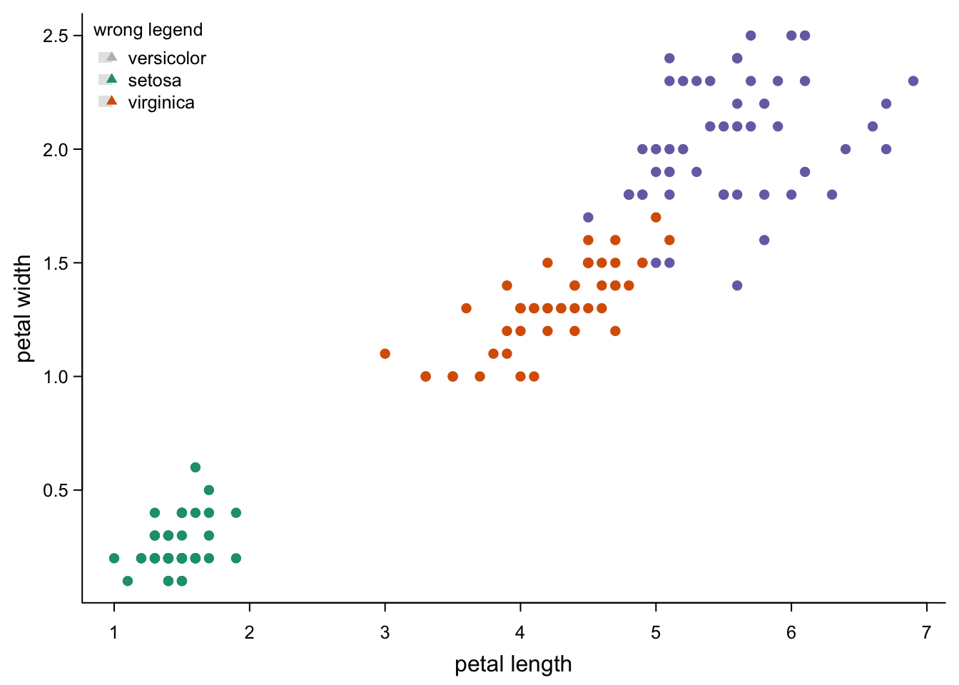
5.6 Lines
5.6.1 Histogram-style lines
You don’t always need to have points. You can have vertical lines:
par(mar=c(3,3,0.5,0.5),
    mgp=c(1.7,0.5,0),
    tcl=-0.3)
plot(iris$Petal.Length,
     iris$Petal.Width,
     xlab = "petal length",
     ylab = "petal width",
     type = "h", #vertical lines
     col = brewer.pal(3,"Dark2")[as.numeric(as.factor(iris$Species))],
     bty = "l",
     las = 1,
cex.axis = 0.8) 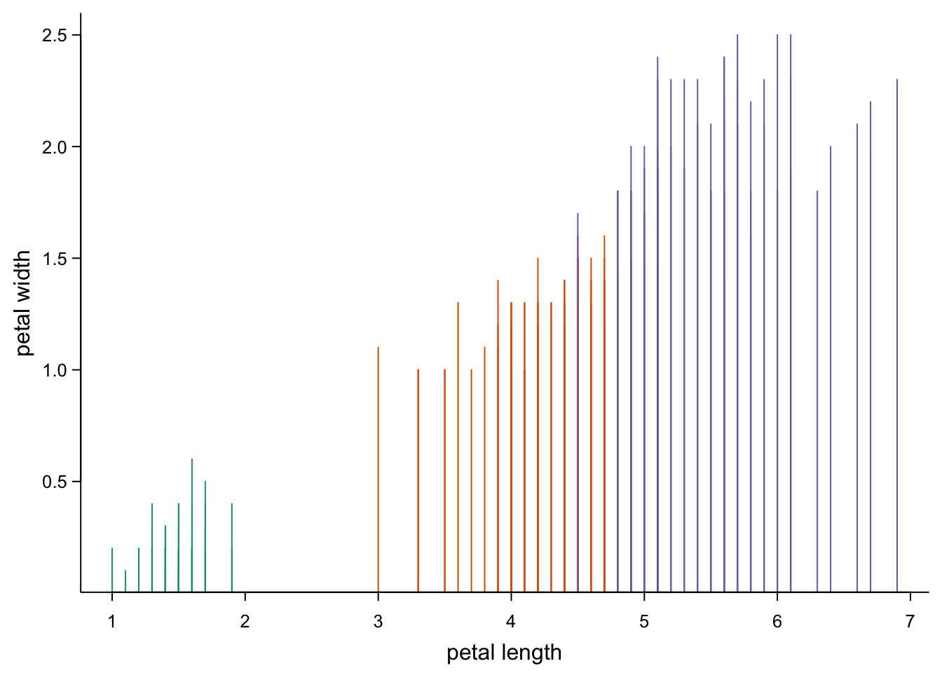
This is not a great example, because you can’t see points that are close to each other on the x-axis. But there are uses for this.
5.6.2 Lines between points
You can plot lines between all coordinates:
par(mar=c(3,3,0.5,0.5),
    mgp=c(1.7,0.5,0),
    tcl=-0.3)
plot(iris$Petal.Length,
     iris$Petal.Width,
     xlab = "petal length",
     ylab = "petal width",
     type = "l", # lines
     bty = "l",
     las = 1,
cex.axis = 0.8) 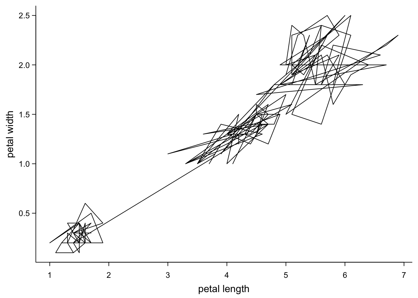
That’s not very informative, but with a bit of sorting, this can make sense in some circumstances:
par(mar=c(3,3,0.5,0.5),
    mgp=c(1.7,0.5,0),
    tcl=-0.3)
plot(iris$Petal.Length[order(iris$Petal.Length,iris$Petal.Width)],
     iris$Petal.Width[order(iris$Petal.Length,iris$Petal.Width)], #both coordinates ordered first by x then y
     xlab = "petal length",
     ylab = "petal width",
     type = "l", # lines
     bty = "l",
     las = 1,
cex.axis = 0.8) 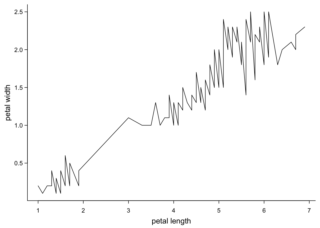
You can see how this can be useful, if you have e.g. a time on the x-axis.
You can also combine points and lines:
par(mar=c(3,3,0.5,0.5),
    mgp=c(1.7,0.5,0),
    tcl=-0.3)
plot(iris$Petal.Length[order(iris$Petal.Length,iris$Petal.Width)],
     iris$Petal.Width[order(iris$Petal.Length,iris$Petal.Width)], #both coordinates ordered first by x then y
     xlab = "petal length",
     ylab = "petal width",
     type = "o", # lines and points
     pch = 16, #filled circles
     lty = 3, #dash line
     col = brewer.pal(3,"Dark2")[as.numeric(as.factor(iris$Species))[order(iris$Petal.Length,iris$Petal.Width)]], #color (lines take the first, hm)
     bty = "l",
     las = 1,
cex.axis = 0.8) 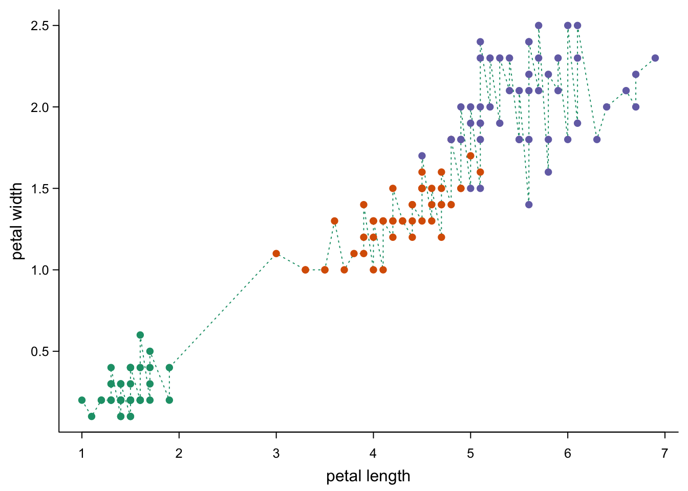
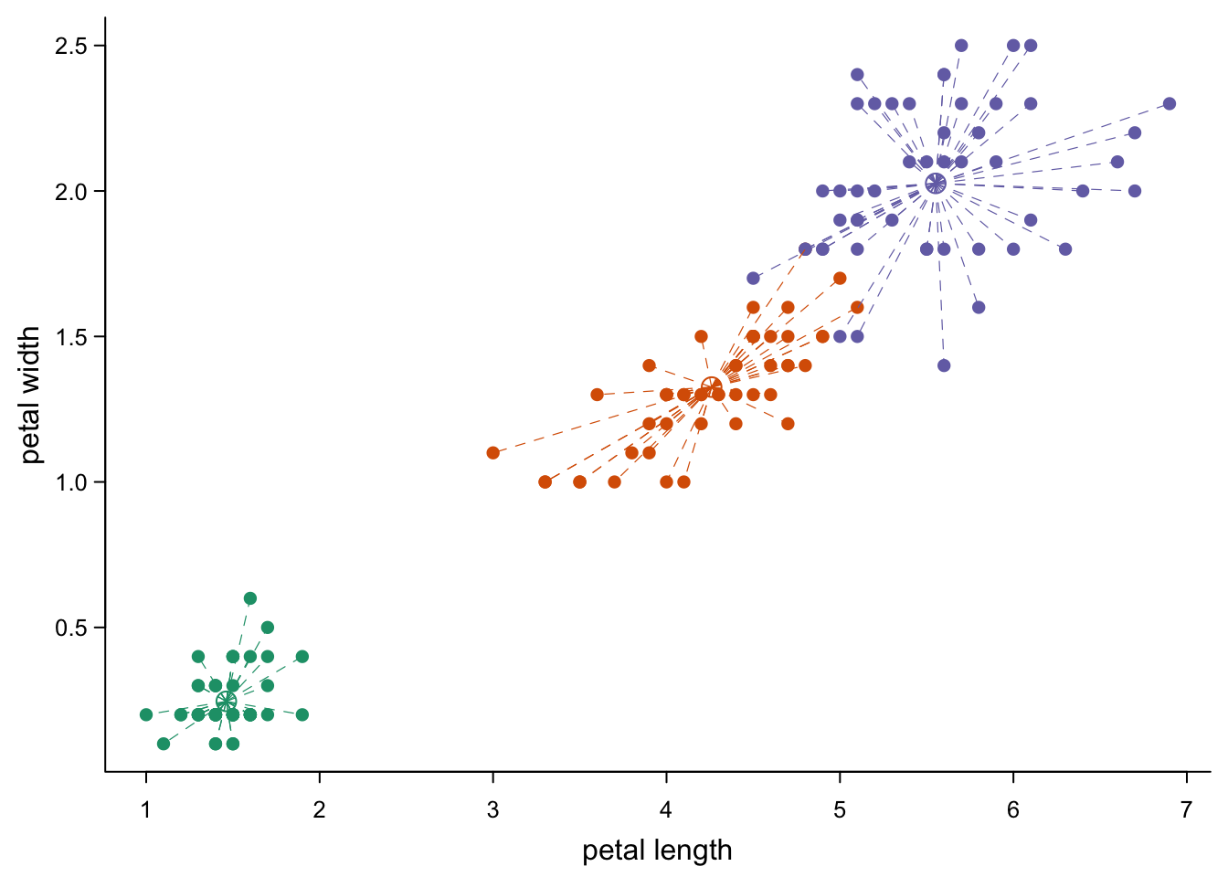
Like with the points command, you can also add lines to an existing
plot. Let’s say we want to connect every point to a center for its
species.
par(mar=c(3,3,0.5,0.5),
    mgp=c(1.7,0.5,0),
    tcl=-0.3)
plot(iris$Petal.Length,
     iris$Petal.Width, #no sorting necessary
     xlab = "petal length",
     ylab = "petal width",
     type = "p", # back to points
     pch = 16,
     col = brewer.pal(3,"Dark2")[as.numeric(as.factor(iris$Species))],
     bty = "l",
     las = 1,
     cex.axis = 0.8)
#center points:
iris_centers <- aggregate(iris[,1:4],list(iris$Species),mean) #mean value per species
points(iris_centers$Petal.Length, #center points
       iris_centers$Petal.Width,
       col = brewer.pal(3,"Dark2"),  # coloured as above
       pch = 1, #open circle
       cex = 1.5)  #bit bigger
for(i in 1:nrow(iris)){ #one line per point from center
  currSpec <- iris$Species[i] #species of this point
  lines(x = c(iris_centers$Petal.Length[iris_centers$Group.1 == currSpec], #x coordinate of center
              iris$Petal.Length[i]), #x coordinate of point
        y = c(iris_centers$Petal.Width[iris_centers$Group.1 == currSpec], #y coordinate of center
              iris$Petal.Width[i]), #y coordinate of point
        lty = 2, #dashed line
        lwd = 0.6, #thinner
        col = brewer.pal(3,"Dark2")[which(levels(as.factor(iris$Species))==currSpec)]) #appropriate color
}
This might be as good a moment as any to point out that you can also plot text:
par(mar=c(3,3,0.5,0.5),
    mgp=c(1.7,0.5,0),
    tcl=-0.3)
plot(iris$Petal.Length,
     iris$Petal.Width, #no sorting necessary
     xlab = "petal length",
     ylab = "petal width",
     type = "p", # back to points
     pch = 16,
     col = brewer.pal(3,"Dark2")[as.numeric(as.factor(iris$Species))],
     bty = "l",
     las = 1,
     cex.axis = 0.8)
#text at center points:
text(iris_centers$Petal.Length, #center points
     iris_centers$Petal.Width,
     col = brewer.pal(3,"Dark2"),  # coloured as above
     font = 4, #bold italic
     labels = iris_centers$Group.1, #species names
     cex = 1.5)  #bit bigger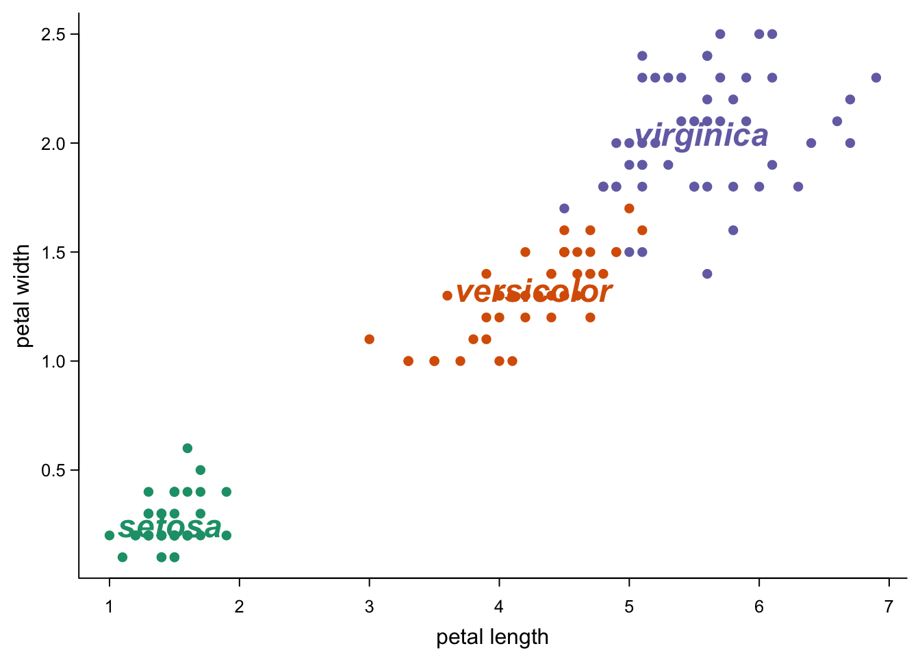
5.6.3 Lines through the plot
Sometimes you want to just draw some lines at specific places. E.g. you may want to indicate a diagonal:
par(mar=c(3,3,0.5,0.5),
    mgp=c(1.7,0.5,0),
    tcl=-0.3)
plot(iris$Petal.Length,
     iris$Petal.Width, #no sorting necessary
     xlab = "petal length",
     ylab = "petal width",
     type = "p", # back to points
     pch = 16,
     col = brewer.pal(3,"Dark2")[as.numeric(as.factor(iris$Species))],
     bty = "l",
     las = 1,
     cex.axis = 0.8,
     xlim = c(0,7), #give both axes the same range
     ylim = c(0,7))  #give both axes the same range
abline(a=0, #diagonal, cutting y at 0
       b=1, #diagonal, 45 degrees
       lty=3)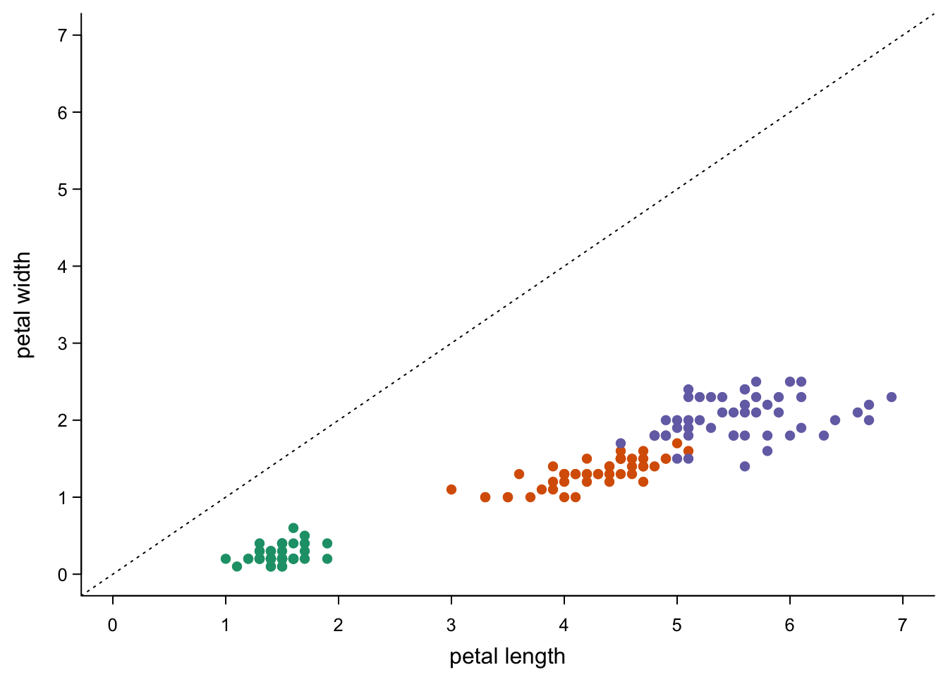
Or some cut-off (try this with v instead of h in the abline
command to get a vertical line).
par(mar=c(3,3,0.5,0.5),
    mgp=c(1.7,0.5,0),
    tcl=-0.3)
plot(iris$Petal.Length,
     iris$Petal.Width, #no sorting necessary
     xlab = "petal length",
     ylab = "petal width",
     type = "p", # back to points
     pch = 16,
     col = c("red","grey20")[1+as.numeric(iris$Petal.Width>1.2)], #colour changes at 1.2
     bty = "l",
     las = 1,
     cex.axis = 0.8)  #give both axes the same range
abline(h=1.2, # horizontal line at 1
       lty=3)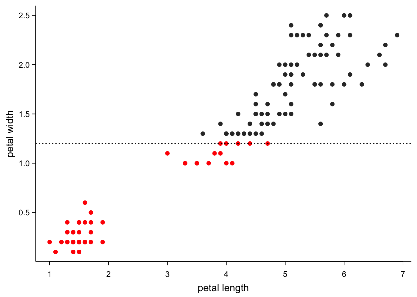
5.6.4 Trend lines
You can also use these ablines to show trends:
par(mar=c(3,3,0.5,0.5),
    mgp=c(1.7,0.5,0),
    tcl=-0.3)
plot(iris$Petal.Length,
     iris$Petal.Width, #no sorting necessary
     xlab = "petal length",
     ylab = "petal width",
     type = "p", # back to points
     pch = 16,
     col = brewer.pal(3,"Dark2")[as.numeric(as.factor(iris$Species))],
     bty = "l",
     las = 1,
     cex.axis = 0.8)
#linear trend for all points:
abline(lm(iris$Petal.Width ~ iris$Petal.Length), #linear model
      col = "grey30",
      lwd = 2)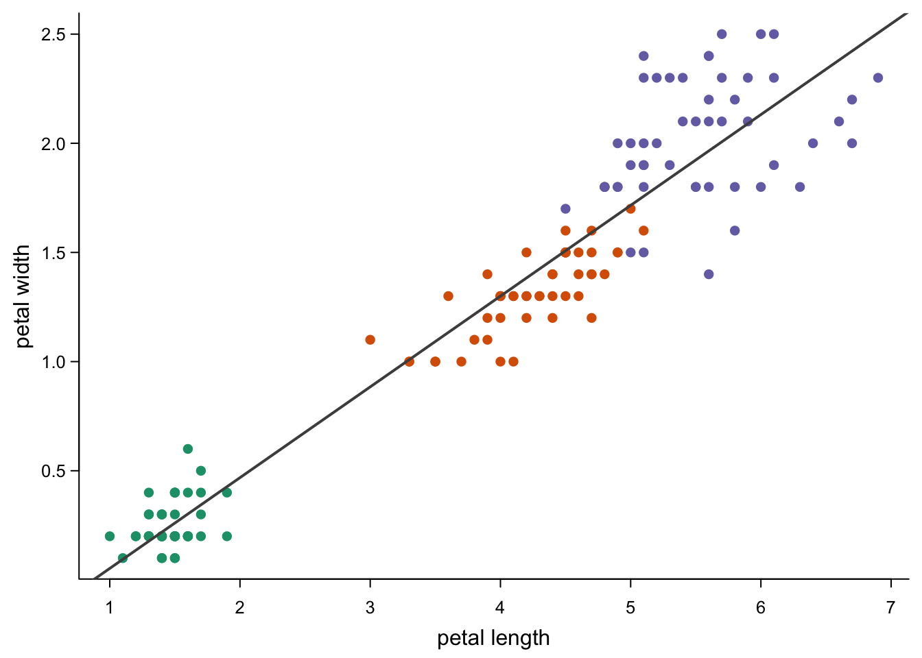
The more correct version is to use lines to limit the line to the
range you observed, but it’s a lot more typing work.
par(mar=c(3,3,0.5,0.5),
    mgp=c(1.7,0.5,0),
    tcl=-0.3)
plot(iris$Petal.Length,
     iris$Petal.Width,
     xlab = "petal length",
     ylab = "petal width",
     type = "p",
     xlim = c(0,8), #a bit bigger part of the axes to see the difference to abline
     ylim = c(0,3),
     xaxs = "i", #no negative parts on the axis
     yaxs = "i", #no negative parts on the axis
     pch = 16,
     col = brewer.pal(3,"Dark2")[as.numeric(as.factor(iris$Species))],
     bty = "l",
     las = 1,
     cex.axis = 0.8)
# points to predict:
new <- data.frame(Petal.Length=seq(min(iris$Petal.Length),
                                   max(iris$Petal.Length),
                                   length.out = 100))
#linear trend for all points:
lines(new$Petal.Length,
      predict(lm(Petal.Width ~ Petal.Length, data=iris), #linear model
              newdata = new,
              se.fit=T,
              interval = "prediction")$fit[,1],
      col = "grey30",
      lwd = 2)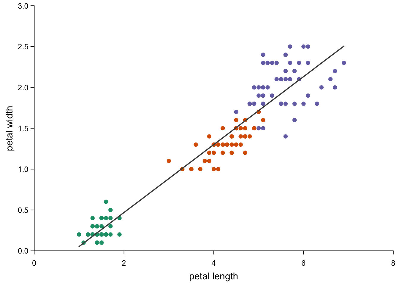
There are some more options that we could not detail today. Have a good
look at ?par if you get stuck.