Chapter 11 Visualizing networks with igraph
In this chapter, we take a look at networks. R can handle networks, both for analysis as well as for visualization. There are several packages to help with this job. The methods in this tutorial are based on the igraph package. The igraph project actually interfaces with several programming languages, so you may also find it in other contexts.
11.1 Setup
if(!require(igraph)){
  install.packages("igraph",repos = "http://cran.us.r-project.org")
  library(igraph)
}
## Loading required package: igraph##
## Attaching package: 'igraph'## The following object is masked from 'package:gtools':
##
## permute## The following objects are masked from 'package:dplyr':
##
## as_data_frame, groups, union## The following objects are masked from 'package:purrr':
##
## compose, simplify## The following object is masked from 'package:tidyr':
##
## crossing## The following object is masked from 'package:tibble':
##
## as_data_frame## The following objects are masked from 'package:stats':
##
## decompose, spectrum## The following object is masked from 'package:base':
##
## union11.2 Network representations
There are multiple ways of reading in or defining a network. The two most common ways to represent a network are edge lists and adjacency matrices.
11.2.1 Network formats: edgelist
In the first representation, you have a table with at least two columns. Every line represents an edge. The two columns take the two nodes that are connected in this line. Directionality is straight-forward with this: You can define one column to contain only source nodes (where the arrow starts) and the other column to contain only sink or target nodes (where the arrow ends). Un-directed networks can be (implicitly or explicitly) defined by giving every edge twice, with the source and sink nodes of one line being exchanged in the other line. Directionality and weights can also be defined in additional columns. A common input file format is simple interaction format.
Here is the example of a simple network.
edgelist_circle1 <- matrix(c("A","B","B","C","C","D","D","E","E","F","F","A"),
                           byrow = T,
                           ncol=2,
                           dimnames = list(c(1:6),c("source","sink")))
edgelist_circle1
## source sink
## 1 "A" "B"
## 2 "B" "C"
## 3 "C" "D"
## 4 "D" "E"
## 5 "E" "F"
## 6 "F" "A"testgraph_circle1 <- graph_from_edgelist(edgelist_circle1)
plot(testgraph_circle1, layout = layout_in_circle(testgraph_circle1))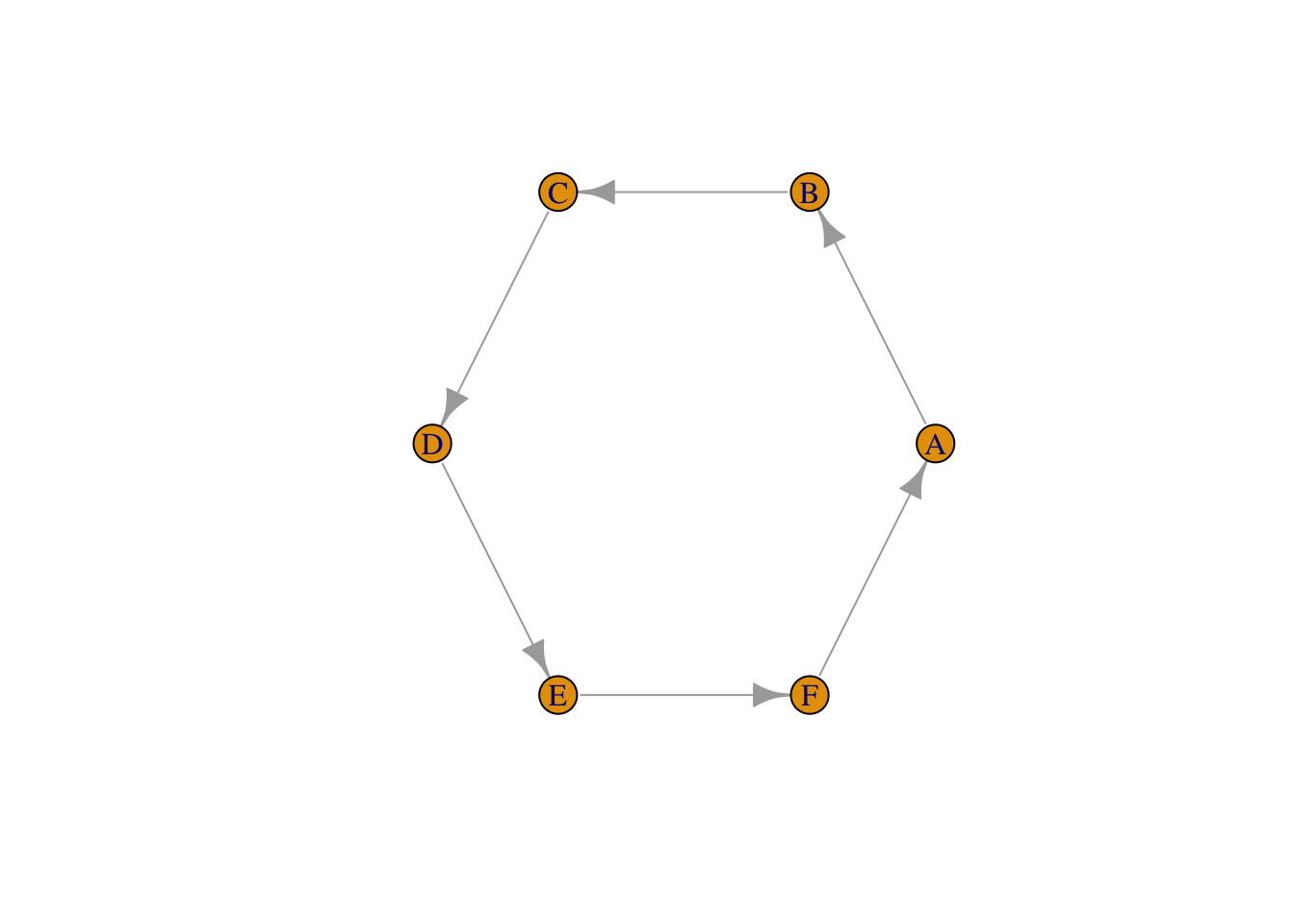
11.2.2 Network formats: adjacency matrix
The second representation is a square matrix with one row and one column
each for every node. The fields that are spanned by this matrix contain
information on whether an edge connects the node belonging to this row
and the node belonging to this column. Usually, 0 indicates no
connection and 1 indicates a connection (weights can be introduced,
too, if necessary). Directionality is dealt with by using the two
triangles of the matrix: the matrix is read such that the rows indicate
source nodes and the columns sink nodes for the edges.
#make an empty matrix with as many rows and columns as there are nodes
adjMat_circle2 <- matrix(0,
                         nrow=6,
                         ncol=6,
                         dimnames = list(c("J","K","L","M","N","O"),
                                         c("J","K","L","M","N","O")))
#fill matrix by connecting each node to only the next
for(i in 1:(nrow(adjMat_circle2)-1)){
  adjMat_circle2[i,i+1] <- 1
}
#close the circle
adjMat_circle2[nrow(adjMat_circle2),1] <- 1
adjMat_circle2
## J K L M N O
## J 0 1 0 0 0 0
## K 0 0 1 0 0 0
## L 0 0 0 1 0 0
## M 0 0 0 0 1 0
## N 0 0 0 0 0 1
## O 1 0 0 0 0 0testgraph_circle2 <- graph_from_adjacency_matrix(adjMat_circle2)
plot(testgraph_circle2, layout = layout_in_circle(testgraph_circle2))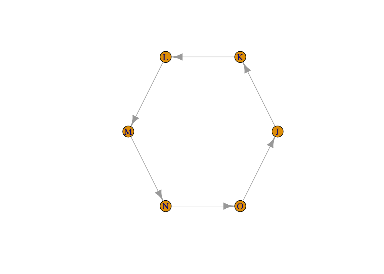
Exercise: In the code below, change the edgelist in a way that breaks the circle and adds a new edge instead. Plot the result.
edgelist_new <- matrix(c("A","B","B","C","C","D","D","E","E","F","F","A"), #adapt this
                           byrow = T,
                           ncol=2,
                           dimnames = list(c(1:6),c("source","sink")))
edgelist_new
## source sink
## 1 "A" "B"
## 2 "B" "C"
## 3 "C" "D"
## 4 "D" "E"
## 5 "E" "F"
## 6 "F" "A"testgraph_new1 <- graph_from_edgelist(edgelist_new)
plot(testgraph_new1, layout = layout_in_circle(testgraph_new1))
Exercise: In the code below, change the adjacency matrix in a way that breaks the circle and adds a new edge instead. Plot the result.
adjMat_new <- adjMat_circle2
#replace at least two fields by adjusting the following lines (you need to un-comment them by removing the hashkey):
# adjMat_new[x1,y1] <- 0
# adjMat_new[x2,y2] <- 1
adjMat_new
## J K L M N O
## J 0 1 0 0 0 0
## K 0 0 1 0 0 0
## L 0 0 0 1 0 0
## M 0 0 0 0 1 0
## N 0 0 0 0 0 1
## O 1 0 0 0 0 0testgraph_new2 <- graph_from_adjacency_matrix(adjMat_new )
plot(testgraph_new2, layout = layout_in_circle(testgraph_new2))
11.3 Network visualization
base R and igraph are not really made for visualizing large
graphs/networks. There’s better software outthere for those tasks. But
what is nice is that you can integrate your visualization with the
functions to analyse graphs and R’s statistical tools and all the
visualizations for the results from those functions. So let’s take a
look at igraph’s options for plotting graphs.
We’ll first create a simple graph from a built-in function. In real
life, you’d be using an igraph object that you created from an
adjacency matrix or an edge list, depending on your data.
g <- graph_from_atlas(501)
plot(g)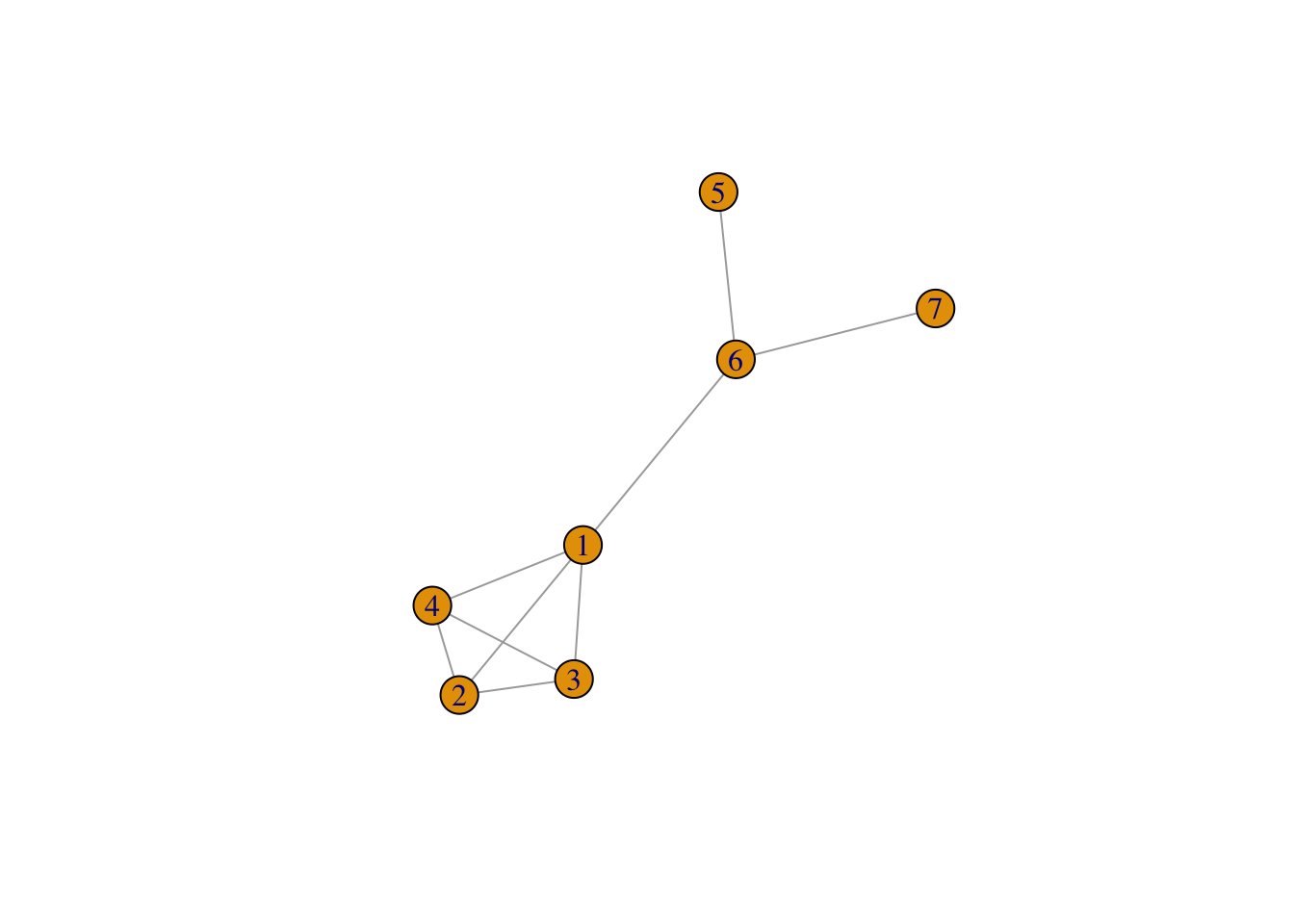
As you can see, this graph’s nodes don’t have names. Let’s give them some.
V(g)$name <- c("Maria","Johannes","Jan","Johanna","Cornelis","Hendrik","Anna")
plot(g)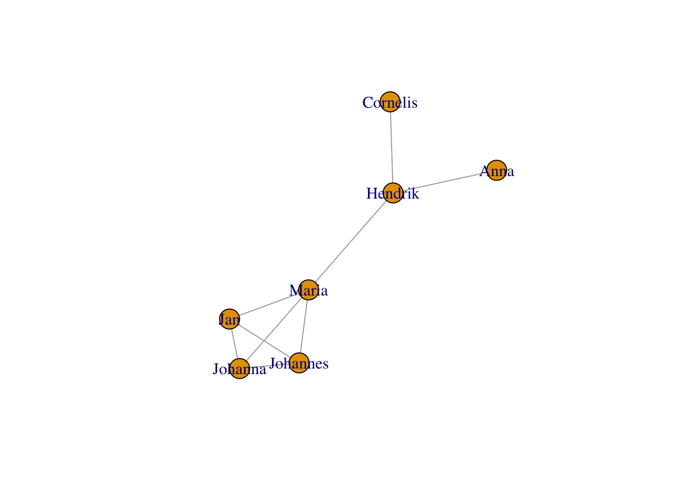
11.3.1 Layouts
Layouts are what determine where the nodes sit on the canvas. By
default, igraph guesses a good layout algorithm for your graph’s size.
For a small graph, this is usually a Fruchterman-Reingold force-directed
layout, which will put more connected nodes closer to each other. It can
also be chosen explicitly:
plot(g,layout = layout_with_fr(g))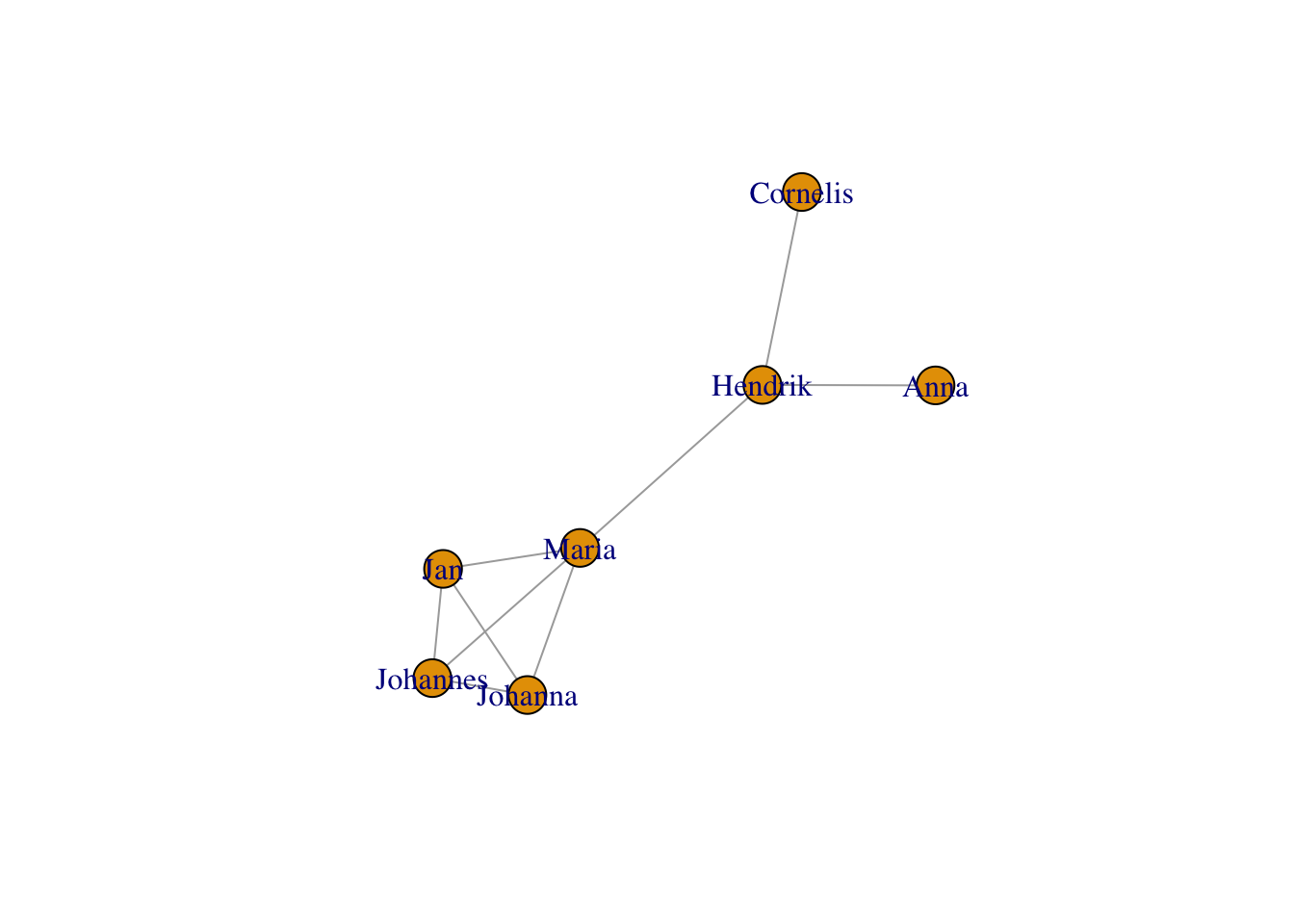
One important point to notice is that the layout does not always look the same. If you run the above chunk a couple of times, you will end up with slightly different positions of your nodes. This can be a problem, if you want to plot the same graph twice, but highlight different aspects. In this case, you can save a layout.
frg <- layout_with_fr(g)Now, you can re-use this layout - run the following chunk a couple of times, you will see that nothing changes:
plot(g, layout=frg)
You’ve already met the circle layout above:
plot(g,layout = layout_in_circle(g))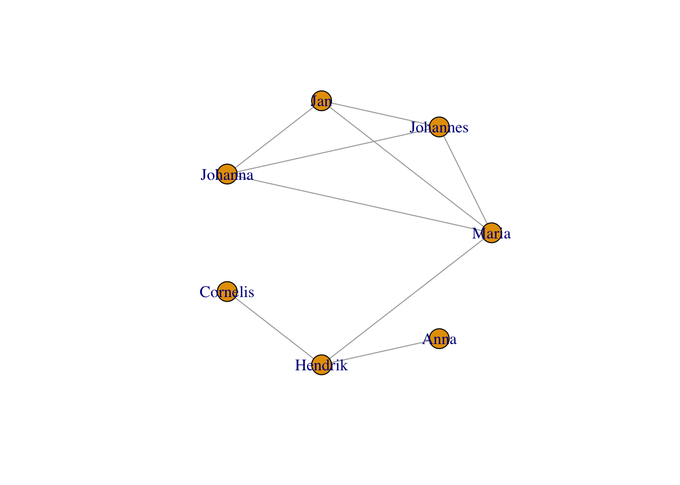
More layouts include stars:
plot(g,layout = layout_as_star(g))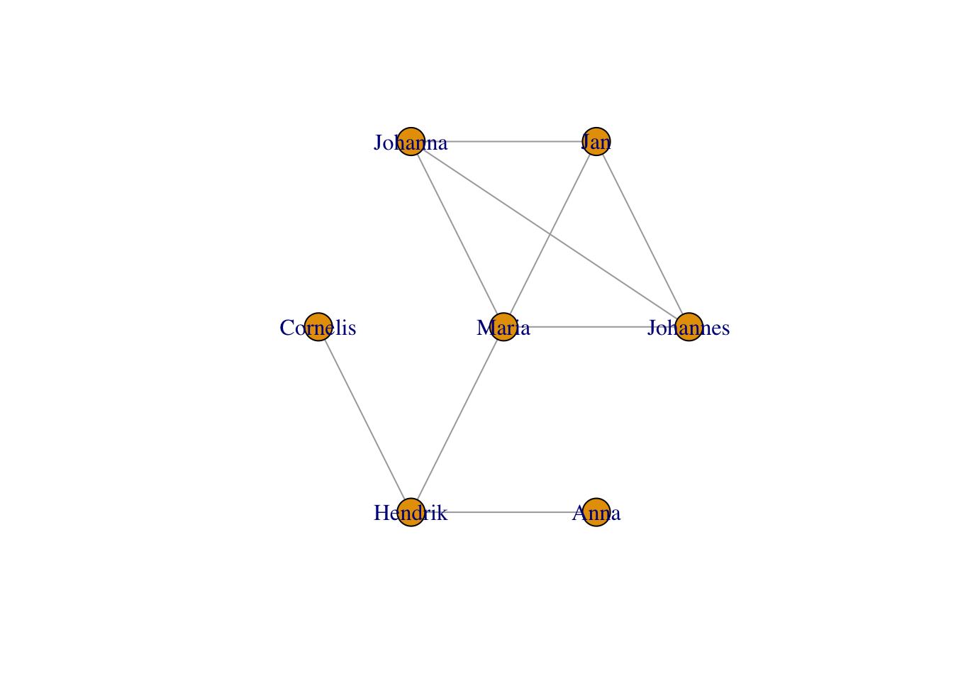
… as trees (this one is nice for tree-like structures, e.g. pedigrees):
plot(g,layout = layout_as_tree(g))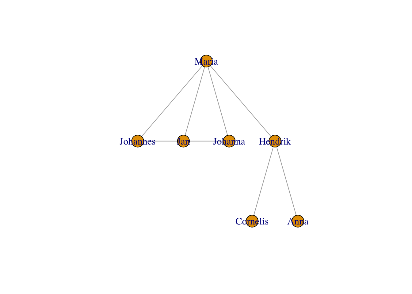
… other algorithms that try to bring more connected nodes together while avoiding crowding, e.g.,
… using the Kamada-Kawai layout:
plot(g,layout = layout_with_kk(g))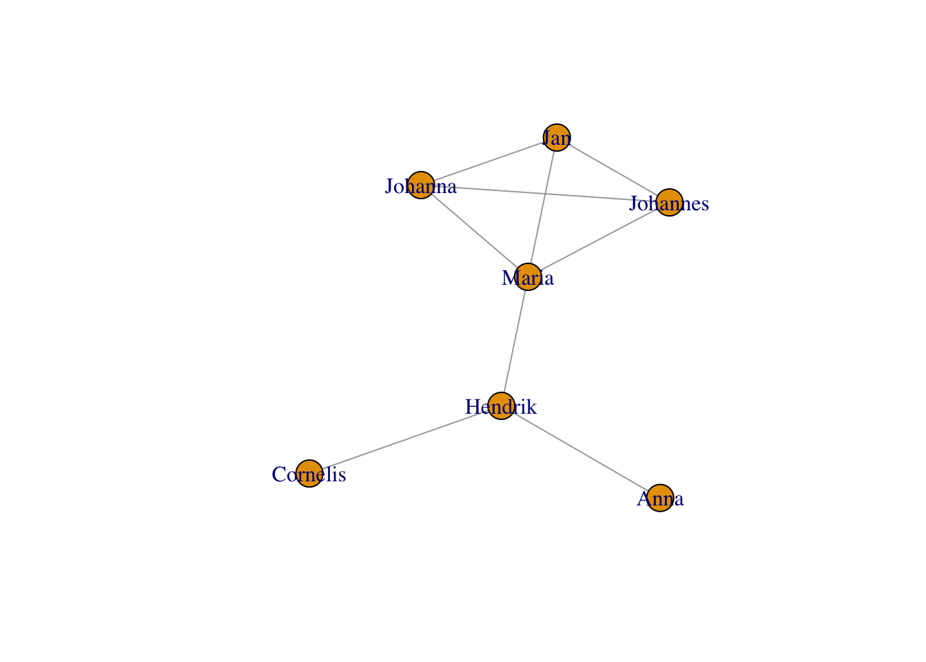
… using the GEM layout:
plot(g,layout = layout_with_gem(g))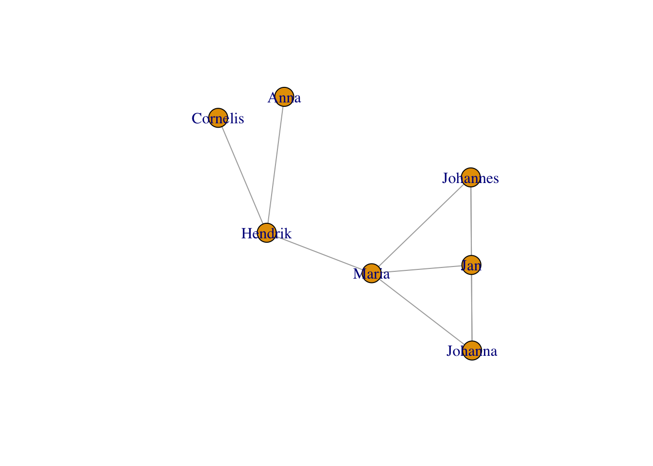
… or using multi-dimensional scaling of the distances between the nodes in the graph (problematic with equi-distant nodes like we have them here):
plot(g,layout = layout_with_mds(g))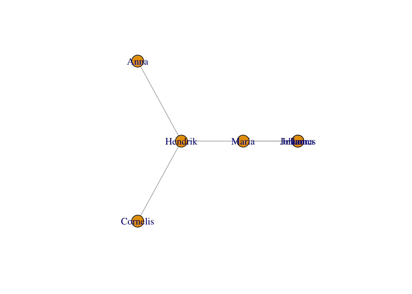
… or just plain random:
plot(g,layout = layout_randomly(g))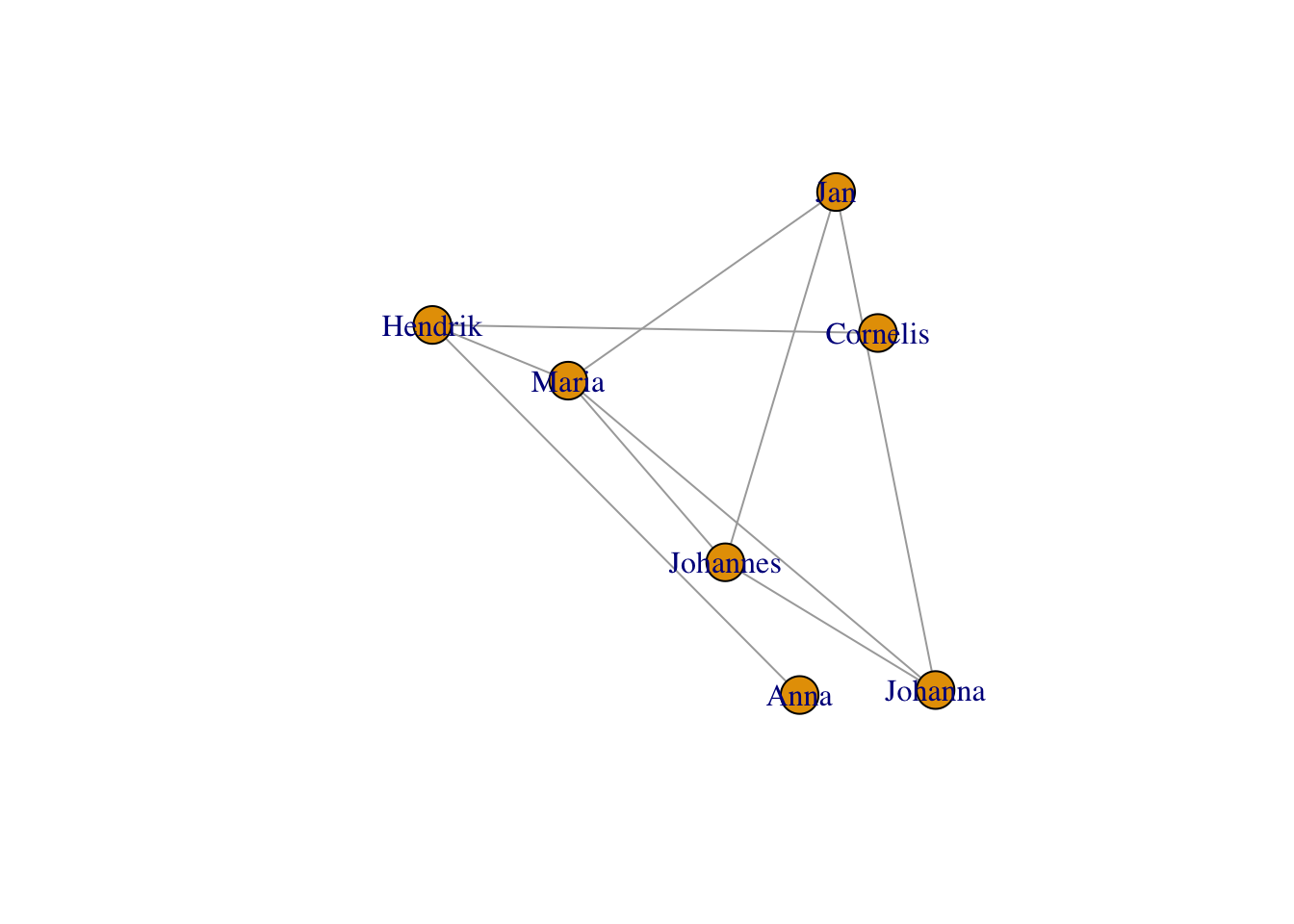
You can even set all the coordinates manually, by giving one coordinate per node in a \(n\times2\) matric (n being the number of nodes).
plot(g,layout = matrix(sample(1:7,14,replace=T),nrow=7,ncol=2))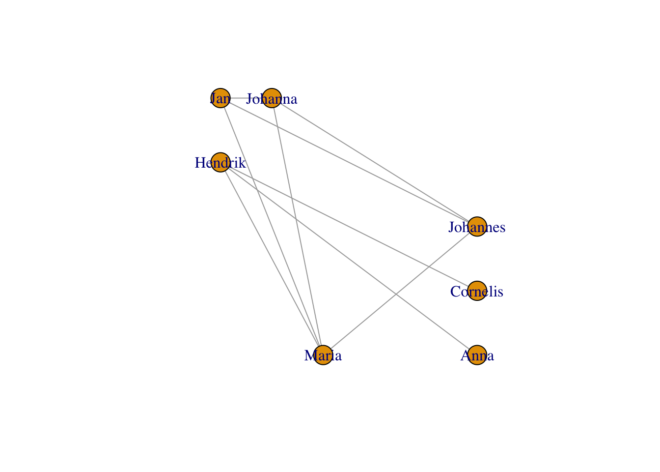
11.3.2 Node labels
Let’s keep our FR-layout from above and manipulate its look. Exercise: play around with the visualization arguments shown below to understand how they work. Let’s start with the labels. You can choose not to plot them:
plot(g, layout=frg,
     vertex.label = NA) #no labels
In a very un-R-ish way, the default labels have serifs. You can change to a more usual sans serif font like so:
plot(g, layout=frg,
     vertex.label.family = "sans") # sans serif labels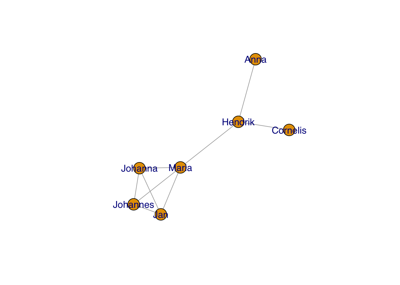
And change the color:
plot(g, layout=frg,
     vertex.label.family = "sans", # sans serif labels
     vertex.label.color = "black") #color
… and the size:
plot(g, layout=frg,
     vertex.label.family = "sans", # sans serif labels
     vertex.label.color = "black", #color
     vertex.label.cex = 0.7) # size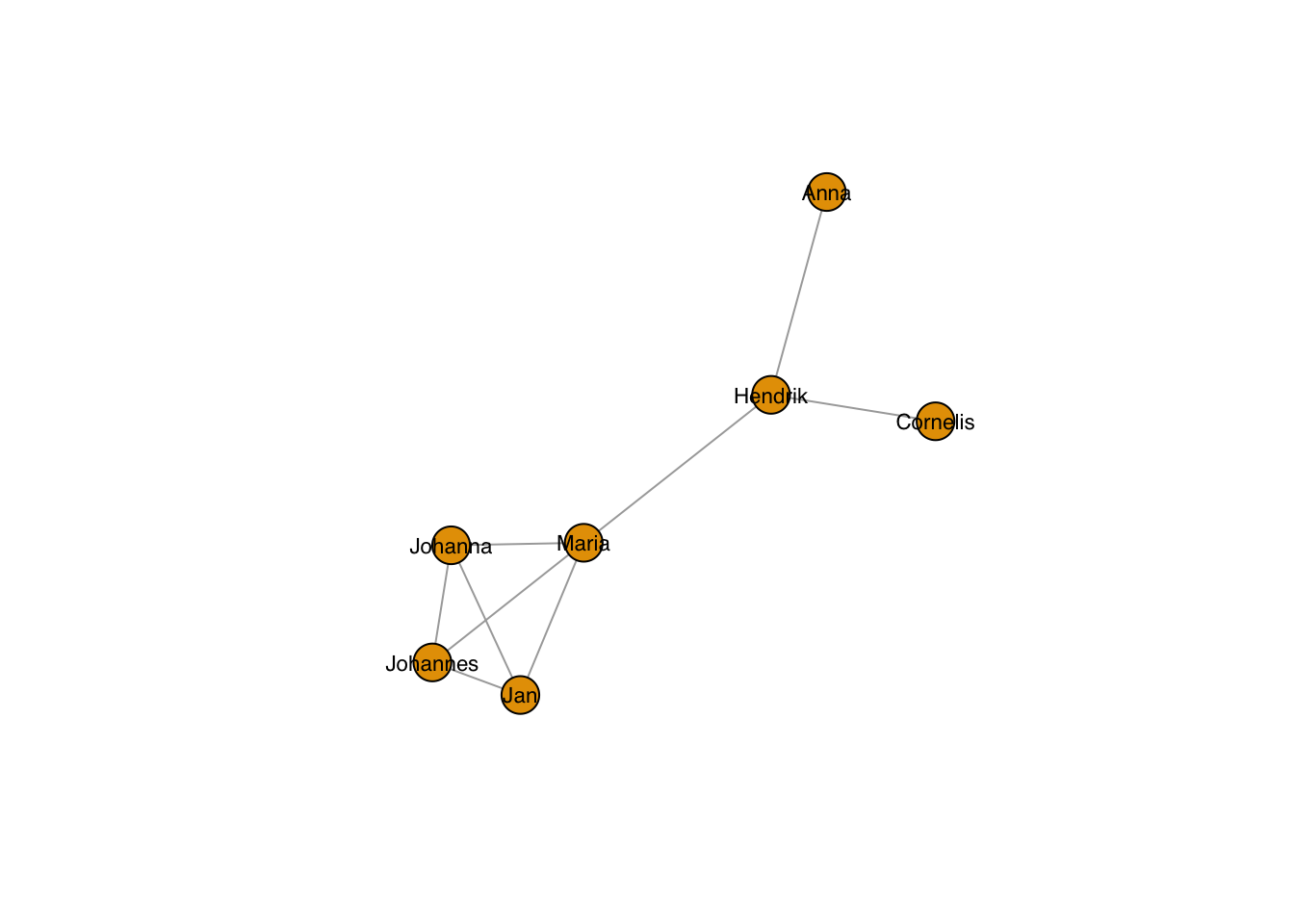
… also for the individual nodes:
plot(g, layout=frg,
     vertex.label.family = "sans", # sans serif labels
     vertex.label.color = "black", #color
     vertex.label.cex = 0.2*1:7) # size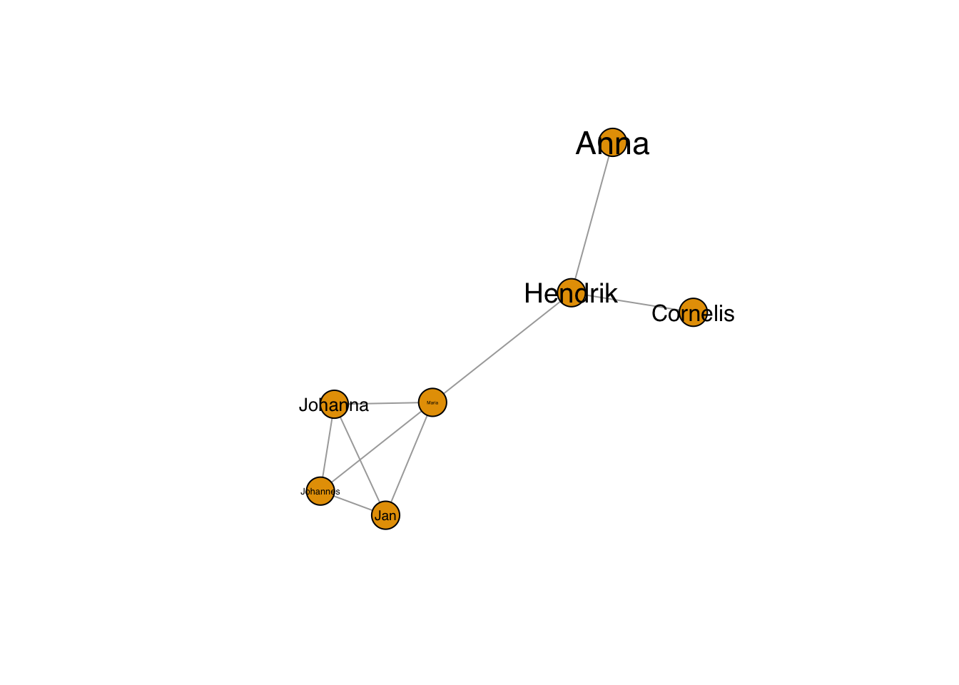
With this, you could also take values from an analysis, e.g. the degree (i.e. number of connections) of the nodes:
plot(g, layout=frg,
     vertex.label.family = "sans", # sans serif labels
     vertex.label.color = "black", #color
     vertex.label.cex = 0.2*degree(g)) # size based on degree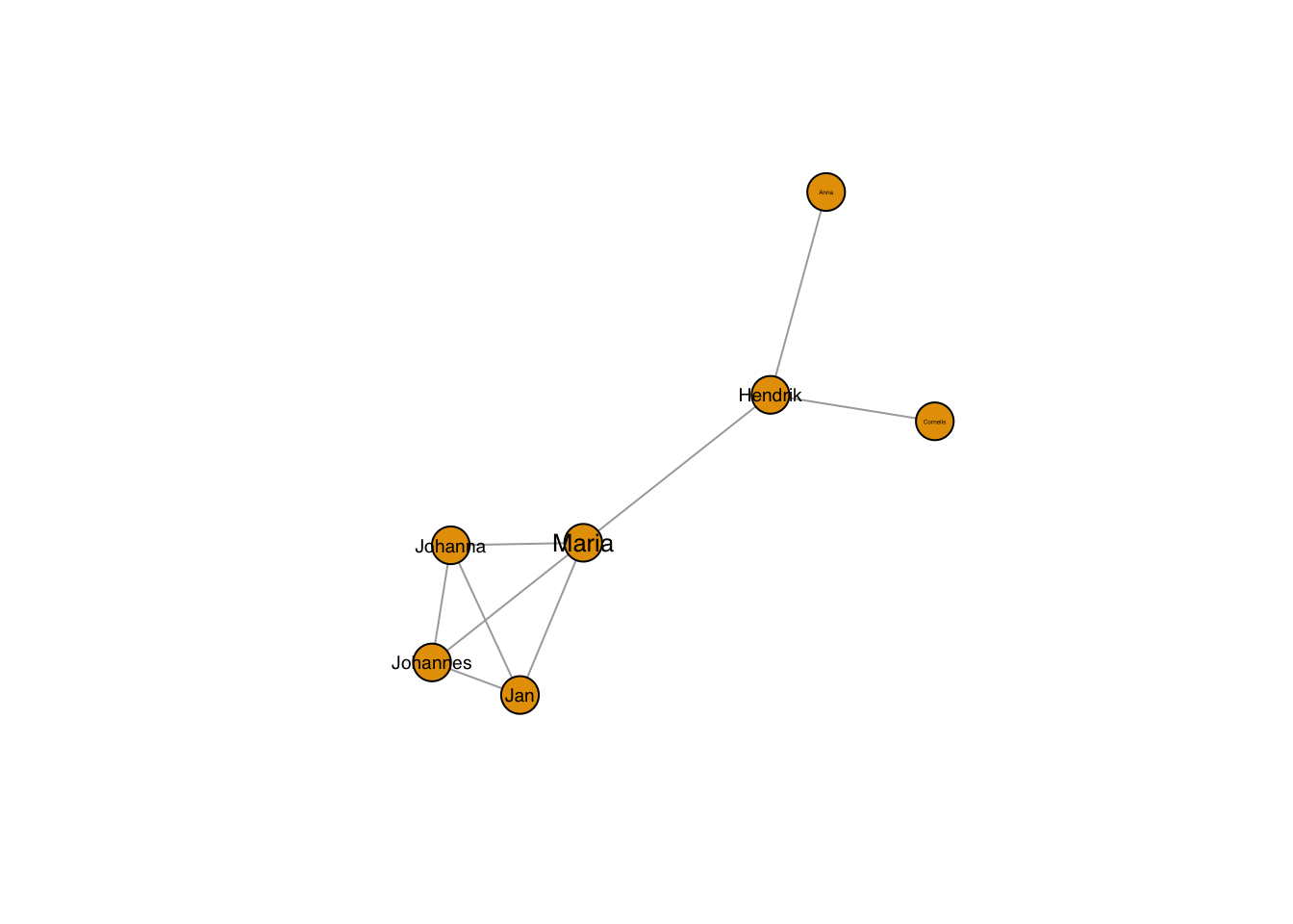
The labels don’t need to sit in the node:
plot(g, layout=frg,
     vertex.label.family = "sans", # sans serif labels
     vertex.label.color = "black", #color
     vertex.label.cex = 0.6, # size
     vertex.label.dist = 3, # label distance to node centre
     vertex.label.degree = 0) # label position 0=right, pi=left, pi/2=below etc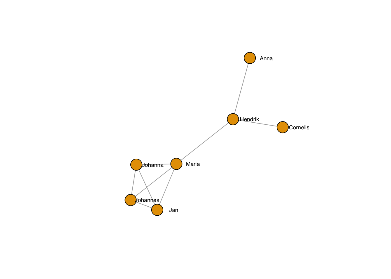
11.3.3 Node shapes and sizes
You have a choice of different shapes, e.g. circles, squares, rectangles, spheres.
plot(g, layout=frg,
     vertex.shape="square",
     vertex.size = 40,
     vertex.label.family = "sans", # sans serif labels
     vertex.label.color = "black", # label color
vertex.label.cex = 0.6) # label size 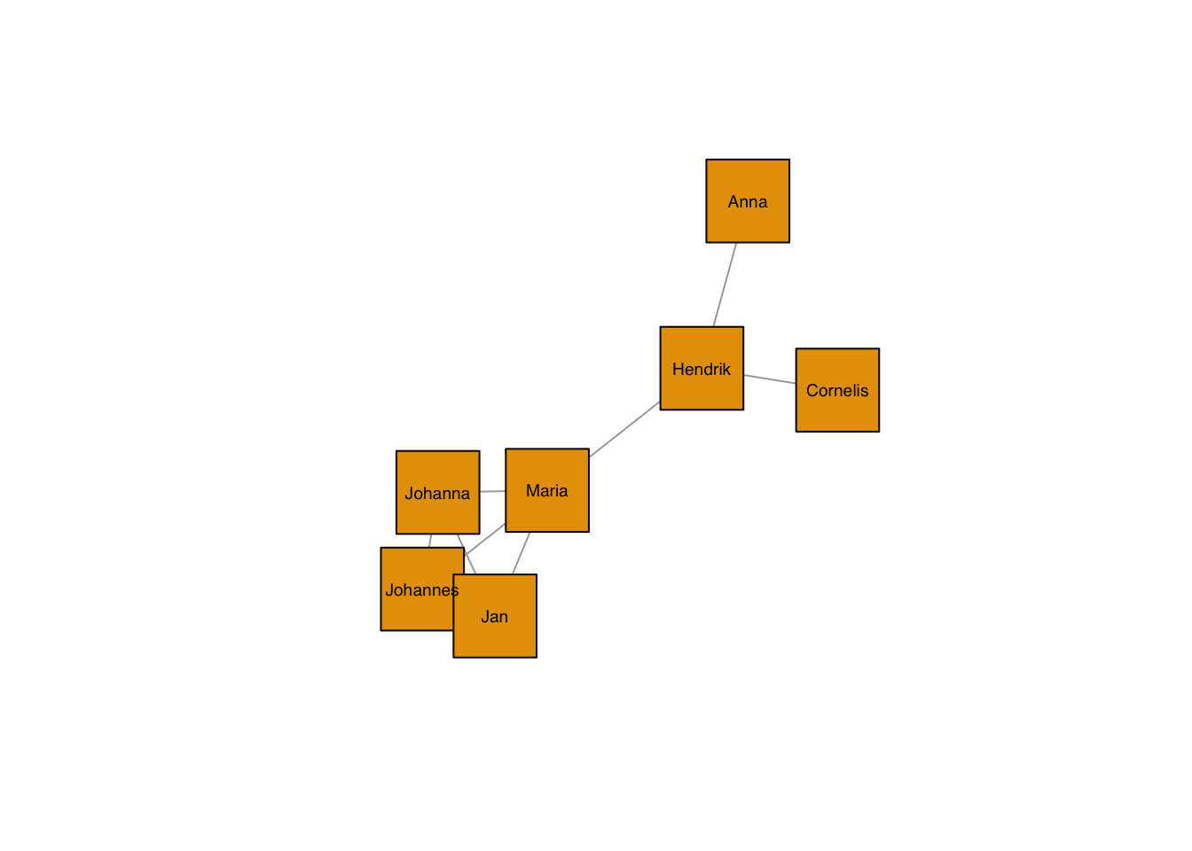
As always, they can be set by node:
plot(g, layout=frg,
     vertex.shape=c("square","circle")[1+as.numeric(grepl("nn",V(g)$name))],
     vertex.size = 40,
     vertex.label.family = "sans", # sans serif labels
     vertex.label.color = "black", # label color
vertex.label.cex = 0.6) # label size 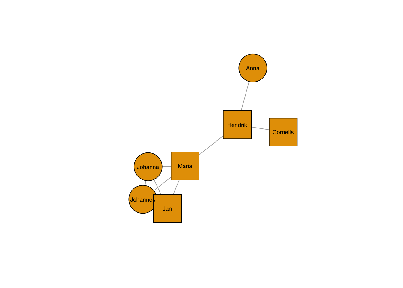
Colours of both the node and its frame can be chosen freely, too:
plot(g, layout=frg,
     vertex.shape=c("square","circle")[1+as.numeric(grepl("nn",V(g)$name))],
     vertex.color = c("darkgreen","orange")[1+as.numeric(grepl("^J",V(g)$name))],
     vertex.frame.color = c("black","grey"), # vectors are not recycled, any node without a value gets an NA
     vertex.size = 40,
     vertex.label.family = "sans", # sans serif labels
     vertex.label.color = "black", # label color
vertex.label.cex = 0.6) # label size 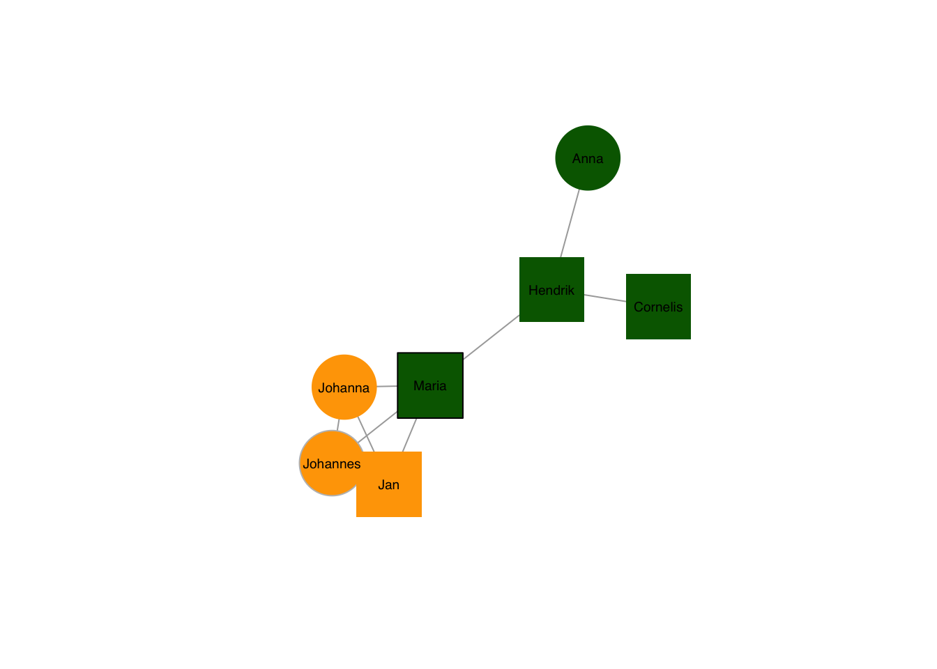
A special case of nodes are pies:
plot(g, layout=frg,
     vertex.shape= "pie",
     vertex.size = 30,
     vertex.pie = list(c(1,1,0,2),
                       c(2,1,0,1),
                       c(3,1,0,0),
                       c(4,0,1,0),
                       c(2,2,0,3),
                       c(1,1,0,1),
                       c(4,4,0,1),
                       c(5,0,0,1)),
     vertex.pie.color = list(rainbow(4)),
     vertex.label.family = "sans", # sans serif labels
     vertex.label.color = "black", # label color
     vertex.label.cex = 0.6, # label size
     vertex.label.dist = 3, # label distance to node centre
     vertex.label.degree = 0) # label position 0=right, pi=left, pi/2=below etc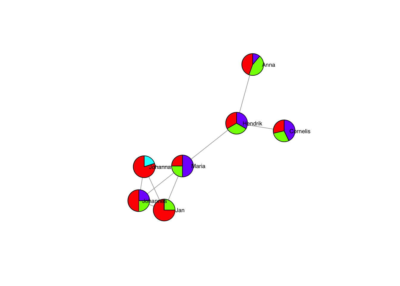
Which are especially effective with the size vector:
pieList <- list(c(1,1,0,2),
                c(2,1,0,1),
                c(3,1,0,0),
                c(4,0,1,0),
                c(2,2,0,3),
                c(1,1,0,1),
                c(4,4,0,1),
                c(5,0,0,1))
plot(g, layout=frg,
     vertex.shape= "pie",
     vertex.size = sapply(pieList,sum)*6,
     vertex.pie = pieList,
     vertex.pie.color = list(rainbow(4)),
     vertex.label.family = "sans", # sans serif labels
     vertex.label.color = "black", # label color
     vertex.label.cex = 0.6, # label size
     vertex.label.dist = rep(3,7), # label distance to node centre
     vertex.label.degree = rep(0,7)) # label position 0=right, pi=left, pi/2=below etc
## Warning in label.dist * cos(-label.degree) * (vertex.size + 6 * 8 * log10(2)):
## longer object length is not a multiple of shorter object length## Warning in layout[, 1] + label.dist * cos(-label.degree) * (vertex.size + :
## longer object length is not a multiple of shorter object length## Warning in label.dist * sin(-label.degree) * (vertex.size + 6 * 8 * log10(2)):
## longer object length is not a multiple of shorter object length## Warning in layout[, 2] + label.dist * sin(-label.degree) * (vertex.size + :
## longer object length is not a multiple of shorter object length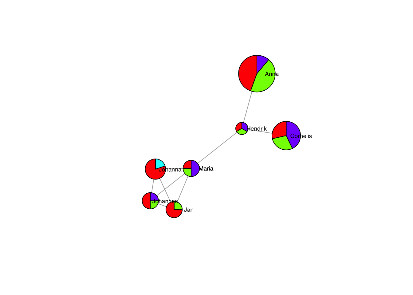
11.3.4 Edge appearance
Of course, the edges can also be controlled individually.
plot(g, layout=frg,
     edge.color = "black",
     vertex.label.family = "sans", # sans serif labels
     vertex.label.color = "black", #color
     vertex.label.cex = 0.6, # size
     vertex.label.dist = 3, # label distance to node centre
     vertex.label.degree = 0) # label position 0=right, pi=left, pi/2=below etc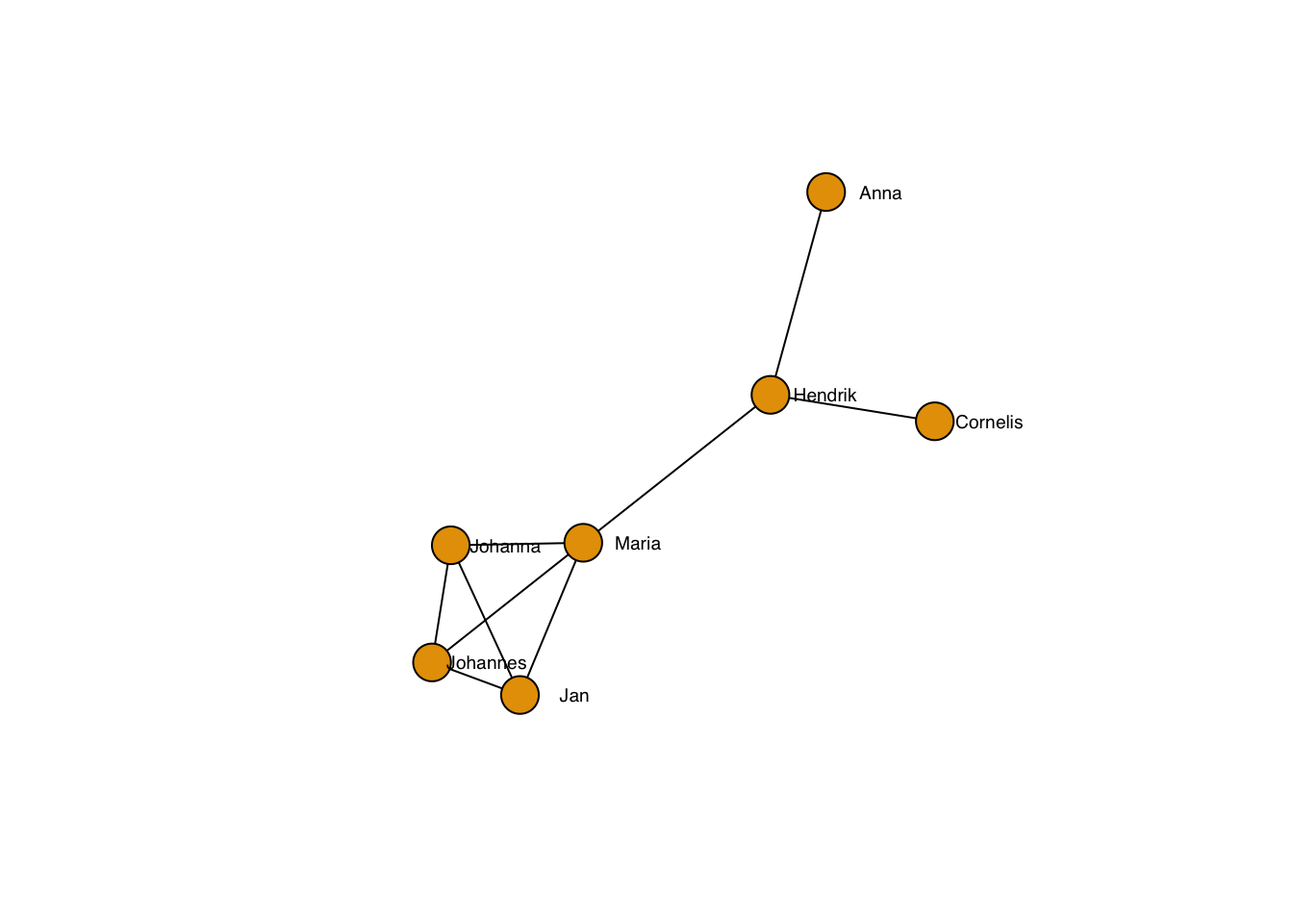
… including the line type:
plot(g, layout=frg,
     edge.lty = 3,
     edge.color = "black",
     vertex.label.family = "sans", # sans serif labels
     vertex.label.color = "black", #color
     vertex.label.cex = 0.6, # size
     vertex.label.dist = 3, # label distance to node centre
     vertex.label.degree = 0) # label position 0=right, pi=left, pi/2=below etc
… and the thickness:
plot(g, layout=frg,
     edge.width = 3,
     edge.lty = 2,
     edge.color = "black",
     vertex.label.family = "sans", # sans serif labels
     vertex.label.color = "black", #color
     vertex.label.cex = 0.6, # size
     vertex.label.dist = 3, # label distance to node centre
     vertex.label.degree = 0) # label position 0=right, pi=left, pi/2=below etc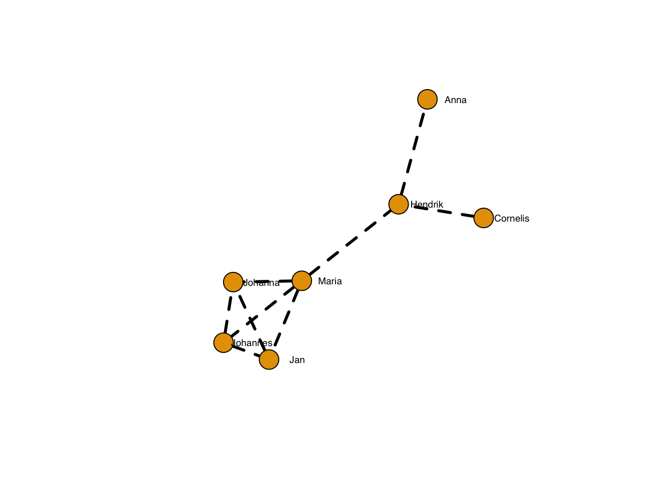
… which can, of course be adapted per edge:
plot(g, layout=frg,
     edge.width = sqrt(edge_betweenness(g)),
     edge.lty = 2,
     edge.color = "black",
     vertex.label.family = "sans", # sans serif labels
     vertex.label.color = "black", #color
     vertex.label.cex = 0.6, # size
     vertex.label.dist = 3, # label distance to node centre
     vertex.label.degree = 0) # label position 0=right, pi=left, pi/2=below etc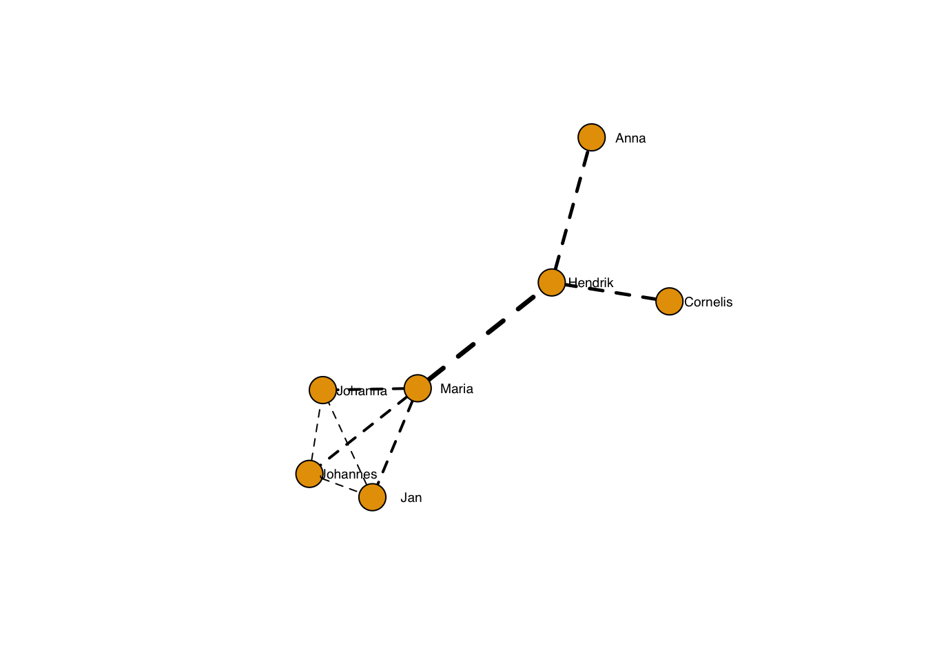
Edges can be curved:
plot(g, layout=frg,
     edge.curved = T,
     edge.width = sqrt(edge_betweenness(g)),
     edge.lty = 1,
     edge.color = "black",
     vertex.label.family = "sans", # sans serif labels
     vertex.label.color = "black", #color
     vertex.label.cex = 0.6, # size
     vertex.label.dist = 3, # label distance to node centre
     vertex.label.degree = 0) # label position 0=right, pi=left, pi/2=below etc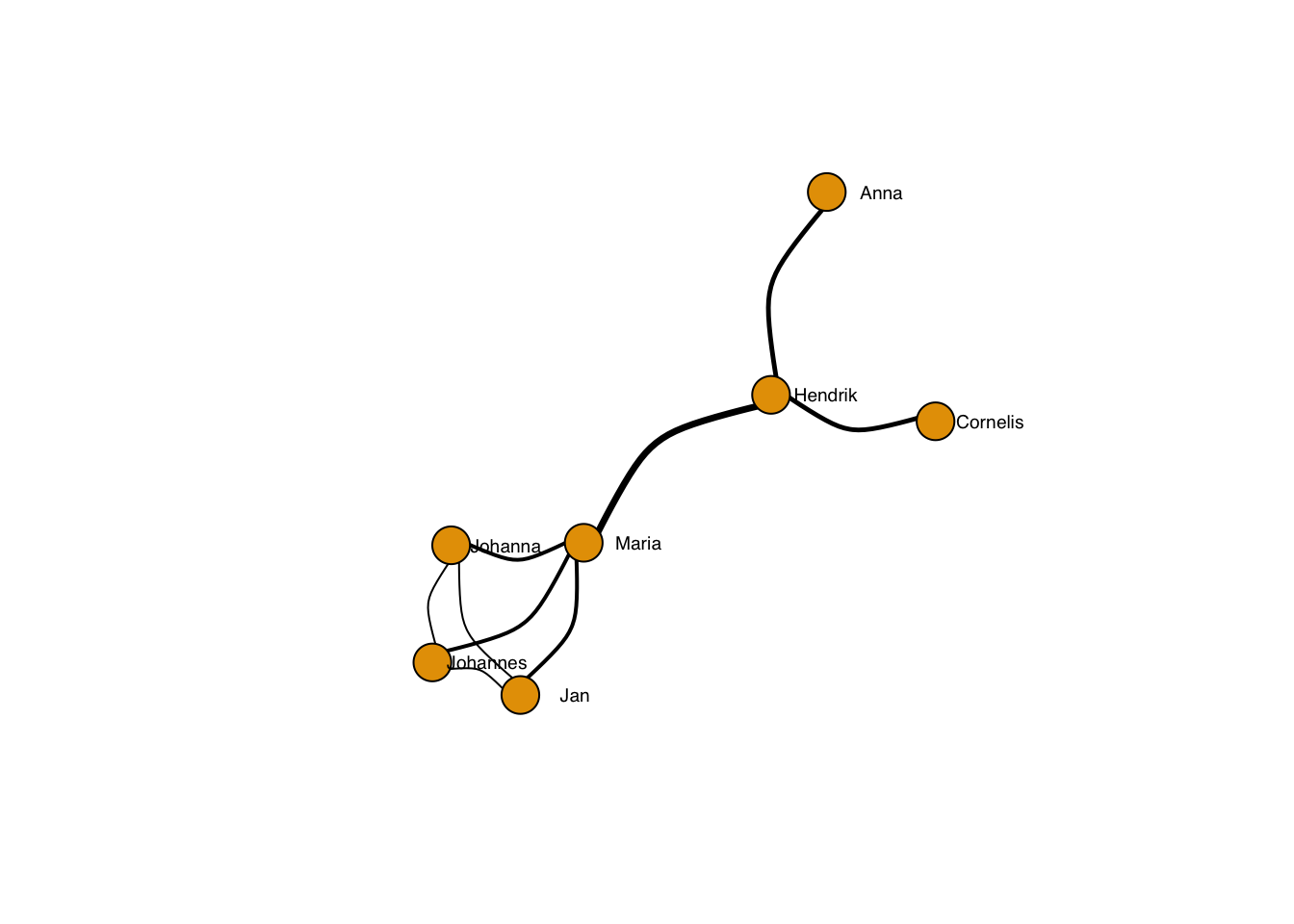
… and more or less curved:
plot(g, layout=frg,
     edge.curved = 0.1,
     edge.width = sqrt(edge_betweenness(g)),
     edge.lty = 1,
     edge.color = "black",
     vertex.label.family = "sans", # sans serif labels
     vertex.label.color = "black", #color
     vertex.label.cex = 0.6, # size
     vertex.label.dist = 3, # label distance to node centre
     vertex.label.degree = 0) # label position 0=right, pi=left, pi/2=below etc
plot(g, layout=frg,
     edge.curved = -2,
     edge.width = sqrt(edge_betweenness(g)),
     edge.lty = 1,
     edge.color = "black",
     vertex.label.family = "sans", # sans serif labels
     vertex.label.color = "black", #color
     vertex.label.cex = 0.6, # size
     vertex.label.dist = 3, # label distance to node centre
     vertex.label.degree = 0) # label position 0=right, pi=left, pi/2=below etc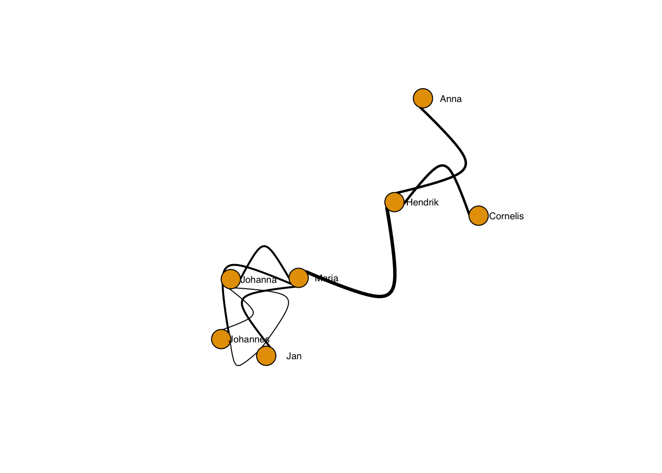
Of course, edges may have labels:
plot(g, layout=frg,
     edge.label = E(g),
     edge.label.family = "sans",
     edge.label.cex = 0.6,
     edge.label.color = "magenta",
     edge.label.font = 3,
     edge.curved = 0.1,
     edge.width = sqrt(edge_betweenness(g)),
     edge.lty = 1,
     edge.color = "black",
     vertex.label.family = "sans", # sans serif labels
     vertex.label.color = "black", #color
     vertex.label.cex = 0.6, # size
     vertex.label.dist = 3, # label distance to node centre
     vertex.label.degree = 0) # label position 0=right, pi=left, pi/2=below etc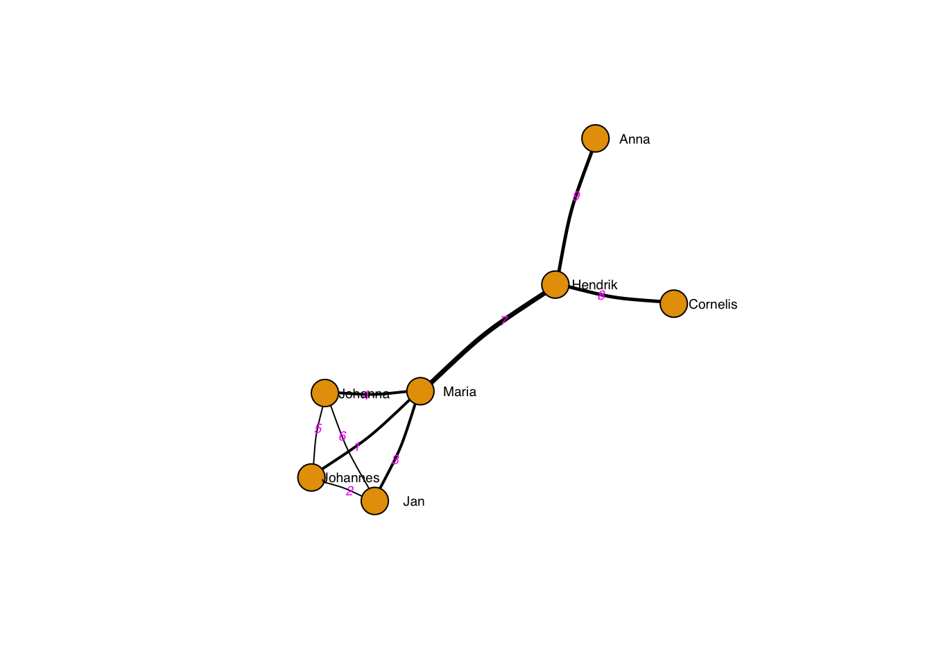
You can also add a title, box and other things. See ?igraph.plotting
for further tips.